শেয়ারFacebookWhatsApp

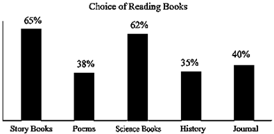
The graph below shows the percentage of the students [গণিত] choice of reading books from the library of ABC Model High School, Dhaka in the academic session 2023. Now, describe the graph in about 150 words. You should highlight and summarize the information given in the graph. [চিত্র]
উত্তর: Students [গণিত] Choice of Reading Books The provided [গণিত] graph illustrates the percentage of students [গণিত] choices for different types of reading books from the library of ABC Model High School in the academic year 2023. The graph displays preferences for four categories: Story Books, Novels, Textbooks, and Others. From the graph, it is evident that Story Books are the most popular choice among the students, with 40% of them preferring [গণিত] read this type of book. This indicates a strong interest in fiction and imaginative literature. The second most popular category is 'Others [গণিত] , which accounts for 25% of the students [গণিত] choices. This category likely includes books on general knowledge, science fiction, magazines, etc. Novels are the third choice, attracting 20% of the student readers. The least popular choice is Textbooks, with only 15% of students opting [গণিত] read them from the library, which might be because they already own their personal copies. In conclusion, the graph clearly shows that students at ABC Model High School have a greater interest in reading for pleasure (Story Books and Novels) than for academic purposes (Textbooks).

SSC English 1st Paper Interpreting graph/chart (Old Syllabus) CQ — Prosthuti প্রশ্নব্যাংক

SSC · English 1st Paper · Interpreting graph/chart (Old Syllabus) · সৃজনশীল

The graph below shows the percentage of the students′choiceofreadingbooksfromthelibraryofABCModelHighstudents^{\prime} choice of reading books from the library of ABC Model High School, Dhaka in the academic session 2023. Now, describe the graph in about 150 words. You should highlight and summarize the information given in the graph. question image

উত্তর

Students′ChoiceofReadingBooksTheprovidedgˉraphillustratesthepercentageofstudents′choicesfordifferenttypesofreadingbooksfromthelibraryofABCModelHighSchoolintheacademicyear2023.ThegraphdisplayspreferencesforfourStudents^{\prime} Choice of Reading Books The provided \bar graph illustrates the percentage of students^{\prime} choices for different types of reading books from the library of ABC Model High School in the academic year 2023. The graph displays preferences for four
categories: Story Books, Novels, Textbooks, and Others. From the graph, it is evident that Story Books are the most popular choice among the students, with 40% of them preferring →readthistypeof\to read this type of book. This indicates a strong interest in fiction and imaginative literature. The second most popular category is 'Others′,whichaccountsfor25Others^{\prime}, which accounts for 25% of the students′students^{\prime} choices. This category likely includes books on general knowledge, science fiction, magazines, etc. Novels are the third choice, attracting 20% of the student readers. The least popular choice is Textbooks, with only 15% of students opting →readthemfromthe\to read them from the library, which might be because they already own their personal copies. In conclusion, the graph clearly shows that students at ABC Model High School have a greater interest in reading for pleasure (Story Books and Novels) than for academic purposes (Textbooks).
SSCEnglish 1st PaperInterpreting graph/chart (Old Syllabus)
12টি সম্পর্কিত প্রশ্ন — ব্যাখ্যা লকড

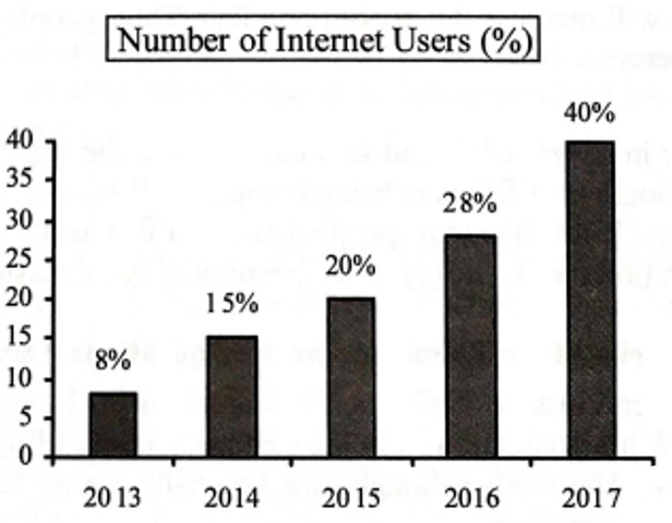
1.The graph below shows the number of people using the internet from the year 2013 →2017in\to 2017 in Bangladesh. Now, describe the graph in 150 words. You should highlight and summarize the information given in the graph: question image

The graph below shows the number of people using the internet from the year 2013 →2017in\to 2017 in Bangladesh. Now, describe the graph in 150 words. You should highlight and summarize the information given in the graph: question image

উত্তর ও ব্যাখ্যা দেখতে ফ্রি রেজিস্ট্রেশন করো

ফ্রি শুরু করো

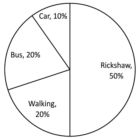
2.The pie chart below shows the percentage of transportation used by the students →come→their\to come \to their school. Describe the chart in 150 words. You should highlight and summarize the information given in the chart. question image

The pie chart below shows the percentage of transportation used by the students →come→their\to come \to their school. Describe the chart in 150 words. You should highlight and summarize the information given in the chart. question image

উত্তর ও ব্যাখ্যা দেখতে ফ্রি রেজিস্ট্রেশন করো

ফ্রি শুরু করো

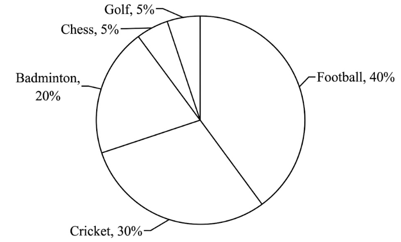
3.The pie chart below shows the percentage of supporters of different games of a country. Now, describe the chart in about 150 words. You should highlight and summarize the information given in the chart. question image

The pie chart below shows the percentage of supporters of different games of a country. Now, describe the chart in about 150 words. You should highlight and summarize the information given in the chart. question image

উত্তর ও ব্যাখ্যা দেখতে ফ্রি রেজিস্ট্রেশন করো

ফ্রি শুরু করো

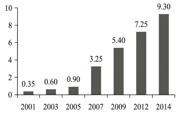
4.The graph below shows "The Number of Telephone and Mobile Users" from 2001 →2014.Describethegraphin150\to 2014. Describe the graph in 150 words. You should highlight and summarize the information given in the graph . question image

The graph below shows "The Number of Telephone and Mobile Users" from 2001 →2014.Describethegraphin150\to 2014. Describe the graph in 150 words. You should highlight and summarize the information given in the graph . question image

উত্তর ও ব্যাখ্যা দেখতে ফ্রি রেজিস্ট্রেশন করো

ফ্রি শুরু করো

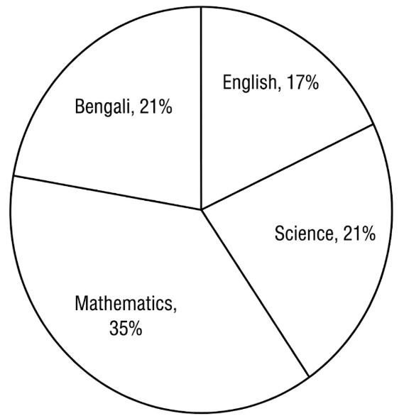
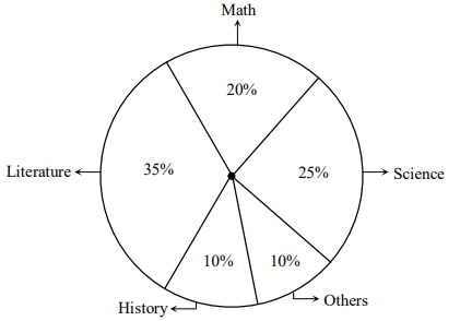
5.The pie-chart below shows the interest of a secondary school in different subjects. Describe the chart in about 150 words. You should highlight and summarise the information given in the chart. question image

The pie-chart below shows the interest of a secondary school in different subjects. Describe the chart in about 150 words. You should highlight and summarise the information given in the chart. question image

উত্তর ও ব্যাখ্যা দেখতে ফ্রি রেজিস্ট্রেশন করো

ফ্রি শুরু করো

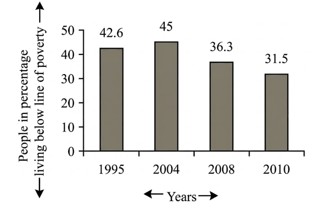
6.The graph below shows "The number of people in percentage, living below the poverty line" from 1995 →2010.Describethegraphsin150\to 2010. Describe the graphs in 150 words. You should highlight and summarize the information given in the graph. question image

The graph below shows "The number of people in percentage, living below the poverty line" from 1995 →2010.Describethegraphsin150\to 2010. Describe the graphs in 150 words. You should highlight and summarize the information given in the graph. question image

উত্তর ও ব্যাখ্যা দেখতে ফ্রি রেজিস্ট্রেশন করো

ফ্রি শুরু করো

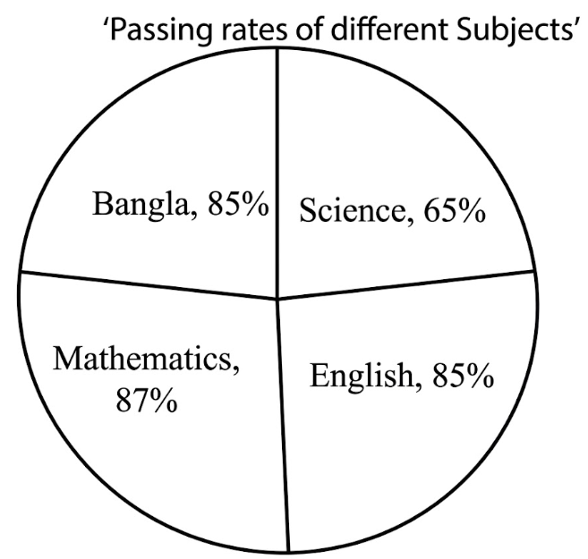
7.Look at the following pie-chart. It represents the passing rates of the students in different subjects of a school. Now, describe the chart in your own words. question image

Look at the following pie-chart. It represents the passing rates of the students in different subjects of a school. Now, describe the chart in your own words. question image

উত্তর ও ব্যাখ্যা দেখতে ফ্রি রেজিস্ট্রেশন করো

ফ্রি শুরু করো

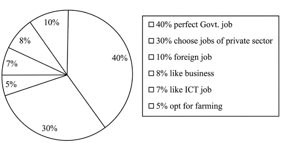
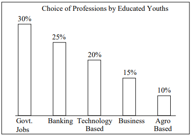
8.Look at the following pie-chart. It shows the choice of professions by different educated youths in Bangladesh. Now, describe the pie-chart in your own words in 150 words. You are advised →highlightandsummarizetheinformationgiveninthe\to highlight and summarize the information given in the pie-chart. question image

Look at the following pie-chart. It shows the choice of professions by different educated youths in Bangladesh. Now, describe the pie-chart in your own words in 150 words. You are advised →highlightandsummarizetheinformationgiveninthe\to highlight and summarize the information given in the pie-chart. question image

উত্তর ও ব্যাখ্যা দেখতে ফ্রি রেজিস্ট্রেশন করো

ফ্রি শুরু করো

9.Look at the chart below. It is about the importance and uses of English. Now, describe the chart in 150 words. You should highlight and summarize the information given in the chart: question image

Look at the chart below. It is about the importance and uses of English. Now, describe the chart in 150 words. You should highlight and summarize the information given in the chart: question image

উত্তর ও ব্যাখ্যা দেখতে ফ্রি রেজিস্ট্রেশন করো

ফ্রি শুরু করো

10.Look at the graph below. It shows the choice of professions by educated youths in Bangladesh. Now, describe the graph in about 150 words. You should highlight and summarize the information given in the graph: question image

Look at the graph below. It shows the choice of professions by educated youths in Bangladesh. Now, describe the graph in about 150 words. You should highlight and summarize the information given in the graph: question image

উত্তর ও ব্যাখ্যা দেখতে ফ্রি রেজিস্ট্রেশন করো

ফ্রি শুরু করো

11.The pie chart below shows the percentage of books in a school library. Describe the chart in your own words. You should highlight and summarize the information given in the chart. question image

The pie chart below shows the percentage of books in a school library. Describe the chart in your own words. You should highlight and summarize the information given in the chart. question image

উত্তর ও ব্যাখ্যা দেখতে ফ্রি রেজিস্ট্রেশন করো

ফ্রি শুরু করো

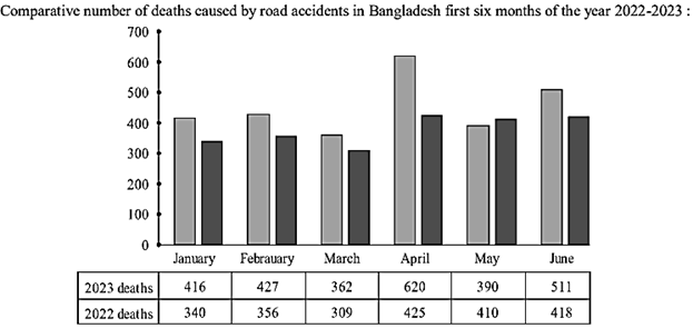
12.Look at the following graph. It shows the comparative number of deaths caused by road accidents in the first six month of the year 2022 and 2023. Now describe the graph in your own words in 150 words. You are advised →highlightandsummarizetheinformationgiveninthe\to highlight and summarize the information given in the graph. question image

Look at the following graph. It shows the comparative number of deaths caused by road accidents in the first six month of the year 2022 and 2023. Now describe the graph in your own words in 150 words. You are advised →highlightandsummarizetheinformationgiveninthe\to highlight and summarize the information given in the graph. question image

উত্তর ও ব্যাখ্যা দেখতে ফ্রি রেজিস্ট্রেশন করো

ফ্রি শুরু করো

আরো প্রশ্ন দেখো

আরো হাজারো প্রশ্ন + মডেল টেস্ট

ফ্রি রেজিস্ট্রেশন করো — ফেভারিট, AI টিউটর, লিডারবোর্ড ও অ্যানালিটিক্স আনলক করো।