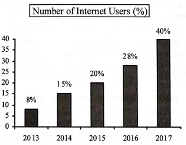
The graph below shows the number of people using the internet from the year 2013 [গণিত] 2017 in Bangladesh. Now, describe the graph in 150 words. You should highlight and summarize the information given in the graph: [চিত্র]
উত্তর: The bar graph illustrates the percentage of the Internet users in Bangladesh during the years between 2013 and 2017. It represents an overall increase in the number of internet users during this period. It shows that just about 8% of people in Bangladesh used internet in 2013, whereas, by the following year, the percentage of users rose to 15%. In 2015, the total number of users increased modestly to 20%. By 2016, however, more than a quarter of the total population were using Internet. The percentage was 28%. Moreover, there was a substantial boost in the percentage in 2017. The total number of users rose to 40%. Analyzing the graph, we find that within four years the number of Internet users in Bangladesh increased by five times. It is a clear indication that during this period, the digital infrastructure of the country improved significantly. It also shows that people of Bangladesh are getting accustomed to the modern technologies.
SSC English 1st Paper Interpreting graph/chart (Old Syllabus) CQ — Prosthuti প্রশ্নব্যাংক
SSC · English 1st Paper · Interpreting graph/chart (Old Syllabus) · সৃজনশীল
The graph below shows the number of people using the internet from the year 2013 Bangladesh. Now, describe the graph in 150 words. You should highlight and summarize the information given in the graph:
উত্তর