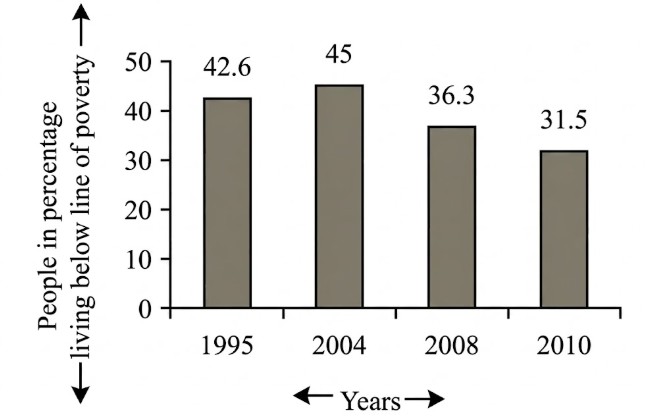
The graph below shows "The number of people in percentage, living below the poverty line" from 1995 [গণিত] 2010. Describe the graphs in 150 words. You should highlight and summarize the information given in the graph. [চিত্র]
উত্তর: The bar chart deals with the number of people living below the poverty line in the years of 1995, 2004, 2008 and 2010. In the bar chart, the percentage of the number of people living below the poverty line is compared among four years. 35.6 percent people were living under the poverty line in 1995. Nine years later, in 2004 , the number rose to 45 percent which is about 9.4 percent higher than 1995 . In 2008 , fortunately the number decreased to 36.3 percent which is about 8.7 percent lower than that of four years ago. Finally, in 2010, with a happy note the number decreased to 31.51 percent which is about 4.8 percent lower than that of 2008. So, it can be said that within the time span of 15 years, the percentage of the people living below the poverty line has slightly been decreased. Though in 2004 the number had risen, in the following years it decreased gradually.
SSC English 1st Paper Interpreting graph/chart (Old Syllabus) CQ — Prosthuti প্রশ্নব্যাংক
SSC · English 1st Paper · Interpreting graph/chart (Old Syllabus) · সৃজনশীল
The graph below shows "The number of people in percentage, living below the poverty line" from 1995 words. You should highlight and summarize the information given in the graph.
উত্তর