শেয়ারFacebookWhatsApp

Look at the graph below. It shows the choice of professions by educated youths in Bangladesh. Now, describe the graph in about 150 words. You should highlight and summarize the information given in the graph: [চিত্র]
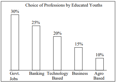
উত্তর: The provided bar graph illustrates the professional preferences of educated youths in Bangladesh across five different sectors. The data highlights a strong inclination towards traditional, secure government jobs, which are the most popular choice, attracting 30% of the respondents. Following government jobs, banking emerges as the second most preferred profession, with 25% of educated youths opting for this field. The third position is held by technology-based careers, chosen by 20% of the individuals surveyed. Business is the fourth most popular choice, capturing the interest of 15% of the educated youth. This indicates a moderate level of entrepreneurial spirit. Farming (agro-based professions) is the least preferred option among the educated youths in Bangladesh, with only 10% choosing it as a career path. In summary, the graph clearly shows that job security and stability, often associated with government and banking sectors, are the primary drivers for career choices among educated youths in Bangladesh, while agro-based professions are the least favored.

SSC English 1st Paper Interpreting graph/chart (Old Syllabus) CQ — Prosthuti প্রশ্নব্যাংক

SSC · English 1st Paper · Interpreting graph/chart (Old Syllabus) · সৃজনশীল

Look at the graph below. It shows the choice of professions by educated youths in Bangladesh. Now, describe the graph in about 150 words. You should highlight and summarize the information given in the graph: question image

উত্তর

The provided bar graph illustrates the professional preferences of educated youths in Bangladesh across five different sectors. The data highlights a strong inclination towards traditional, secure government jobs, which are the most popular choice, attracting 30% of the respondents. Following government jobs, banking emerges as the second most preferred profession, with 25% of educated youths opting for this field. The third position is held by technology-based careers, chosen by 20% of the individuals surveyed. Business is the fourth most popular choice, capturing the interest of 15% of the educated youth. This indicates a moderate level of entrepreneurial spirit. Farming (agro-based professions) is the least preferred option among the educated youths in Bangladesh, with only 10% choosing it as a career path. In summary, the graph clearly shows that job security and stability, often associated with government and banking sectors, are the primary drivers for career choices among educated youths in Bangladesh, while agro-based professions are the least favored.
SSCEnglish 1st PaperInterpreting graph/chart (Old Syllabus)
12টি সম্পর্কিত প্রশ্ন — ব্যাখ্যা লকড

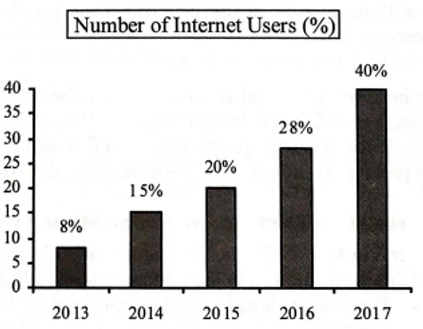
1.The graph below shows the number of people using the internet from the year 2013 →2017in\to 2017 in Bangladesh. Now, describe the graph in 150 words. You should highlight and summarize the information given in the graph: question image

The graph below shows the number of people using the internet from the year 2013 →2017in\to 2017 in Bangladesh. Now, describe the graph in 150 words. You should highlight and summarize the information given in the graph: question image

উত্তর ও ব্যাখ্যা দেখতে ফ্রি রেজিস্ট্রেশন করো

ফ্রি শুরু করো

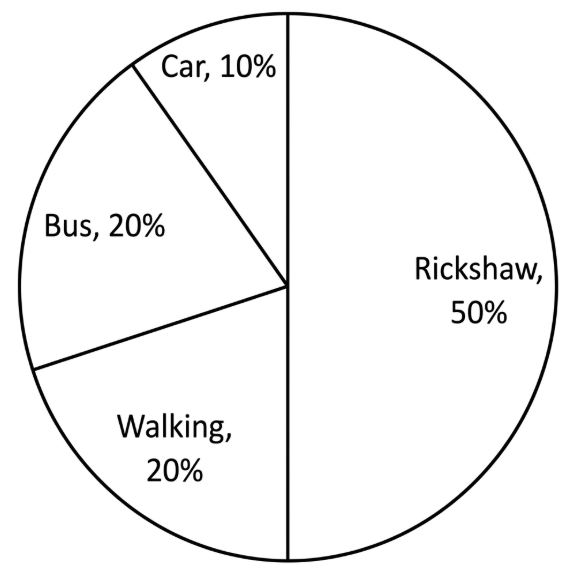
2.The pie chart below shows the percentage of transportation used by the students →come→their\to come \to their school. Describe the chart in 150 words. You should highlight and summarize the information given in the chart. question image

The pie chart below shows the percentage of transportation used by the students →come→their\to come \to their school. Describe the chart in 150 words. You should highlight and summarize the information given in the chart. question image

উত্তর ও ব্যাখ্যা দেখতে ফ্রি রেজিস্ট্রেশন করো

ফ্রি শুরু করো

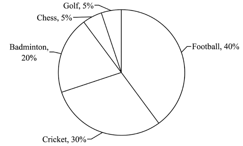
3.The pie chart below shows the percentage of supporters of different games of a country. Now, describe the chart in about 150 words. You should highlight and summarize the information given in the chart. question image

The pie chart below shows the percentage of supporters of different games of a country. Now, describe the chart in about 150 words. You should highlight and summarize the information given in the chart. question image

উত্তর ও ব্যাখ্যা দেখতে ফ্রি রেজিস্ট্রেশন করো

ফ্রি শুরু করো

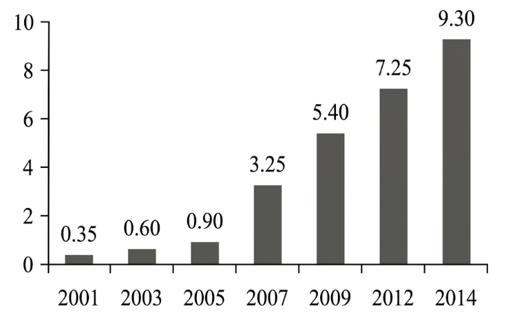
4.The graph below shows "The Number of Telephone and Mobile Users" from 2001 →2014.Describethegraphin150\to 2014. Describe the graph in 150 words. You should highlight and summarize the information given in the graph . question image

The graph below shows "The Number of Telephone and Mobile Users" from 2001 →2014.Describethegraphin150\to 2014. Describe the graph in 150 words. You should highlight and summarize the information given in the graph . question image

উত্তর ও ব্যাখ্যা দেখতে ফ্রি রেজিস্ট্রেশন করো

ফ্রি শুরু করো

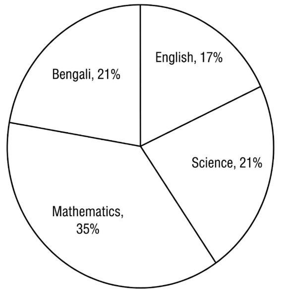
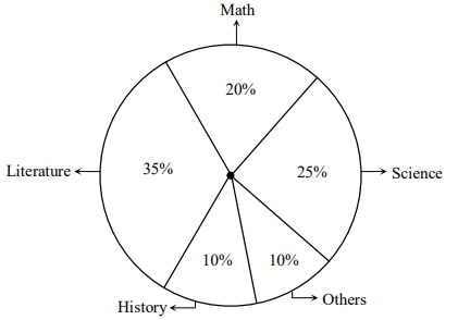
5.The pie-chart below shows the interest of a secondary school in different subjects. Describe the chart in about 150 words. You should highlight and summarise the information given in the chart. question image

The pie-chart below shows the interest of a secondary school in different subjects. Describe the chart in about 150 words. You should highlight and summarise the information given in the chart. question image

উত্তর ও ব্যাখ্যা দেখতে ফ্রি রেজিস্ট্রেশন করো

ফ্রি শুরু করো

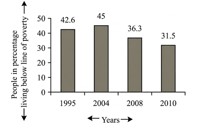
6.The graph below shows "The number of people in percentage, living below the poverty line" from 1995 →2010.Describethegraphsin150\to 2010. Describe the graphs in 150 words. You should highlight and summarize the information given in the graph. question image

The graph below shows "The number of people in percentage, living below the poverty line" from 1995 →2010.Describethegraphsin150\to 2010. Describe the graphs in 150 words. You should highlight and summarize the information given in the graph. question image

উত্তর ও ব্যাখ্যা দেখতে ফ্রি রেজিস্ট্রেশন করো

ফ্রি শুরু করো

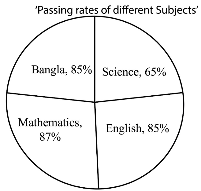
7.Look at the following pie-chart. It represents the passing rates of the students in different subjects of a school. Now, describe the chart in your own words. question image

Look at the following pie-chart. It represents the passing rates of the students in different subjects of a school. Now, describe the chart in your own words. question image

উত্তর ও ব্যাখ্যা দেখতে ফ্রি রেজিস্ট্রেশন করো

ফ্রি শুরু করো

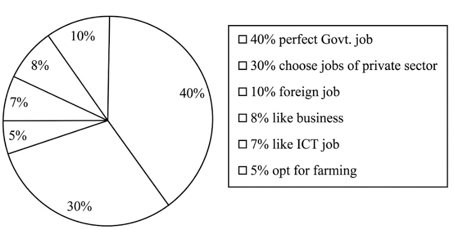
8.Look at the following pie-chart. It shows the choice of professions by different educated youths in Bangladesh. Now, describe the pie-chart in your own words in 150 words. You are advised →highlightandsummarizetheinformationgiveninthe\to highlight and summarize the information given in the pie-chart. question image

Look at the following pie-chart. It shows the choice of professions by different educated youths in Bangladesh. Now, describe the pie-chart in your own words in 150 words. You are advised →highlightandsummarizetheinformationgiveninthe\to highlight and summarize the information given in the pie-chart. question image

উত্তর ও ব্যাখ্যা দেখতে ফ্রি রেজিস্ট্রেশন করো

ফ্রি শুরু করো

9.Look at the chart below. It is about the importance and uses of English. Now, describe the chart in 150 words. You should highlight and summarize the information given in the chart: question image

Look at the chart below. It is about the importance and uses of English. Now, describe the chart in 150 words. You should highlight and summarize the information given in the chart: question image

উত্তর ও ব্যাখ্যা দেখতে ফ্রি রেজিস্ট্রেশন করো

ফ্রি শুরু করো

10.The pie chart below shows the percentage of books in a school library. Describe the chart in your own words. You should highlight and summarize the information given in the chart. question image

The pie chart below shows the percentage of books in a school library. Describe the chart in your own words. You should highlight and summarize the information given in the chart. question image

উত্তর ও ব্যাখ্যা দেখতে ফ্রি রেজিস্ট্রেশন করো

ফ্রি শুরু করো

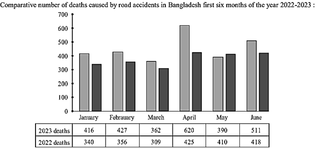
11.Look at the following graph. It shows the comparative number of deaths caused by road accidents in the first six month of the year 2022 and 2023. Now describe the graph in your own words in 150 words. You are advised →highlightandsummarizetheinformationgiveninthe\to highlight and summarize the information given in the graph. question image

Look at the following graph. It shows the comparative number of deaths caused by road accidents in the first six month of the year 2022 and 2023. Now describe the graph in your own words in 150 words. You are advised →highlightandsummarizetheinformationgiveninthe\to highlight and summarize the information given in the graph. question image

উত্তর ও ব্যাখ্যা দেখতে ফ্রি রেজিস্ট্রেশন করো

ফ্রি শুরু করো

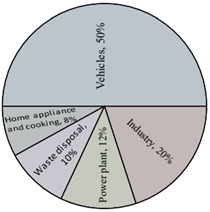
12.The pie-chart below shows the sources of air pollution in Dhaka city. Describe the chart in 150 words. You should highlight and summaries the information given in the chart. question image

The pie-chart below shows the sources of air pollution in Dhaka city. Describe the chart in 150 words. You should highlight and summaries the information given in the chart. question image

উত্তর ও ব্যাখ্যা দেখতে ফ্রি রেজিস্ট্রেশন করো

ফ্রি শুরু করো

আরো প্রশ্ন দেখো

আরো হাজারো প্রশ্ন + মডেল টেস্ট

ফ্রি রেজিস্ট্রেশন করো — ফেভারিট, AI টিউটর, লিডারবোর্ড ও অ্যানালিটিক্স আনলক করো।