শেয়ারFacebookWhatsApp

The pie chart below shows the percentage of transportation used by the students [গণিত] come [গণিত] their school. Describe the chart in 150 words. You should highlight and summarize the information given in the chart. [চিত্র]
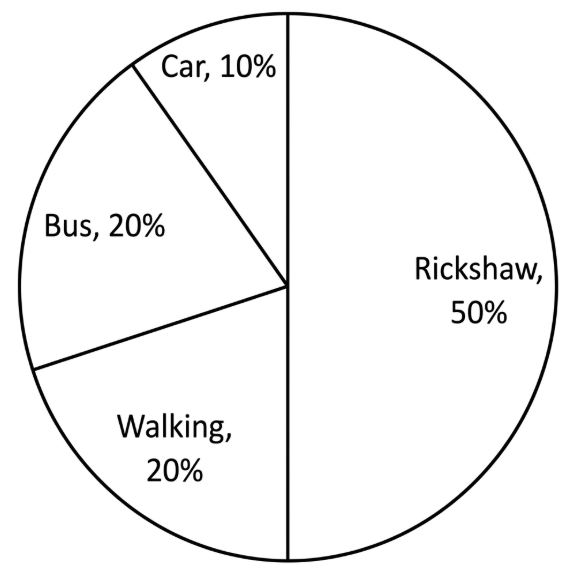
উত্তর: The graph provides information about the students [গণিত] transportation [গণিত] their School. From the graph, we can see that the highest number of students come [গণিত] school by Rickshaw whose percentage is around [গণিত] . Then it is by bus and by walking. Each mode of transportation is used by 20 % of the total students. Next, it is by car. 10 % of the total students of the school come [গণিত] school by car. Hence, from the information of the chart, we can say that the road communication system of the school is very good. Again, we can say that the most of the students reside near the school and so they can come [গণিত] school by rickshaw and by walking.

SSC English 1st Paper Interpreting graph/chart (Old Syllabus) CQ — Prosthuti প্রশ্নব্যাংক

SSC · English 1st Paper · Interpreting graph/chart (Old Syllabus) · সৃজনশীল

The pie chart below shows the percentage of transportation used by the students →come→their\to come \to their school. Describe the chart in 150 words. You should highlight and summarize the information given in the chart. question image

উত্তর

The graph provides information about the students′transportation→theirstudents^{\prime} transportation \to their School. From the graph, we can see that the highest number of students come →schoolbyRickshawwhosepercentageisaround\to school by Rickshaw whose percentage is around 50%50 \%. Then it is by bus and by walking. Each mode of transportation is used by 20\% of the total students. Next, it is by car. 10\% of the total students of the school come →schoolby\to school by car. Hence, from the information of the chart, we can say that the road communication system of the school is very good. Again, we can say that the most of the students reside near the school and so they can come →schoolbyrickshawandby\to school by rickshaw and by walking.
SSCEnglish 1st PaperInterpreting graph/chart (Old Syllabus)
12টি সম্পর্কিত প্রশ্ন — ব্যাখ্যা লকড

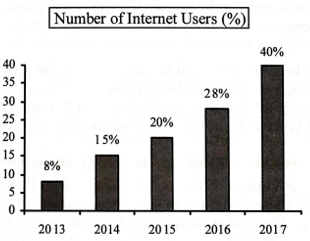
1.The graph below shows the number of people using the internet from the year 2013 →2017in\to 2017 in Bangladesh. Now, describe the graph in 150 words. You should highlight and summarize the information given in the graph: question image

The graph below shows the number of people using the internet from the year 2013 →2017in\to 2017 in Bangladesh. Now, describe the graph in 150 words. You should highlight and summarize the information given in the graph: question image

উত্তর ও ব্যাখ্যা দেখতে ফ্রি রেজিস্ট্রেশন করো

ফ্রি শুরু করো

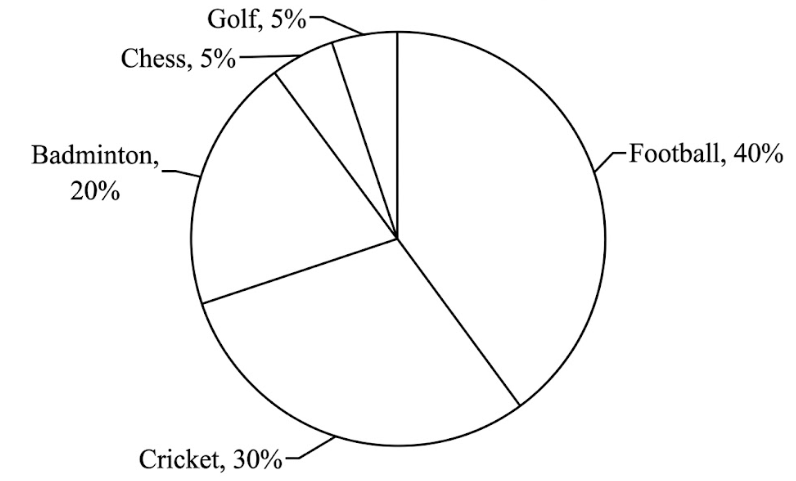
2.The pie chart below shows the percentage of supporters of different games of a country. Now, describe the chart in about 150 words. You should highlight and summarize the information given in the chart. question image

The pie chart below shows the percentage of supporters of different games of a country. Now, describe the chart in about 150 words. You should highlight and summarize the information given in the chart. question image

উত্তর ও ব্যাখ্যা দেখতে ফ্রি রেজিস্ট্রেশন করো

ফ্রি শুরু করো

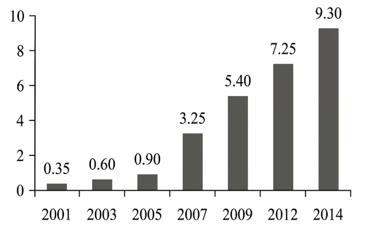
3.The graph below shows "The Number of Telephone and Mobile Users" from 2001 →2014.Describethegraphin150\to 2014. Describe the graph in 150 words. You should highlight and summarize the information given in the graph . question image

The graph below shows "The Number of Telephone and Mobile Users" from 2001 →2014.Describethegraphin150\to 2014. Describe the graph in 150 words. You should highlight and summarize the information given in the graph . question image

উত্তর ও ব্যাখ্যা দেখতে ফ্রি রেজিস্ট্রেশন করো

ফ্রি শুরু করো

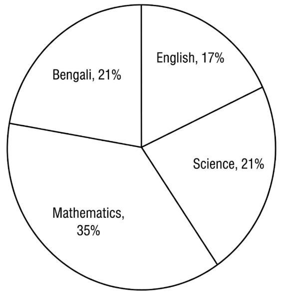
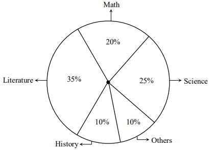
4.The pie-chart below shows the interest of a secondary school in different subjects. Describe the chart in about 150 words. You should highlight and summarise the information given in the chart. question image

The pie-chart below shows the interest of a secondary school in different subjects. Describe the chart in about 150 words. You should highlight and summarise the information given in the chart. question image

উত্তর ও ব্যাখ্যা দেখতে ফ্রি রেজিস্ট্রেশন করো

ফ্রি শুরু করো

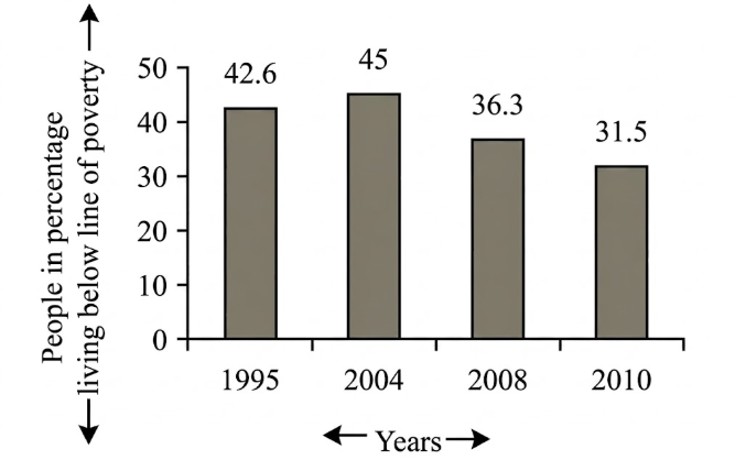
5.The graph below shows "The number of people in percentage, living below the poverty line" from 1995 →2010.Describethegraphsin150\to 2010. Describe the graphs in 150 words. You should highlight and summarize the information given in the graph. question image

The graph below shows "The number of people in percentage, living below the poverty line" from 1995 →2010.Describethegraphsin150\to 2010. Describe the graphs in 150 words. You should highlight and summarize the information given in the graph. question image

উত্তর ও ব্যাখ্যা দেখতে ফ্রি রেজিস্ট্রেশন করো

ফ্রি শুরু করো

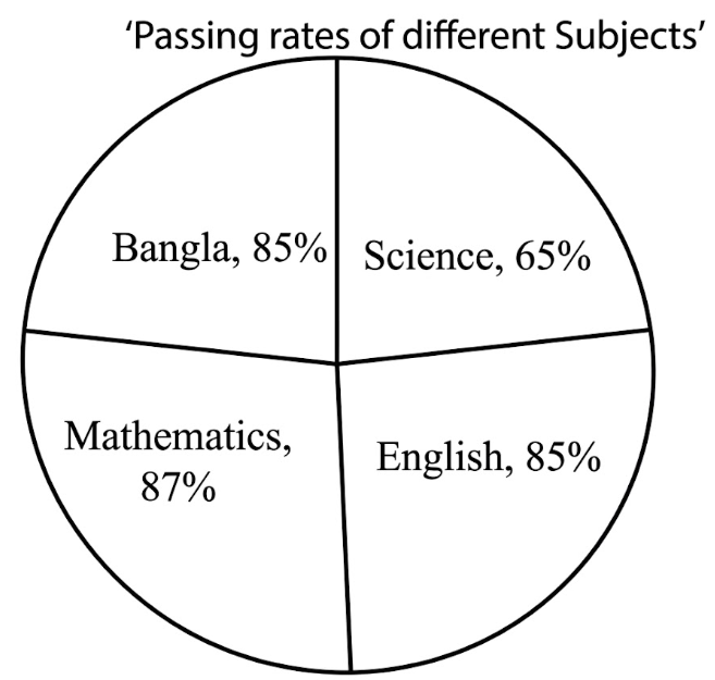
6.Look at the following pie-chart. It represents the passing rates of the students in different subjects of a school. Now, describe the chart in your own words. question image

Look at the following pie-chart. It represents the passing rates of the students in different subjects of a school. Now, describe the chart in your own words. question image

উত্তর ও ব্যাখ্যা দেখতে ফ্রি রেজিস্ট্রেশন করো

ফ্রি শুরু করো

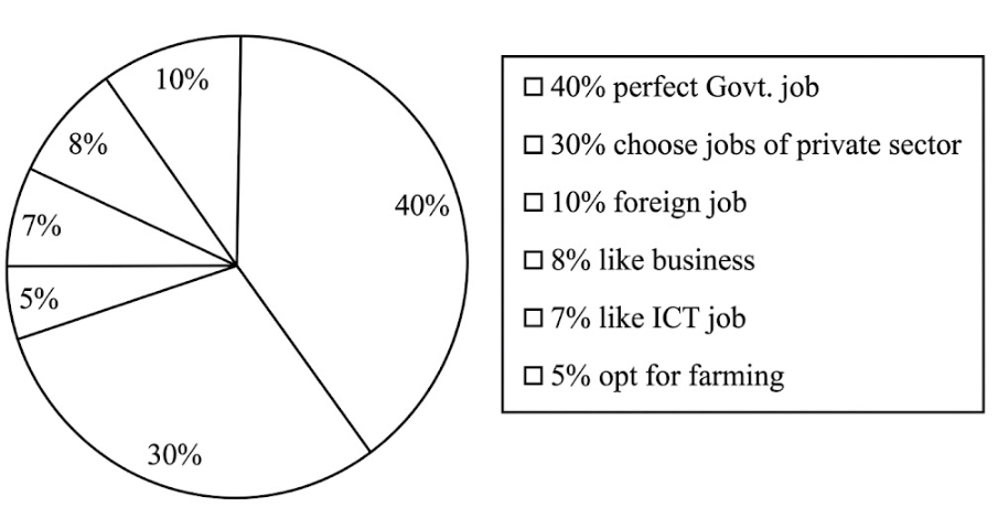
7.Look at the following pie-chart. It shows the choice of professions by different educated youths in Bangladesh. Now, describe the pie-chart in your own words in 150 words. You are advised →highlightandsummarizetheinformationgiveninthe\to highlight and summarize the information given in the pie-chart. question image

Look at the following pie-chart. It shows the choice of professions by different educated youths in Bangladesh. Now, describe the pie-chart in your own words in 150 words. You are advised →highlightandsummarizetheinformationgiveninthe\to highlight and summarize the information given in the pie-chart. question image

উত্তর ও ব্যাখ্যা দেখতে ফ্রি রেজিস্ট্রেশন করো

ফ্রি শুরু করো

8.Look at the chart below. It is about the importance and uses of English. Now, describe the chart in 150 words. You should highlight and summarize the information given in the chart: question image

Look at the chart below. It is about the importance and uses of English. Now, describe the chart in 150 words. You should highlight and summarize the information given in the chart: question image

উত্তর ও ব্যাখ্যা দেখতে ফ্রি রেজিস্ট্রেশন করো

ফ্রি শুরু করো

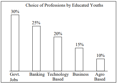
9.Look at the graph below. It shows the choice of professions by educated youths in Bangladesh. Now, describe the graph in about 150 words. You should highlight and summarize the information given in the graph: question image

Look at the graph below. It shows the choice of professions by educated youths in Bangladesh. Now, describe the graph in about 150 words. You should highlight and summarize the information given in the graph: question image

উত্তর ও ব্যাখ্যা দেখতে ফ্রি রেজিস্ট্রেশন করো

ফ্রি শুরু করো

10.The pie chart below shows the percentage of books in a school library. Describe the chart in your own words. You should highlight and summarize the information given in the chart. question image

The pie chart below shows the percentage of books in a school library. Describe the chart in your own words. You should highlight and summarize the information given in the chart. question image

উত্তর ও ব্যাখ্যা দেখতে ফ্রি রেজিস্ট্রেশন করো

ফ্রি শুরু করো

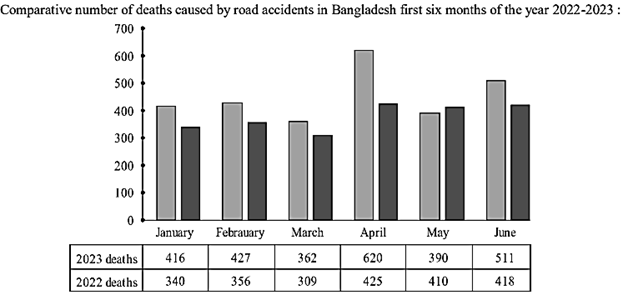
11.Look at the following graph. It shows the comparative number of deaths caused by road accidents in the first six month of the year 2022 and 2023. Now describe the graph in your own words in 150 words. You are advised →highlightandsummarizetheinformationgiveninthe\to highlight and summarize the information given in the graph. question image

Look at the following graph. It shows the comparative number of deaths caused by road accidents in the first six month of the year 2022 and 2023. Now describe the graph in your own words in 150 words. You are advised →highlightandsummarizetheinformationgiveninthe\to highlight and summarize the information given in the graph. question image

উত্তর ও ব্যাখ্যা দেখতে ফ্রি রেজিস্ট্রেশন করো

ফ্রি শুরু করো

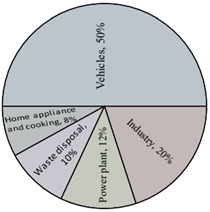
12.The pie-chart below shows the sources of air pollution in Dhaka city. Describe the chart in 150 words. You should highlight and summaries the information given in the chart. question image

The pie-chart below shows the sources of air pollution in Dhaka city. Describe the chart in 150 words. You should highlight and summaries the information given in the chart. question image

উত্তর ও ব্যাখ্যা দেখতে ফ্রি রেজিস্ট্রেশন করো

ফ্রি শুরু করো

আরো প্রশ্ন দেখো

আরো হাজারো প্রশ্ন + মডেল টেস্ট

ফ্রি রেজিস্ট্রেশন করো — ফেভারিট, AI টিউটর, লিডারবোর্ড ও অ্যানালিটিক্স আনলক করো।