শেয়ারFacebookWhatsApp

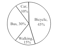
The pie chart below shows the percentage of types of transportation used by 800 students to come to college. Describe the chart in 150 words. Types of Transportation

উত্তর: The chart shows us the percentage of various types of transportations (পরিবহন) used by 800 students to come to college everyday. According to the chart, 45% of the total students avail themselves of bicycle as a transport and it is the most used transport by the students. 360 students use this transport to come to college. After that 30% of the students that means 240 students avail themselves of public bus as transport and it is the second highest used transport. 15% of the total students i.e. 120 students who live near to school, do not avail themselves of any transport to come to college. Rather they come to college on foot. It is clear that most of the students are not using personal car to come to college. Only 10% of the students that means only 80 students are using personal car to come to college and it is the lowest percentage among all other types of transport. From the analysis (বিশ্লেষণ) of the pie chart, it can be said that most of the students use bicycle to come to college. Those who use car, are the lowest in number. বাংলা অনুবাদ: চার্টটি আমাদের দেখায় যে প্রতিদিন কলেজে আসার জন্য ৮০০ জন শিক্ষার্থীর ব্যবহৃত বিভিন্ন ধরনের পরিবহনের শতকরা হার কত। চার্ট অনুযায়ী, মোট শিক্ষার্থীর ৪৫% সাইকেলকে পরিবহন হিসেবে ব্যবহার করে এবং এটি শিক্ষার্থীদের মধ্যে সর্বাধিক ব্যবহৃত পরিবহন। ৩৬০ জন শিক্ষার্থী এই পরিবহন ব্যবহার করে কলেজে আসে। এরপর ৩০% শিক্ষার্থী, অর্থাৎ ২৪০ জন শিক্ষার্থী, পরিবহন হিসেবে পাবলিক বাস ব্যবহার করে এবং এটি দ্বিতীয় সর্বোচ্চ ব্যবহৃত পরিবহন। ১৫% শিক্ষার্থী, অর্থাৎ ১২০ জন শিক্ষার্থী যারা কলেজের কাছে থাকে, তারা কোনো পরিবহন ব্যবহার না করেই হেঁটে কলেজে আসে। এটি পরিষ্কারভাবে বোঝা যায় যে, অধিকাংশ শিক্ষার্থী কলেজে আসার জন্য ব্যক্তিগত গাড়ি ব্যবহার করে না। মাত্র ১০% শিক্ষার্থী, অর্থাৎ ৮০ জন শিক্ষার্থী, ব্যক্তিগত গাড়ি ব্যবহার করে কলেজে আসে এবং এটি অন্যান্য পরিবহনের মধ্যে সর্বনিম্ন ব্যবহৃত। পাই চার্টের বিশ্লেষণ থেকে বলা যায় যে, অধিকাংশ শিক্ষার্থী কলেজে আসার জন্য সাইকেল ব্যবহার করে এবং যারা গাড়ি ব্যবহার করে, তাদের সংখ্যা সবচেয়ে কম।

HSC English 1st Paper Writing : Interpreting graph/chart CQ — Prosthuti প্রশ্নব্যাংক

HSC · English 1st Paper · Writing : Interpreting graph/chart · সৃজনশীল

The pie chart below shows the percentage of types of transportation…

ফৌজদারহাট ক্যাডেট কলেজ, চট্টগ্রাম · 2025

উত্তর
The chart shows us the percentage of various types of transportations (পরিবহন) used by 800 students to come to college everyday. According to the chart, 45% of the total students avail themselves of bicycle as a transport and it is the most used transport by the students. 360 students use this transport to come to college. After that 30% of the students that means 240 students avail themselves of public bus as transport and it is the second highest used transport. 15% of the total students i.e. 120 students who live near to school, do not avail themselves of any transport to come to college. Rather they come to college on foot. It is clear that most of the students are not using personal car to come to college. Only 10% of the students that means only 80 students are using personal car to come to college and it is the lowest percentage among all other types of transport. From the analysis (বিশ্লেষণ) of the pie chart, it can be said that most of the students use bicycle to come to college. Those who use car, are the lowest in number. বাংলা অনুবাদ: চার্টটি আমাদের দেখায় যে প্রতিদিন কলেজে আসার জন্য ৮০০ জন শিক্ষার্থীর ব্যবহৃত বিভিন্ন ধরনের পরিবহনের শতকরা হার কত। চার্ট অনুযায়ী, মোট শিক্ষার্থীর ৪৫% সাইকেলকে পরিবহন হিসেবে ব্যবহার করে এবং এটি শিক্ষার্থীদের মধ্যে সর্বাধিক ব্যবহৃত পরিবহন। ৩৬০ জন শিক্ষার্থী এই পরিবহন ব্যবহার করে কলেজে আসে। এরপর ৩০% শিক্ষার্থী, অর্থাৎ ২৪০ জন শিক্ষার্থী, পরিবহন হিসেবে পাবলিক বাস ব্যবহার করে এবং এটি দ্বিতীয় সর্বোচ্চ ব্যবহৃত পরিবহন। ১৫% শিক্ষার্থী, অর্থাৎ ১২০ জন শিক্ষার্থী যারা কলেজের কাছে থাকে, তারা কোনো পরিবহন ব্যবহার না করেই হেঁটে কলেজে আসে। এটি পরিষ্কারভাবে বোঝা যায় যে, অধিকাংশ শিক্ষার্থী কলেজে আসার জন্য ব্যক্তিগত গাড়ি ব্যবহার করে না। মাত্র ১০% শিক্ষার্থী, অর্থাৎ ৮০ জন শিক্ষার্থী, ব্যক্তিগত গাড়ি ব্যবহার করে কলেজে আসে এবং এটি অন্যান্য পরিবহনের মধ্যে সর্বনিম্ন ব্যবহৃত। পাই চার্টের বিশ্লেষণ থেকে বলা যায় যে, অধিকাংশ শিক্ষার্থী কলেজে আসার জন্য সাইকেল ব্যবহার করে এবং যারা গাড়ি ব্যবহার করে, তাদের সংখ্যা সবচেয়ে কম।
HSCEnglish 1st PaperWriting : Interpreting graph/chartফৌজদারহাট ক্যাডেট কলেজ, চট্টগ্রাম
12টি সম্পর্কিত প্রশ্ন — ব্যাখ্যা লকড

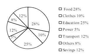
1.The pie-chart below shows the percentage of a family's household income distributed into different categories. Describe the pie-chart in 150 words:— question image

Barisal

The pie-chart below shows the percentage of a family's household income distributed into different categories. Describe the pie-chart in 150 words:— question image

উত্তর ও ব্যাখ্যা দেখতে ফ্রি রেজিস্ট্রেশন করো

ফ্রি শুরু করো

2.The pie-chart below shows the percentage of a family's household income distributed into different categories. Describe the pie-chart in 150 words:— question image

Barisal

The pie-chart below shows the percentage of a family's household income distributed into different categories. Describe the pie-chart in 150 words:— question image

উত্তর ও ব্যাখ্যা দেখতে ফ্রি রেজিস্ট্রেশন করো

ফ্রি শুরু করো

3.The pie chart below shows the percentages of transportation used by 800 students come\to come \to college. Describe the chart in 150 words. question image

Sylhet

The pie chart below shows the percentages of transportation used by 800 students come\to come \to college. Describe the chart in 150 words. question image

উত্তর ও ব্যাখ্যা দেখতে ফ্রি রেজিস্ট্রেশন করো

ফ্রি শুরু করো

4.The pie chart below shows the percentages of transportation used by 800 students come\to come \to college. Describe the chart in 150 words. question image

Sylhet

The pie chart below shows the percentages of transportation used by 800 students come\to come \to college. Describe the chart in 150 words. question image

উত্তর ও ব্যাখ্যা দেখতে ফ্রি রেজিস্ট্রেশন করো

ফ্রি শুরু করো

5.The graph chart shows the choice of profession by educated people in our country. Describe the graph in at least 150 words:—

Chittagong

The graph chart shows the choice of profession by educated people in our country. Describe the graph in at least 150 words:—

উত্তর ও ব্যাখ্যা দেখতে ফ্রি রেজিস্ট্রেশন করো

ফ্রি শুরু করো

6.The graph chart shows the choice of profession by educated people in our country. Describe the graph in at least 150 words:—

Chittagong

The graph chart shows the choice of profession by educated people in our country. Describe the graph in at least 150 words:—

উত্তর ও ব্যাখ্যা দেখতে ফ্রি রেজিস্ট্রেশন করো

ফ্রি শুরু করো

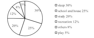
7.The pie chart below shows the time allocation of studentsdailystudents^{\prime} daily activities. Analyse the chart focussing the main preoccupations. (At least in 150 words) question image

Comilla

The pie chart below shows the time allocation of studentsdailystudents^{\prime} daily activities. Analyse the chart focussing the main preoccupations. (At least in 150 words) question image

উত্তর ও ব্যাখ্যা দেখতে ফ্রি রেজিস্ট্রেশন করো

ফ্রি শুরু করো

8.The pie chart below shows the time allocation of studentsdailystudents^{\prime} daily activities. Analyse the chart focussing the main preoccupations. (At least in 150 words) question image

Comilla

The pie chart below shows the time allocation of studentsdailystudents^{\prime} daily activities. Analyse the chart focussing the main preoccupations. (At least in 150 words) question image

উত্তর ও ব্যাখ্যা দেখতে ফ্রি রেজিস্ট্রেশন করো

ফ্রি শুরু করো

9.The graph below shows "The number of people living below the poverty line from 1995 to 2010". Describe the graph in 150 words. You should highlight and summarize the information given in the graph.

Jessore

The graph below shows "The number of people living below the poverty line from 1995 to 2010". Describe the graph in 150 words. You should highlight and summarize the information given in the graph.

উত্তর ও ব্যাখ্যা দেখতে ফ্রি রেজিস্ট্রেশন করো

ফ্রি শুরু করো

10.The graph below shows "The number of people living below the poverty line from 1995 to 2010". Describe the graph in 150 words. You should highlight and summarize the information given in the graph.

Jessore

The graph below shows "The number of people living below the poverty line from 1995 to 2010". Describe the graph in 150 words. You should highlight and summarize the information given in the graph.

উত্তর ও ব্যাখ্যা দেখতে ফ্রি রেজিস্ট্রেশন করো

ফ্রি শুরু করো

11.Look at the chart below. It shows the sources of air pollution in a city. Now, analyze the chart in at least 150 words focusing the main aspects.

Dinajpur

Look at the chart below. It shows the sources of air pollution in a city. Now, analyze the chart in at least 150 words focusing the main aspects.

উত্তর ও ব্যাখ্যা দেখতে ফ্রি রেজিস্ট্রেশন করো

ফ্রি শুরু করো

12.Look at the chart below. It shows the sources of air pollution in a city. Now, analyze the chart in at least 150 words focusing the main aspects.

Dinajpur

Look at the chart below. It shows the sources of air pollution in a city. Now, analyze the chart in at least 150 words focusing the main aspects.

উত্তর ও ব্যাখ্যা দেখতে ফ্রি রেজিস্ট্রেশন করো

ফ্রি শুরু করো

আরো প্রশ্ন দেখো

আরো হাজারো প্রশ্ন + মডেল টেস্ট

ফ্রি রেজিস্ট্রেশন করো — ফেভারিট, AI টিউটর, লিডারবোর্ড ও অ্যানালিটিক্স আনলক করো।

The pie chart below shows the percentage of types of transportation… | Prosthuti