Writing : Interpreting graph/chart English 1st Paper

HSC English 1st Paper এর Writing : Interpreting graph/chart অধ্যায়ের বোর্ড প্রশ্ন ও MCQ অনুশীলন করো।

৮৩

প্রশ্ন

English 1st Paper

বিষয়

HSC

ক্লাস

সাম্প্রতিক প্রশ্ন

HSCEnglish 1st Paperসৃজনশীল

Barisal Board · 2017

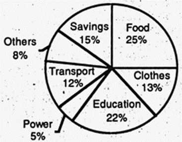
The pie-chart below shows the percentage of a family's household income distributed into different categories. Describe the pie-chart in 150 words:— question image

উত্তর

The distribution of a middle-class family's monthly income into different categories (%) The given pie chart embodies the outcome of a survey carried out on the percentages of monthly expenses of a particular middle class family in Bangladesh. The chart shows that the family spends 28% of the total monthly income on food items. The family spends 25% of the total income for education purpose. The family spends 10% and 12% on the purchase of clothes and the use of transport respectively. Likewise, the family spends 5% and 8% on the consumption of power including electricity and miscellaneous items for family use respectively. The family, after meeting all necessities, saves 12% of the total monthly income. A close study of the chart reveals that the family spends the highest amount of monthly income (28%) on food items and the lowest amount on the consumption of power. The family is an ideal one, because it allots a reasonable amount (25%) on the education of the children. Finally, the family is aware of its future prospect and so it saves a considerable amount (12%). বাংলা অনুবাদঃ প্রদত্ত পাই চার্টটি বাংলাদেশের একটি নির্দিষ্ট মধ্যবিত্ত পরিবারের মাসিক খরচের শতাংশের উপর ভিত্তি করে পরিচালিত জরিপের ফলাফল উপস্থাপন করে। চার্টে দেখা যায় যে পরিবারটি মাসিক মোট আয়ের ২৮% খাবার সামগ্রীর উপর ব্যয় করে। শিক্ষার জন্য পরিবারটি মোট আয়ের ২৫% ব্যয় করে। পোশাক কেনার জন্য ১০% এবং পরিবহনের জন্য ১২% খরচ করে। একইভাবে, বিদ্যুৎসহ বিদ্যুতের খরচের জন্য ৫% এবং পরিবারের অন্যান্য প্রয়োজনীয় সামগ্রীর জন্য ৮% ব্যয় করে। প্রয়োজনীয় সকল খরচ মেটানোর পর, পরিবারটি মাসিক মোট আয়ের ১২% সঞ্চয় করে। চার্টটি ঘনিষ্ঠভাবে বিশ্লেষণ করলে দেখা যায় যে পরিবারটি মাসিক আয়ের সর্বাধিক অংশ (২৮%) খাবার সামগ্রীর জন্য ব্যয় করে এবং সর্বনিম্ন অংশ বিদ্যুতের জন্য ব্যয় করে। পরিবারটি একটি আদর্শ পরিবার, কারণ এটি শিশুদের শিক্ষার জন্য যুক্তিসঙ্গত পরিমাণ (২৫%) বরাদ্দ করে। সর্বশেষে, পরিবারটি ভবিষ্যৎ পরিকল্পনা সম্পর্কে সচেতন এবং তাই এটি উল্লেখযোগ্য পরিমাণ (১২%) সঞ্চয় করে।

সম্পূর্ণ প্রশ্ন দেখো

HSCEnglish 1st Paperসৃজনশীল

Sylhet Board · 2017

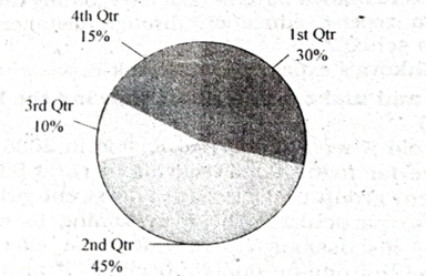
The pie chart below shows the percentages of transportation used by 800 students come\to come \to college. Describe the chart in 150 words. question image

উত্তর

Type of transportation used by 800 students to come to college (in %) The chart shows us the percentage of various types of transportations used by 800 students to come to college every day. According to the chart, 45% of the total students avail themselves of bicycles as a transport and it is the most used transports by the students. 360 students use the transport to come to college. After that 30% of the students that means 240 students avail themselves of public buses as transport and it is the second highest used transports. 15% of the total students f.e. 120 students who live near to school, do not avail themselves of any transport to come to college. Rather they come to college on foot. It is clear that most of the students cannot afford to use personal car to come to college. Only 10% of the students that means only 80 students are using personal car to come to college and it is the lowest percentage among all other types of transports. In fact, students use various types of transportations according to their advantages, distance between their home and college, economic ability or status, etc. বাংলা অনুবাদঃ চার্টটি প্রতিদিন কলেজে আসার জন্য ৮০০ শিক্ষার্থীর ব্যবহৃত বিভিন্ন ধরণের পরিবহনের শতকরা হার দেখায়। চার্ট অনুযায়ী, মোট শিক্ষার্থীদের ৪৫% সাইকেলকে পরিবহন হিসেবে ব্যবহার করে, যা শিক্ষার্থীদের মধ্যে সবচেয়ে বেশি ব্যবহৃত পরিবহন। ৩৬০ জন শিক্ষার্থী এই পরিবহন ব্যবহার করে কলেজে আসে। এরপর ৩০% শিক্ষার্থী, অর্থাৎ ২৪০ জন শিক্ষার্থী, পাবলিক বাস ব্যবহার করে, যা দ্বিতীয় সর্বোচ্চ ব্যবহৃত পরিবহন। মোট শিক্ষার্থীদের ১৫%, অর্থাৎ ১২০ জন শিক্ষার্থী, যারা স্কুলের কাছাকাছি বাস করে, তারা কোনো পরিবহন ব্যবহার করে না। বরং তারা পায়ে হেঁটে কলেজে আসে। এটি স্পষ্ট যে বেশিরভাগ শিক্ষার্থী ব্যক্তিগত গাড়ি ব্যবহার করার সামর্থ্য রাখে না। মাত্র ১০% শিক্ষার্থী, অর্থাৎ মাত্র ৮০ জন, ব্যক্তিগত গাড়ি ব্যবহার করে কলেজে আসে, যা অন্যান্য সকল পরিবহনের মধ্যে সর্বনিম্ন। আসলে, শিক্ষার্থীরা তাদের সুবিধা, বাড়ি এবং কলেজের মধ্যকার দূরত্ব, আর্থিক সামর্থ্য বা সামাজিক অবস্থার উপর ভিত্তি করে বিভিন্ন ধরনের পরিবহন ব্যবহার করে।

সম্পূর্ণ প্রশ্ন দেখো

HSCEnglish 1st Paperসৃজনশীল

Chittagong Board · 2017

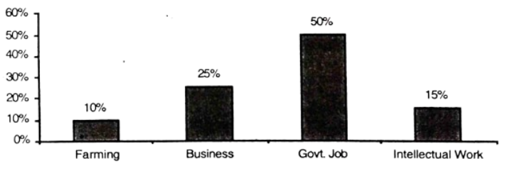
The graph chart shows the choice of profession by educated people in our country. Describe the graph in at least 150 words:—

উত্তর

The choice of profession by educated people in recent ×(\times (%) The graph chart shows the choice of profession by different educated people in recent ×.Sixcategoriesofjobsarementionedinthe\times. Six categories of jobs are mentioned in the graph- these are farming, business, govt job, research work, banking and teaching. In the graph, we see that govt job has occupied the first position, 60% of the educated people prefer govt job as their profession. In the field of the educated people's choice of their profession. banking has occupied the second position. 40% of educated people select banking as their profession. Teaching is in the third position. The percentage of the people who choose teaching as their profession is 30%. After teaching, comes the turn of business which occupies the fourth position engaging 20% of the total educated people. Undoubtedly, farming is also called the key to our national progress. But unfortunately, only 10% of the educated people are engaged in this sector. If the educated people are interested in farming, it can be said without hesitation that they will succeed. Our country will also go forward with their success. At last comes the research work, which engages only 5% of the total educated people. It is not possible to give such guarantee that every educated person will get government job. So, to summarize the graph, we want to say with an emphasis that it is high time some of the educated people made up their mind to select farming and business as their profession. বাংলা অনুবাদঃ গ্রাফ চার্টটি সাম্প্রতিক সময়ে বিভিন্ন শিক্ষিত মানুষের পেশা নির্বাচনের প্রবণতা প্রদর্শন করে। গ্রাফে ছয়টি পেশার কথা উল্লেখ করা হয়েছে—এই পেশাগুলো হলো কৃষিকাজ, ব্যবসা, সরকারি চাকরি, গবেষণা কাজ, ব্যাংকিং এবং শিক্ষকতা। গ্রাফে দেখা যায়, সরকারি চাকরি প্রথম অবস্থান দখল করেছে। ৬০% শিক্ষিত মানুষ পেশা হিসেবে সরকারি চাকরিকে পছন্দ করে। শিক্ষিত মানুষের পেশা নির্বাচনের ক্ষেত্রে ব্যাংকিং দ্বিতীয় স্থানে রয়েছে। ৪০% শিক্ষিত মানুষ ব্যাংকিংকে তাদের পেশা হিসেবে বেছে নেয়। তৃতীয় স্থানে রয়েছে শিক্ষকতা। যারা শিক্ষকতাকে তাদের পেশা হিসেবে বেছে নেয় তাদের হার ৩০%। শিক্ষকতার পরে চতুর্থ স্থানে রয়েছে ব্যবসা, যা মোট শিক্ষিত মানুষের ২০% কে নিয়োজিত করে। নিঃসন্দেহে কৃষিকাজ আমাদের জাতীয় অগ্রগতির চাবিকাঠি হিসেবে বিবেচিত হয়। কিন্তু দুর্ভাগ্যবশত, মাত্র ১০% শিক্ষিত মানুষ এই ক্ষেত্রে নিয়োজিত। যদি শিক্ষিত মানুষ কৃষিকাজে আগ্রহী হয়, তবে নিশ্চিতভাবে বলা যায় যে তারা সফল হবে। তাদের সাফল্যের সাথে আমাদের দেশও অগ্রসর হবে। সর্বশেষে রয়েছে গবেষণা কাজ, যা মোট শিক্ষিত মানুষের মাত্র ৫% কে নিয়োজিত করে। তবে, এমন কোনো নিশ্চয়তা দেওয়া সম্ভব নয় যে প্রতিটি শিক্ষিত মানুষ সরকারি চাকরি পাবে। সুতরাং, গ্রাফটি সংক্ষেপে বলতে গেলে, আমরা জোর দিয়ে বলতে চাই যে এখনই সময় কিছু শিক্ষিত মানুষ কৃষিকাজ এবং ব্যবসাকে তাদের পেশা হিসেবে বেছে নেওয়ার সিদ্ধান্ত নেবে।

সম্পূর্ণ প্রশ্ন দেখো

HSCEnglish 1st Paperসৃজনশীল

Comilla Board · 2017

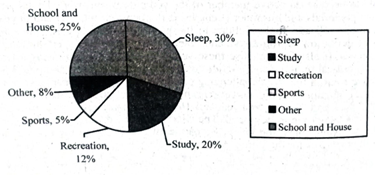
The pie chart below shows the time allocation of studentsdailystudents^{\prime} daily activities. Analyse the chart focussing the main preoccupations. (At least in 150 words) question image

উত্তর

The time allocation of
studentsdailyactivitiesThegivenpiechartperfectlydescribesthetimeallocationofstudentsdailystudents^{\prime} daily activities The given pie chart perfectly describes the time allocation of students^{\prime} daily
activities. beagoodstudentandleadahealthy\to be a good student and \to lead a healthy life, one should maintain a routine. Study, play, recreation, school and home, sleep, etc. are the parts of a student's daily activities. As per the information contained in the pie chart, we find that a student needs spend25\to spend 25% time of a day at school and home. It shows that a student should spend 20% time of a day in his/her study. A student needs spendrecreationaltimewhichisnotmorethan12\to spend recreational time which is not more than 12% of the total time of a day. keep\to keep fit, a student needs physical exercise. Sport is one of them. In the afternoon, a student should play for some time which is helpful makethebodystrongandhealthyand5\to make the body strong and healthy and 5% time of a day is better for the allotment of game and sports. A student should spend 8% of the time of a day in doing other activities: From dawn \to dusk, a student is busy with his/her study, work, etc. A sound sleep is necessary for every human being. getridoffatigueand\to get rid of fatigue and tension, sleeping is the best medicine. So, sleep30\to sleep 30% of the total time of a day seems be\to be optimum. However, if students maintain the above time allocation, they must attain success in life. বাংলা অনুবাদঃ প্রদত্ত পাই চার্টটি শিক্ষার্থীদের দৈনন্দিন কার্যক্রমের সময় বণ্টনকে নিখুঁতভাবে বর্ণনা করে। একজন ভালো শিক্ষার্থী হতে এবং সুস্থ জীবনযাপন করতে, একজন শিক্ষার্থীর রুটিন মেনে চলা প্রয়োজন। পড়াশোনা, খেলাধুলা, বিনোদন, স্কুল এবং বাড়ি, ঘুম ইত্যাদি শিক্ষার্থীদের দৈনন্দিন কার্যক্রমের অংশ। পাই চার্টের তথ্য অনুযায়ী, দেখা যায় একজন শিক্ষার্থীকে তার দিনের ২৫% সময় স্কুল এবং বাড়িতে ব্যয় করতে হয়। চার্ট থেকে বোঝা যায় যে একজন শিক্ষার্থীর পড়াশোনায় দিনের ২০% সময় ব্যয় করা উচিত। একজন শিক্ষার্থীর বিনোদনের জন্য সময় প্রয়োজন, যা দিনের মোট সময়ের ১২%-এর বেশি নয়। শারীরিকভাবে সুস্থ থাকতে শিক্ষার্থীর শারীরিক ব্যায়ামের প্রয়োজন। খেলাধুলা এর একটি গুরুত্বপূর্ণ অংশ। বিকেলে শিক্ষার্থীর কিছু সময় খেলাধুলায় ব্যয় করা উচিত, যা শরীরকে মজবুত এবং স্বাস্থ্যকর করতে সাহায্য করে। এ জন্য দিনের ৫% সময় খেলাধুলার জন্য বরাদ্দ করা উত্তম। একজন শিক্ষার্থীকে তার দিনের ৮% সময় অন্যান্য কাজে ব্যয় করা উচিত। ভোর থেকে সন্ধ্যা পর্যন্ত একজন শিক্ষার্থী তার পড়াশোনা এবং অন্যান্য কাজ নিয়ে ব্যস্ত থাকে। প্রতিটি মানুষের জন্য একটি সুষ্ঠু ঘুম অত্যন্ত প্রয়োজনীয়। ক্লান্তি এবং মানসিক চাপ দূর করতে ঘুম হলো সেরা ওষুধ। তাই দিনের মোট সময়ের ৩০% ঘুমানোর জন্য বরাদ্দ করা যথাযথ। তবে, যদি শিক্ষার্থীরা উপরের সময় বণ্টন অনুসরণ করে, তবে তারা জীবনে অবশ্যই সাফল্য অর্জন করবে।

সম্পূর্ণ প্রশ্ন দেখো

HSCEnglish 1st Paperসৃজনশীল

Jessore Board · 2017

The graph below shows "The number of people living below the poverty line from 1995 to 2010". Describe the graph in 150 words. You should highlight and summarize the information given in the graph.

উত্তর

The number of people living below the poverty line from 1995
2010Thesurveyhasbeencarriedoutonthenumberofpeoplelivingbelowthepovertylinecoveringaperiodof16yearsfrom19952010.Inthe\to 2010 The survey has been carried out on the number of people living below the poverty line covering a period of 16 years from 1995 \to 2010. In the
graph; we notice 36% of the people were living below the poverty line in 1995. The situation kept on deteriorating until 2004, when the percentage rose 44\to 44%. But the situation went on improving later on and the percentage of people living below the poverty line came down 32.5\to 32.5% in 2008 and 28.5% in 2010 indicating a positive picture of the country's economy. A careful evaluation of the graph indicates. an alarming situation from 1995 2004,whenthepictureofpovertywasreally\to 2004, when the picture of poverty was really dreadful. But afterwards, the situation improved and the poverty level came down. It means that the overall economic condition of the country was improving though the. picture was discouraging at the
\begin{ning}.
বাংলা অনুবাদঃ জরিপটি ১৯৯৫ থেকে ২০১০ সালের মধ্যে ১৬ বছরের সময়কালে দারিদ্র্যসীমার নিচে বসবাসকারী মানুষের সংখ্যা নিয়ে পরিচালিত হয়েছে। গ্রাফে দেখা যায়, ১৯৯৫ সালে ৩৬% মানুষ দারিদ্র্যসীমার নিচে বাস করত। ২০০৪ সাল পর্যন্ত পরিস্থিতি আরও খারাপ হতে থাকে, যখন এই হার বেড়ে ৪৪%-এ পৌঁছায়। তবে পরবর্তী সময়ে পরিস্থিতির উন্নতি ঘটে এবং ২০০৮ সালে দারিদ্র্যসীমার নিচে বসবাসকারী মানুষের হার ৩২.৫%-এ এবং ২০১০ সালে ২৮.৫%-এ নেমে আসে, যা দেশের অর্থনীতির একটি ইতিবাচক চিত্র নির্দেশ করে। গ্রাফটির একটি গভীর মূল্যায়ন করলে বোঝা যায় যে ১৯৯৫ থেকে ২০০৪ সাল পর্যন্ত সময়ে দারিদ্র্যের চিত্র অত্যন্ত ভয়াবহ ছিল। তবে পরবর্তী সময়ে পরিস্থিতি উন্নত হয় এবং দারিদ্র্যের হার কমে যায়। এটি ইঙ্গিত করে যে দেশের সামগ্রিক অর্থনৈতিক অবস্থার উন্নতি ঘটছিল, যদিও শুরুর দিকে চিত্রটি হতাশাজনক ছিল।

সম্পূর্ণ প্রশ্ন দেখো

HSCEnglish 1st Paperসৃজনশীল

Dinajpur Board · 2017

Look at the chart below. It shows the sources of air pollution in a city. Now, analyze the chart in at least 150 words focusing the main aspects.

উত্তর

The sources of air pollution in a city The given pie chart nicely shows the sources of air pollution in a certain city. We all know that air is polluted mainly by smoke. Smoke emitted from vehicles contributes most in this field. 60% of the total pollution is caused by vehicles. Factories hold the second position, contributing 15% of pollution. Next comes the turn of domestic activities including cooking, having their contribution of 10%. Brick-field is also a major factor in polluting air, contributing 8%. Finally, railway engines and powerhouses have some contribution as well, though their role is not so significant. A careful study of the chart provides us with the various elements having their contribution in polluting air. Vehicles are found to be the major contributor and powerhouse is discovered as the minor one. Effective steps should be taken to make the city healthy by minimizing the amount of pollution. Industrial parks need to be created, for all factories to be shifted there. A concerted effort is necessary to make sure that the city is free from air pollution. বাংলা অনুবাদঃ প্রদত্ত পাই চার্টটি একটি নির্দিষ্ট শহরে বায়ু দূষণের উৎসগুলো সুন্দরভাবে প্রদর্শন করে। আমরা সকলেই জানি যে বায়ু প্রধানত ধোঁয়ার কারণে দূষিত হয়। যানবাহন থেকে নির্গত ধোঁয়া এই ক্ষেত্রে সবচেয়ে বেশি ভূমিকা রাখে। মোট দূষণের ৬০% যানবাহনের কারণে ঘটে। ১৫% দূষণের জন্য দায়ী কারখানাগুলো দ্বিতীয় অবস্থানে রয়েছে। এরপর আসে গৃহস্থালির কার্যক্রম, যার মধ্যে রান্না অন্যতম, যা ১০% দূষণে ভূমিকা রাখে। ইটভাটাও একটি বড় কারণ, যা ৮% বায়ু দূষণে অবদান রাখে। অবশেষে, রেল ইঞ্জিন এবং পাওয়ারহাউসেরও কিছুটা ভূমিকা রয়েছে, যদিও তাদের ভূমিকা ততটা উল্লেখযোগ্য নয়। চার্টটি সতর্কতার সাথে বিশ্লেষণ করলে দেখা যায় যে বিভিন্ন উপাদান বায়ু দূষণে ভূমিকা রাখছে। যানবাহন সবচেয়ে বড় দূষণকারী এবং পাওয়ারহাউস সবচেয়ে ছোট ভূমিকা পালনকারী হিসেবে চিহ্নিত হয়। দূষণের পরিমাণ কমিয়ে শহরটিকে সুস্থ রাখার জন্য কার্যকর পদক্ষেপ গ্রহণ করা উচিত। সমস্ত কারখানাকে স্থানান্তর করার জন্য শিল্পাঞ্চল গড়ে তোলার প্রয়োজন। শহরকে বায়ু দূষণ থেকে মুক্ত রাখতে সম্মিলিত প্রচেষ্টা অপরিহার্য।

সম্পূর্ণ প্রশ্ন দেখো

HSCEnglish 1st Paperসৃজনশীল

Rajshahi Board · 2017

The graph below shows the gradual rate of the internet users in Bangladesh. Describe the graph in at least 150 words. You should highlight the information and report the main features given in the graph. question image

উত্তর

Gradual rate of the Internet users in Bangladesh from 2000-2012 (in crore) A survey was conducted recently on the number of Internet users. The survey period ranges from 2000 to 2012. The given graph depicts the result of the survey. The survey during these 13 years. shows that the number of Internet users is rising gradually and steadily. In 2000, the first year of the survey period, we find that 0.31 crore people used the Internet and in 2002, it rose to 1.50 crore in number. This number is almost 5 ×morethanthatof2000.ThenumberofInternetusersroseto2.43crorein2003thatisalso\times more than that of 2000. The number of Internet users rose to 2.43 crore in 2003 that is also remarkable. In 2005, the number of Internet users rose to 3 crore. We notice, in the whole survey, the greatest increase in the number of Internet users between 2005 and 2007 ranging from 3.00 crore to 5.00 crore. In 2009, 5.56 crore people used the Internet and Internet users rose to 6.14 crore in 2012. The tendency of using the Internet is gradually increasing keeping pace with the demand of the modern age. বাংলা অনুবাদঃ সম্প্রতি ইন্টারনেট ব্যবহারকারীর সংখ্যা নিয়ে একটি জরিপ পরিচালিত হয়েছে। জরিপের সময়কাল ২০০০ থেকে ২০১২ পর্যন্ত। প্রদত্ত গ্রাফটি জরিপের ফলাফল প্রদর্শন করে। এই ১৩ বছরের জরিপে দেখা যায় যে ইন্টারনেট ব্যবহারকারীর সংখ্যা ধীরে ধীরে এবং ধারাবাহিকভাবে বৃদ্ধি পাচ্ছে। ২০০০ সালে, জরিপের প্রথম বছরে, দেখা যায় যে ০.৩১ কোটি মানুষ ইন্টারনেট ব্যবহার করেছিল এবং ২০০২ সালে এটি বেড়ে ১.৫০ কোটিতে পৌঁছে। এই সংখ্যা ২০০০ সালের তুলনায় প্রায় ৫ গুণ বেশি। ২০০৩ সালে ইন্টারনেট ব্যবহারকারীর সংখ্যা বেড়ে ২.৪৩ কোটিতে পৌঁছায়, যা উল্লেখযোগ্য। ২০০৫ সালে এই সংখ্যা বেড়ে ৩ কোটিতে পৌঁছে। পুরো জরিপে দেখা যায় যে ২০০৫ থেকে ২০০৭ সালের মধ্যে ইন্টারনেট ব্যবহারকারীর সংখ্যায় সবচেয়ে বড় বৃদ্ধি ঘটে, যা ৩.০০ কোটি থেকে ৫.০০ কোটিতে পৌঁছায়। ২০০৯ সালে ৫.৫৬ কোটি মানুষ ইন্টারনেট ব্যবহার করে এবং ২০১২ সালে ইন্টারনেট ব্যবহারকারীর সংখ্যা ৬.১৪ কোটিতে পৌঁছে। আধুনিক যুগের চাহিদার সাথে তাল মিলিয়ে ইন্টারনেট ব্যবহারের প্রবণতা ধীরে ধীরে বাড়ছে।

সম্পূর্ণ প্রশ্ন দেখো

HSCEnglish 1st Paperসৃজনশীল

Dhaka Board · 2017

Look at the chart. It shows the sources of U.S.A. electricity in 1980. Now, analyze the chart focusing the main aspects (At least in 150 words).

উত্তর

Sources of the USA Electricity in 1980 The pie chart shows the sources of electricity of the USA in 1980. Here we notice that in the year 1980 electricity was produced from various sources like oil, coal, natural gas, hydro-electric power and nuclear power. Of them, coal produced 46% of electricity and occupied the highest position. Then comes the use of natural gas producing 24% of electricity. 16% of electricity was produced by hydro-electric power, Oil produced 12% and finally nuclear power produced 2% of electricity. Thus, the pie chart clarifies that the highest amount of electricity. was produced by coal and the second highest amount of electricity was produced by natural gas. This shows that the country is technologically and scientifically much developed. The country is very rich in respect of natural resources especially in coal, natural gas, hydro-electric power and oil. বাংলা অনুবাদঃ পাই চার্টটি ১৯৮০ সালে যুক্তরাষ্ট্রে বিদ্যুতের উৎসগুলো প্রদর্শন করে। এখানে লক্ষ্য করা যায় যে ১৯৮০ সালে বিভিন্ন উৎস যেমন তেল, কয়লা, প্রাকৃতিক গ্যাস, জলবিদ্যুৎ এবং পারমাণবিক শক্তি থেকে বিদ্যুৎ উৎপাদিত হতো। এর মধ্যে কয়লা থেকে ৪৬% বিদ্যুৎ উৎপাদিত হয় যা সর্বোচ্চ স্থান অধিকার করে। এরপর প্রাকৃতিক গ্যাসের মাধ্যমে ২৪% বিদ্যুৎ উৎপাদিত হয়। জলবিদ্যুৎ থেকে ১৬%, তেল থেকে ১২% এবং সর্বশেষ পারমাণবিক শক্তি থেকে ২% বিদ্যুৎ উৎপাদিত হয়। এইভাবে পাই চার্টটি স্পষ্ট করে যে সবচেয়ে বেশি বিদ্যুৎ উৎপাদিত হয়েছে কয়লা থেকে এবং দ্বিতীয় সর্বোচ্চ বিদ্যুৎ উৎপাদিত হয়েছে প্রাকৃতিক গ্যাস থেকে। এটি প্রমাণ করে যে দেশটি প্রযুক্তিগত এবং বৈজ্ঞানিকভাবে অত্যন্ত উন্নত। দেশটি প্রাকৃতিক সম্পদ, বিশেষত কয়লা, প্রাকৃতিক গ্যাস, জলবিদ্যুৎ এবং তেলের ক্ষেত্রে অত্যন্ত সমৃদ্ধ।

সম্পূর্ণ প্রশ্ন দেখো

HSCEnglish 1st Paperসৃজনশীল

Rajshahi, Comilla, Chittagong, Barisal Board · 2018

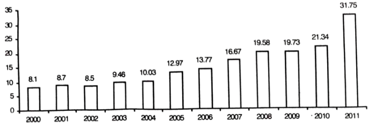
The graph below shows the literacy rate of Bangladesh from 1995 2010.Describethegraphinatleast150\to 2010. Describe the graph in at least 150 words. You should highlight the information and report the main features given in the graph :— question image

উত্তর

The literacy rate of Bangladesh from 1995 to 2010 Here the graph shows the literacy rate of Bangladesh over a period from 1995 to 2010 through vertical columns. According to the information of the graph, in 1995, the literacy rate of the country was 38.1%. In five years, it increased greatly and in 2000, the rate stood at 56%. But sadly after 2000, the rate began to decrease. As such in 2001, the rate came down to 47.9%. Sticking to this decreasing tendency, the rate stood at 43.1% in 2003. Then the rate of literacy began to rise and we see a great increase in the rate over the period between 2003 and 2010. The year 2010 shows its fiteracy rate to be 56.8. Thus, it is clear that literacy rate in Bangladesh having a fluctuating tendency sometimes increases and sometimes decreases. In fact, literacy rate is connected to some important socio-economic factors such as poverty, people's consciousness about the importance of education, government's sincere attempt and good monitoring system, etc. বাংলা অনুবাদঃ গ্রাফটি ১৯৯৫ থেকে ২০১০ সাল পর্যন্ত বাংলাদেশের সাক্ষরতার হার প্রদর্শন করে। উল্লম্ব কলামের মাধ্যমে হারটি চিত্রিত হয়েছে। গ্রাফের তথ্য অনুযায়ী, ১৯৯৫ সালে দেশের সাক্ষরতার হার ছিল ৩৮.১%। পরবর্তী পাঁচ বছরে এই হার উল্লেখযোগ্যভাবে বৃদ্ধি পেয়ে ২০০০ সালে ৫৬%-এ পৌঁছায়। কিন্তু, দুঃখজনকভাবে, ২০০০ সালের পর থেকে এই হার কমতে শুরু করে। ২০০১ সালে হার কমে ৪৭.৯%-এ এবং ২০০৩ সালে আরও কমে ৪৩.১%-এ দাঁড়ায়। এরপর সাক্ষরতার হার আবার বাড়তে শুরু করে এবং ২০০৩ থেকে ২০১০ সালের মধ্যে হার উল্লেখযোগ্যভাবে বৃদ্ধি পায়। ২০১০ সালে সাক্ষরতার হার ৫৬.৮%-এ পৌঁছে। এ থেকে স্পষ্ট হয় যে, বাংলাদেশের সাক্ষরতার হার একটি ওঠানামা প্রবণতা প্রদর্শন করে, যা কখনো বাড়ে আবার কখনো কমে। প্রকৃতপক্ষে, সাক্ষরতার হার কিছু গুরুত্বপূর্ণ সামাজিক ও অর্থনৈতিক উপাদানের সাথে সম্পর্কিত, যেমন দারিদ্র্য, শিক্ষার গুরুত্ব সম্পর্কে জনগণের সচেতনতা, সরকারের আন্তরিক প্রচেষ্টা এবং ভালো পর্যবেক্ষণ ব্যবস্থা।

সম্পূর্ণ প্রশ্ন দেখো

HSCEnglish 1st Paperসৃজনশীল

বীরশ্রেষ্ঠ নূর মোহাম্মদ পাবলিক কলেজ · 2019

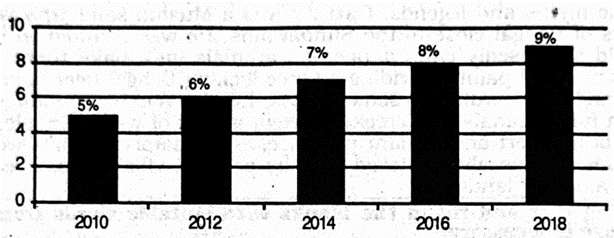
The graph shows "The economic growth rate of Bangladesh from 2010 2018\to 2018 ". Describe in 150 words. question image

উত্তর

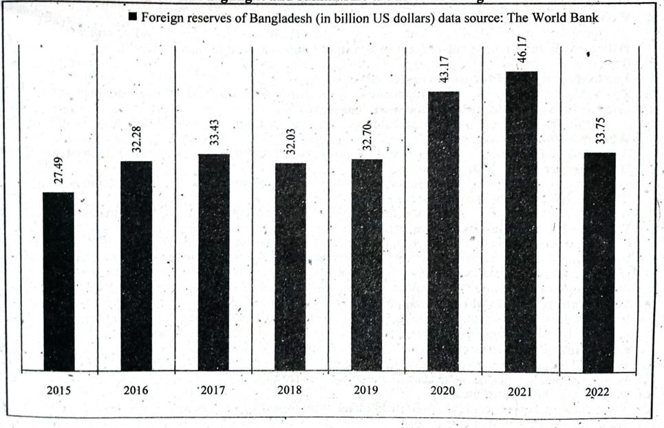
The economic growth rate of Bangladesh from 2010 to 2018 The graph shows the gradual increase of Bangladesh's economic growth rate from 2010 to 2018. In 2010 , the economic growth rate was 5% whereas in 2012 the economic growth rate was 6%. Similarly, we see that the economic growth rate in 2014 was 7%. On the other hand, in 2016 the economic growth rate of Bangladesh was 8%. In addition, the economic growth rate of Bangladesh in 2018 was 9%. It can be mentioned that the increasing rate of our economic growth is encouraging. The economic growth rate of Bangladesh in 2018 was the highest. The gradual rise of the economic growth rate of Bangladesh from 2010 to 2018 is a great achievement for Bangladesh. বাংলা অনুবাদঃ ২০১০ থেকে ২০১৮ সাল পর্যন্ত বাংলাদেশের অর্থনৈতিক প্রবৃদ্ধির হার গ্রাফে প্রদর্শিত হয়েছে, যা ধীরে ধীরে বৃদ্ধির একটি চিত্র তুলে ধরে। ২০১০ সালে অর্থনৈতিক প্রবৃদ্ধির হার ছিল ৫%, যা ২০১২ সালে বেড়ে ৬%-এ পৌঁছায়। একইভাবে, ২০১৪ সালে এই হার বেড়ে ৭%-এ উন্নীত হয়। অন্যদিকে, ২০১৬ সালে বাংলাদেশের অর্থনৈতিক প্রবৃদ্ধির হার ছিল ৮%। এর পর ২০১৮ সালে এই হার আরও বৃদ্ধি পেয়ে ৯%-এ পৌঁছায়। এটি উল্লেখ করা যেতে পারে যে আমাদের অর্থনৈতিক প্রবৃদ্ধির এই ঊর্ধ্বমুখী হার অত্যন্ত উৎসাহব্যঞ্জক। ২০১৮ সালে বাংলাদেশের অর্থনৈতিক প্রবৃদ্ধির হার ছিল সর্বোচ্চ। ২০১০ থেকে ২০১৮ সাল পর্যন্ত অর্থনৈতিক প্রবৃদ্ধির ধারাবাহিক বৃদ্ধি বাংলাদেশের জন্য একটি বড় সাফল্য।

সম্পূর্ণ প্রশ্ন দেখো

HSCEnglish 1st Paperসৃজনশীল

ঢাকা কমার্স কলেজ · 2019

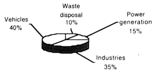
Look at the chart below. It shows the sources of air pollution in Dhaka. Now, analyze the chart in at least 80 words focusing the main aspects.

উত্তর

The sources of air pollution in Dhaka city (%) The chart shows us the percentages of the sources of air pollution in Dhaka city. The chart shows us that there are mainly four sources of air pollution in the city. The use of vehicle holds the lion's share of the sources. It is alarming that only vehicles are responsible for 40% of the total air pollution of the city. Next comes the turn of industry, which causes 35% of the total air pollution. Power generation is responsible for 15% of the total air pollution in the city. Lastly, comes waste disposal which causes 10% of air pollution. There is sensitive rumour rumour that after twenty-five years, people have to leave cities leave cities to lead their lives peacefully. The number of vehicles is increasing day by by day. A are alarmingly increasing. If the situation burdaves result dust, smoke, a etc. on is not not changed, our will be simply impossible in cities. Industries are also increasing in and around cities. To lead a healthy life, industrial zones need to be created and all industries be shifted there. Secondly, the number of industries must also be reduced. Finally, smoke emission must be controlled. বাংলা অনুবাদঃ চার্টটি ঢাকা শহরের বায়ু দূষণের উৎসগুলোর শতকরা হার তুলে ধরে। চার্টে দেখা যায় যে শহরের বায়ু দূষণের প্রধানত চারটি উৎস রয়েছে। এর মধ্যে যানবাহনের ব্যবহার সবচেয়ে বড় অংশীদার, যা মোট দূষণের ৪০%-এর জন্য দায়ী। এটি অত্যন্ত উদ্বেগজনক যে শুধুমাত্র যানবাহনের কারণেই এত বড় পরিমাণ দূষণ হচ্ছে। এরপর শিল্পকারখানার অবস্থান, যা মোট বায়ু দূষণের ৩৫% ঘটায়। বিদ্যুৎ উৎপাদন মোট দূষণের ১৫%-এর জন্য দায়ী। সর্বশেষে রয়েছে বর্জ্য নিষ্পত্তি, যা বায়ু দূষণের ১০% ঘটায়। একটি উদ্বেগজনক ধারণা রয়েছে যে পঁচিশ বছরের মধ্যে মানুষকে শান্তিপূর্ণভাবে জীবনযাপন করার জন্য শহর ছেড়ে যেতে হবে। যানবাহনের সংখ্যা প্রতিদিন বাড়ছে এবং এর ফলে ধুলো ও ধোঁয়ার পরিমাণ আশঙ্কাজনকভাবে বেড়ে চলেছে। যদি এই পরিস্থিতি নিয়ন্ত্রণে আনা না হয়, তাহলে শহরে বসবাস সম্পূর্ণ অসম্ভব হয়ে উঠবে। একই সঙ্গে, শহরের আশপাশে শিল্পকারখানার সংখ্যাও বাড়ছে। সুস্থ ও বাসযোগ্য পরিবেশ নিশ্চিত করতে শিল্পাঞ্চল তৈরি করা এবং সব শিল্পকারখানাকে সেই এলাকায় স্থানান্তর করা প্রয়োজন। পাশাপাশি, শিল্পকারখানার সংখ্যা কমানো এবং ধোঁয়া নির্গমনের কার্যকর নিয়ন্ত্রণ গ্রহণ করা অত্যন্ত জরুরি।

সম্পূর্ণ প্রশ্ন দেখো

HSCEnglish 1st Paperসৃজনশীল

আইডিয়াল স্কুল অ্যান্ড কলেজ, মতিঝিল · 2019

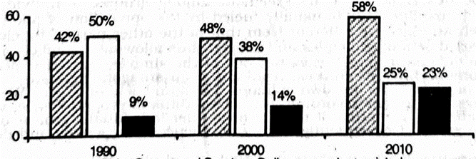
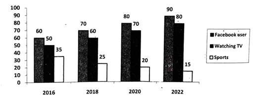
The barchart below shows the young people's changing attitude \to pastimes. Describe the cˉhartinatleast80\bar chart in at least 80 words. You should highlight and analyze the information given in the graph. question image

উত্তর

Describing graph/chart/map Young people's changing attitude to pastimes (1990-2010) With the passage of time, young people's pastime activities are also changing. Here the bar chart As we see in the chart in 1990, 42% of the young people watched TV, participated in games and sports and 9% got themselves engaged in online computer-assisted programme as their pastime activities. Affer a decade in 2000 , the number of TV viewers increased to 48% but the number of young people participating in games and sports came down to 38%. In the same year, the percentage of young people spending time on online computer-based programme rose to 14%, In 2010, the number of TV viewers increased further and stood at 58% while the percentage of participants in games and sports decreased to 25%. But the percentage of the students spending time on online programmes increased to 23%. Thus, it is clear that in compliance with th choosing their pastime activities. Actually, the facilities for fames facilities, the young people are and the students are getting inclined to indoor pastime activities. বাংলা অনুবাদঃ সময়ের সাথে সাথে তরুণদের অবসর কাটানোর কার্যকলাপেও পরিবর্তন দেখা যাচ্ছে। বার চার্ট থেকে দেখা যায়, ১৯৯০ সালে ৪২% তরুণ টিভি দেখত, ৪৯% তরুণ খেলা এবং ক্রীড়া কার্যক্রমে অংশগ্রহণ করত এবং ৯% তরুণ অনলাইন কম্পিউটার-ভিত্তিক প্রোগ্রামে জড়িত ছিল। এক দশক পরে, ২০০০ সালে, টিভি দর্শকের সংখ্যা বেড়ে ৪৮%-এ পৌঁছায়, কিন্তু খেলা এবং ক্রীড়ায় অংশগ্রহণকারী তরুণদের সংখ্যা কমে ৩৮%-এ দাঁড়ায়। একই বছরে, অনলাইন কম্পিউটার-ভিত্তিক প্রোগ্রামে সময় ব্যয়কারী তরুণদের হার বেড়ে ১৪%-এ পৌঁছায়। ২০১০ সালে, টিভি দর্শকের সংখ্যা আরও বৃদ্ধি পেয়ে ৫৮%-এ পৌঁছে, কিন্তু খেলা এবং ক্রীড়ায় অংশগ্রহণকারী তরুণদের হার কমে ২৫%-এ দাঁড়ায়। একই সময়ে, অনলাইন প্রোগ্রামে সময় ব্যয়কারী শিক্ষার্থীদের হার বেড়ে ২৩%-এ পৌঁছায়। এটি স্পষ্ট যে তরুণরা তাদের অবসর কাটানোর কার্যকলাপে পরিবর্তন করছে, এবং আধুনিক সুযোগ-সুবিধার সাথে তারা ইনডোর কার্যকলাপের প্রতি বেশি আকৃষ্ট হচ্ছে। খেলা এবং ক্রীড়ার সুযোগ কমে যাওয়ার কারণে তরুণরা টিভি দেখা এবং অনলাইন কার্যক্রমের প্রতি বেশি ঝুঁকছে।

সম্পূর্ণ প্রশ্ন দেখো