শেয়ারFacebookWhatsApp

The chart below shows the top ten countries with the highest spending on travel in 2014. Describe the chart within 150 words. You should highlight and summarize the information given in the chart.

উত্তর: The top ten countries with the travel spending in 2014 The graph highlights the top ten countries of the world with the highest travel spending in 2014. China leads by a wide margin, spending over 110 billion USD, followed by the United States and Germany which spent around 90 billion USD each and both of them rank the second. The United Kingdom and Singapore occupy the third and fourth positions respectively spending between 55 and 25 billion USD. South Korea and Hong Kong rank fifth position/place that is the same position with the expenditure of 20 billion USD each. India gets the sixth place spending just 15 billion USD. Malaysia spends slightly over 10 billion USD while Taiwan concludes the list spending only 10 billion USD. China's travel spending was noticeably higher than all other countries, reflecting its dominant position in the global travel market. Overall, the graph reveals that both Western, and Asian nations played significant roles in global. travel spending, emphasizing their contributions to the tourism industry in 2014. বাংলা অনুবাদ: গ্রাফটি ২০১৪ সালে বিশ্বের শীর্ষ দশটি দেশের ভ্রমণ ব্যয়ের পরিমাণ তুলে ধরে। চীন ব্যাপক ব্যবধানে শীর্ষে থেকে ১১০ বিলিয়নেরও বেশি মার্কিন ডলার খরচ করেছে। এরপর যুক্তরাষ্ট্র এবং জার্মানি দুই দেশ প্রায় ৯০ বিলিয়ন ডলার করে ব্যয় করেছে এবং তারা উভয়ই দ্বিতীয় স্থান অধিকার করেছে। যুক্তরাজ্য এবং সিঙ্গাপুর যথাক্রমে তৃতীয় ও চতুর্থ অবস্থানে রয়েছে, যারা ৫৫ থেকে ২৫ বিলিয়ন ডলারের মধ্যে ব্যয় করেছে। দক্ষিণ কোরিয়া ও হংকং পঞ্চম স্থানে রয়েছে, যেখানে উভয় দেশের ভ্রমণ ব্যয় ছিল ২০ বিলিয়ন ডলার। ভারত ষষ্ঠ স্থানে রয়েছে, যার ব্যয় মাত্র ১৫ বিলিয়ন ডলার। মালয়েশিয়া কিছুটা বেশি, প্রায় ১০ বিলিয়ন ডলার খরচ করেছে, আর তাইওয়ান ১০ বিলিয়ন ডলার ব্যয়ে তালিকার শেষ স্থানে রয়েছে। চীনের ভ্রমণ ব্যয় অন্যান্য দেশের তুলনায় স্পষ্টভাবে বেশি, যা বিশ্বব্যাপী ভ্রমণ বাজারে তার প্রাধান্য প্রতিফলিত করে। সার্বিকভাবে, গ্রাফটি প্রকাশ করছে যে পশ্চিমা এবং এশীয় দেশগুলো ২০১৪ সালে বিশ্বব্যাপী ভ্রমণ ব্যয়ে গুরুত্বপূর্ণ ভূমিকা পালন করেছে, যা পর্যটন শিল্পে তাদের অবদানকে তুলে ধরে।

HSC English 1st Paper Writing : Interpreting graph/chart CQ — Prosthuti প্রশ্নব্যাংক

HSC · English 1st Paper · Writing : Interpreting graph/chart · সৃজনশীল

The chart below shows the top ten countries with the highest spendi…

নটরডেম কলেজ · 2025

উত্তর
The top ten countries with the travel spending in 2014 The graph highlights the top ten countries of the world with the highest travel spending in 2014. China leads by a wide margin, spending over 110 billion USD, followed by the United States and Germany which spent around 90 billion USD each and both of them rank the second. The United Kingdom and Singapore occupy the third and fourth positions respectively spending between 55 and 25 billion USD. South Korea and Hong Kong rank fifth position/place that is the same position with the expenditure of 20 billion USD each. India gets the sixth place spending just 15 billion USD. Malaysia spends slightly over 10 billion USD while Taiwan concludes the list spending only 10 billion USD. China's travel spending was noticeably higher than all other countries, reflecting its dominant position in the global travel market. Overall, the graph reveals that both Western, and Asian nations played significant roles in global. travel spending, emphasizing their contributions to the tourism industry in 2014. বাংলা অনুবাদ: গ্রাফটি ২০১৪ সালে বিশ্বের শীর্ষ দশটি দেশের ভ্রমণ ব্যয়ের পরিমাণ তুলে ধরে। চীন ব্যাপক ব্যবধানে শীর্ষে থেকে ১১০ বিলিয়নেরও বেশি মার্কিন ডলার খরচ করেছে। এরপর যুক্তরাষ্ট্র এবং জার্মানি দুই দেশ প্রায় ৯০ বিলিয়ন ডলার করে ব্যয় করেছে এবং তারা উভয়ই দ্বিতীয় স্থান অধিকার করেছে। যুক্তরাজ্য এবং সিঙ্গাপুর যথাক্রমে তৃতীয় ও চতুর্থ অবস্থানে রয়েছে, যারা ৫৫ থেকে ২৫ বিলিয়ন ডলারের মধ্যে ব্যয় করেছে। দক্ষিণ কোরিয়া ও হংকং পঞ্চম স্থানে রয়েছে, যেখানে উভয় দেশের ভ্রমণ ব্যয় ছিল ২০ বিলিয়ন ডলার। ভারত ষষ্ঠ স্থানে রয়েছে, যার ব্যয় মাত্র ১৫ বিলিয়ন ডলার। মালয়েশিয়া কিছুটা বেশি, প্রায় ১০ বিলিয়ন ডলার খরচ করেছে, আর তাইওয়ান ১০ বিলিয়ন ডলার ব্যয়ে তালিকার শেষ স্থানে রয়েছে। চীনের ভ্রমণ ব্যয় অন্যান্য দেশের তুলনায় স্পষ্টভাবে বেশি, যা বিশ্বব্যাপী ভ্রমণ বাজারে তার প্রাধান্য প্রতিফলিত করে। সার্বিকভাবে, গ্রাফটি প্রকাশ করছে যে পশ্চিমা এবং এশীয় দেশগুলো ২০১৪ সালে বিশ্বব্যাপী ভ্রমণ ব্যয়ে গুরুত্বপূর্ণ ভূমিকা পালন করেছে, যা পর্যটন শিল্পে তাদের অবদানকে তুলে ধরে।
HSCEnglish 1st PaperWriting : Interpreting graph/chartনটরডেম কলেজ
12টি সম্পর্কিত প্রশ্ন — ব্যাখ্যা লকড

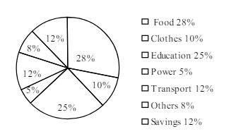
1.The pie-chart below shows the percentage of a family's household income distributed into different categories. Describe the pie-chart in 150 words:— question image

Barisal

The pie-chart below shows the percentage of a family's household income distributed into different categories. Describe the pie-chart in 150 words:— question image

উত্তর ও ব্যাখ্যা দেখতে ফ্রি রেজিস্ট্রেশন করো

ফ্রি শুরু করো

2.The pie-chart below shows the percentage of a family's household income distributed into different categories. Describe the pie-chart in 150 words:— question image

Barisal

The pie-chart below shows the percentage of a family's household income distributed into different categories. Describe the pie-chart in 150 words:— question image

উত্তর ও ব্যাখ্যা দেখতে ফ্রি রেজিস্ট্রেশন করো

ফ্রি শুরু করো

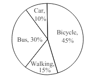
3.The pie chart below shows the percentages of transportation used by 800 students come\to come \to college. Describe the chart in 150 words. question image

Sylhet

The pie chart below shows the percentages of transportation used by 800 students come\to come \to college. Describe the chart in 150 words. question image

উত্তর ও ব্যাখ্যা দেখতে ফ্রি রেজিস্ট্রেশন করো

ফ্রি শুরু করো

4.The pie chart below shows the percentages of transportation used by 800 students come\to come \to college. Describe the chart in 150 words. question image

Sylhet

The pie chart below shows the percentages of transportation used by 800 students come\to come \to college. Describe the chart in 150 words. question image

উত্তর ও ব্যাখ্যা দেখতে ফ্রি রেজিস্ট্রেশন করো

ফ্রি শুরু করো

5.The graph chart shows the choice of profession by educated people in our country. Describe the graph in at least 150 words:—

Chittagong

The graph chart shows the choice of profession by educated people in our country. Describe the graph in at least 150 words:—

উত্তর ও ব্যাখ্যা দেখতে ফ্রি রেজিস্ট্রেশন করো

ফ্রি শুরু করো

6.The graph chart shows the choice of profession by educated people in our country. Describe the graph in at least 150 words:—

Chittagong

The graph chart shows the choice of profession by educated people in our country. Describe the graph in at least 150 words:—

উত্তর ও ব্যাখ্যা দেখতে ফ্রি রেজিস্ট্রেশন করো

ফ্রি শুরু করো

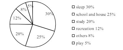
7.The pie chart below shows the time allocation of studentsdailystudents^{\prime} daily activities. Analyse the chart focussing the main preoccupations. (At least in 150 words) question image

Comilla

The pie chart below shows the time allocation of studentsdailystudents^{\prime} daily activities. Analyse the chart focussing the main preoccupations. (At least in 150 words) question image

উত্তর ও ব্যাখ্যা দেখতে ফ্রি রেজিস্ট্রেশন করো

ফ্রি শুরু করো

8.The pie chart below shows the time allocation of studentsdailystudents^{\prime} daily activities. Analyse the chart focussing the main preoccupations. (At least in 150 words) question image

Comilla

The pie chart below shows the time allocation of studentsdailystudents^{\prime} daily activities. Analyse the chart focussing the main preoccupations. (At least in 150 words) question image

উত্তর ও ব্যাখ্যা দেখতে ফ্রি রেজিস্ট্রেশন করো

ফ্রি শুরু করো

9.The graph below shows "The number of people living below the poverty line from 1995 to 2010". Describe the graph in 150 words. You should highlight and summarize the information given in the graph.

Jessore

The graph below shows "The number of people living below the poverty line from 1995 to 2010". Describe the graph in 150 words. You should highlight and summarize the information given in the graph.

উত্তর ও ব্যাখ্যা দেখতে ফ্রি রেজিস্ট্রেশন করো

ফ্রি শুরু করো

10.The graph below shows "The number of people living below the poverty line from 1995 to 2010". Describe the graph in 150 words. You should highlight and summarize the information given in the graph.

Jessore

The graph below shows "The number of people living below the poverty line from 1995 to 2010". Describe the graph in 150 words. You should highlight and summarize the information given in the graph.

উত্তর ও ব্যাখ্যা দেখতে ফ্রি রেজিস্ট্রেশন করো

ফ্রি শুরু করো

11.Look at the chart below. It shows the sources of air pollution in a city. Now, analyze the chart in at least 150 words focusing the main aspects.

Dinajpur

Look at the chart below. It shows the sources of air pollution in a city. Now, analyze the chart in at least 150 words focusing the main aspects.

উত্তর ও ব্যাখ্যা দেখতে ফ্রি রেজিস্ট্রেশন করো

ফ্রি শুরু করো

12.Look at the chart below. It shows the sources of air pollution in a city. Now, analyze the chart in at least 150 words focusing the main aspects.

Dinajpur

Look at the chart below. It shows the sources of air pollution in a city. Now, analyze the chart in at least 150 words focusing the main aspects.

উত্তর ও ব্যাখ্যা দেখতে ফ্রি রেজিস্ট্রেশন করো

ফ্রি শুরু করো

আরো প্রশ্ন দেখো

আরো হাজারো প্রশ্ন + মডেল টেস্ট

ফ্রি রেজিস্ট্রেশন করো — ফেভারিট, AI টিউটর, লিডারবোর্ড ও অ্যানালিটিক্স আনলক করো।

The chart below shows the top ten countries with the highest spendi… | Prosthuti