শেয়ারFacebookWhatsApp

Look at the following graph. It shows a comparative selling rate of four types of books in Ekushey Boi Mela 2016. Describe the graph in at least 80 words. You should highlight the information and report the main features given in the graph. [চিত্র]

উত্তর: Describing a graph Comparative selling rates of four types of books in Ekushey Boi Mela 2016 The graph shows the comparative selling rates of four types of books in Ekushey Boi Mela 2016. Here we see that 3000 science fictions were sold in the Ekushey Boi Mela 2016. As for novel, the number of this type of books sold in the Ekushey Boi Mela 2016 was about 4500. And it was the highest figure in the graph. Books on history sold in the mela were about 2500 in number. As for poetry, the number of the books of poetry sold in the mela was the lowest. And the number of this type of books was about 500. Thus, it is clear that people love novel most and so the sales of this sort of book topped the list. The second highest sales is noticed in science fiction. History occupied the 3rd position in selling rates while poetry occupied the last one. By analyzing the graph, it can be summed up that people's interest in different subjects of books always varies and sometimes greatly. বাংলা অনুবাদ: গ্রাফটিতে ২০১৬ সালের একুশে বই মেলায় চার ধরনের বইয়ের তুলনামূলক বিক্রির হার দেখানো হয়েছে। এখানে দেখা যাচ্ছে যে, ২০১৬ সালের একুশে বই মেলায় ৩০০০টি সায়েন্স ফিকশন বিক্রি হয়েছে। উপন্যাসের ক্ষেত্রে, এই ধরনের বইয়ের সংখ্যা ছিল প্রায় ৪৫০০, যা গ্রাফে সর্বোচ্চ। ইতিহাসভিত্তিক বইয়ের বিক্রি ছিল প্রায় ২৫০০টি। আর কবিতার বইয়ের সংখ্যা ছিল সবচেয়ে কম, যা ছিল প্রায় ৫০০টি। এতে স্পষ্ট বোঝা যায়, মানুষ উপন্যাসকে সবচেয়ে বেশি পছন্দ করে এবং তাই এই ধরনের বইয়ের বিক্রি তালিকার শীর্ষে। দ্বিতীয় সর্বোচ্চ বিক্রি হয়েছে সায়েন্স ফিকশন বইয়ের। ইতিহাসভিত্তিক বই বিক্রির দিক থেকে তৃতীয় অবস্থানে ছিল এবং কবিতার বই ছিল চতুর্থ বা শেষ অবস্থানে। গ্রাফ বিশ্লেষণ করে বলা যায় যে, মানুষ বিভিন্ন বিষয়ের বইয়ের প্রতি ভিন্ন ভিন্ন রকমের আগ্রহ দেখায় এবং অনেক সময় তা ব্যাপকভাবে পরিবর্তিত হতে পারে।

HSC English 1st Paper Writing : Interpreting graph/chart CQ — Prosthuti প্রশ্নব্যাংক

HSC · English 1st Paper · Writing : Interpreting graph/chart · সৃজনশীল

Look at the following graph. It shows a comparative selling rate of…

ভিকারুননিসা নূন স্কুল এন্ড কলেজ · 2025

উত্তর
Describing a graph Comparative selling rates of four types of books in Ekushey Boi Mela 2016 The graph shows the comparative selling rates of four types of books in Ekushey Boi Mela 2016. Here we see that 3000 science fictions were sold in the Ekushey Boi Mela 2016. As for novel, the number of this type of books sold in the Ekushey Boi Mela 2016 was about 4500. And it was the highest figure in the graph. Books on history sold in the mela were about 2500 in number. As for poetry, the number of the books of poetry sold in the mela was the lowest. And the number of this type of books was about 500. Thus, it is clear that people love novel most and so the sales of this sort of book topped the list. The second highest sales is noticed in science fiction. History occupied the 3rd position in selling rates while poetry occupied the last one. By analyzing the graph, it can be summed up that people's interest in different subjects of books always varies and sometimes greatly. বাংলা অনুবাদ: গ্রাফটিতে ২০১৬ সালের একুশে বই মেলায় চার ধরনের বইয়ের তুলনামূলক বিক্রির হার দেখানো হয়েছে। এখানে দেখা যাচ্ছে যে, ২০১৬ সালের একুশে বই মেলায় ৩০০০টি সায়েন্স ফিকশন বিক্রি হয়েছে। উপন্যাসের ক্ষেত্রে, এই ধরনের বইয়ের সংখ্যা ছিল প্রায় ৪৫০০, যা গ্রাফে সর্বোচ্চ। ইতিহাসভিত্তিক বইয়ের বিক্রি ছিল প্রায় ২৫০০টি। আর কবিতার বইয়ের সংখ্যা ছিল সবচেয়ে কম, যা ছিল প্রায় ৫০০টি। এতে স্পষ্ট বোঝা যায়, মানুষ উপন্যাসকে সবচেয়ে বেশি পছন্দ করে এবং তাই এই ধরনের বইয়ের বিক্রি তালিকার শীর্ষে। দ্বিতীয় সর্বোচ্চ বিক্রি হয়েছে সায়েন্স ফিকশন বইয়ের। ইতিহাসভিত্তিক বই বিক্রির দিক থেকে তৃতীয় অবস্থানে ছিল এবং কবিতার বই ছিল চতুর্থ বা শেষ অবস্থানে। গ্রাফ বিশ্লেষণ করে বলা যায় যে, মানুষ বিভিন্ন বিষয়ের বইয়ের প্রতি ভিন্ন ভিন্ন রকমের আগ্রহ দেখায় এবং অনেক সময় তা ব্যাপকভাবে পরিবর্তিত হতে পারে।
HSCEnglish 1st PaperWriting : Interpreting graph/chartভিকারুননিসা নূন স্কুল এন্ড কলেজ
12টি সম্পর্কিত প্রশ্ন — উত্তর ও ব্যাখ্যা লকড

1.সৃজনশীল প্রশ্ন · Barisal

Barisal Board · 2017

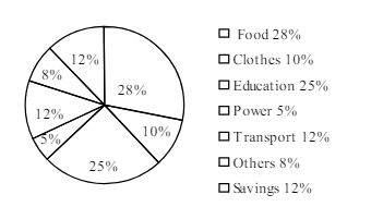
The pie-chart below shows the percentage of a family's household income distributed into different categories. Describe the pie-chart in 150 words:— question image

উত্তর ও ব্যাখ্যা দেখতে ফ্রি রেজিস্ট্রেশন করো

ফ্রি শুরু করো

2.সৃজনশীল প্রশ্ন · Barisal

Barisal Board · 2017

The pie-chart below shows the percentage of a family's household income distributed into different categories. Describe the pie-chart in 150 words:— question image

উত্তর ও ব্যাখ্যা দেখতে ফ্রি রেজিস্ট্রেশন করো

ফ্রি শুরু করো

3.সৃজনশীল প্রশ্ন · Sylhet

Sylhet Board · 2017

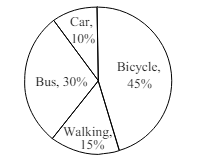
The pie chart below shows the percentages of transportation used by 800 students come\to come \to college. Describe the chart in 150 words. question image

উত্তর ও ব্যাখ্যা দেখতে ফ্রি রেজিস্ট্রেশন করো

ফ্রি শুরু করো

4.সৃজনশীল প্রশ্ন · Sylhet

Sylhet Board · 2017

The pie chart below shows the percentages of transportation used by 800 students come\to come \to college. Describe the chart in 150 words. question image

উত্তর ও ব্যাখ্যা দেখতে ফ্রি রেজিস্ট্রেশন করো

ফ্রি শুরু করো

5.সৃজনশীল প্রশ্ন · Chittagong

Chittagong Board · 2017

The graph chart shows the choice of profession by educated people in our country. Describe the graph in at least 150 words:—

উত্তর ও ব্যাখ্যা দেখতে ফ্রি রেজিস্ট্রেশন করো

ফ্রি শুরু করো

6.সৃজনশীল প্রশ্ন · Chittagong

Chittagong Board · 2017

The graph chart shows the choice of profession by educated people in our country. Describe the graph in at least 150 words:—

উত্তর ও ব্যাখ্যা দেখতে ফ্রি রেজিস্ট্রেশন করো

ফ্রি শুরু করো

7.সৃজনশীল প্রশ্ন · Comilla

Comilla Board · 2017

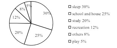
The pie chart below shows the time allocation of studentsdailystudents^{\prime} daily activities. Analyse the chart focussing the main preoccupations. (At least in 150 words) question image

উত্তর ও ব্যাখ্যা দেখতে ফ্রি রেজিস্ট্রেশন করো

ফ্রি শুরু করো

8.সৃজনশীল প্রশ্ন · Comilla

Comilla Board · 2017

The pie chart below shows the time allocation of studentsdailystudents^{\prime} daily activities. Analyse the chart focussing the main preoccupations. (At least in 150 words) question image

উত্তর ও ব্যাখ্যা দেখতে ফ্রি রেজিস্ট্রেশন করো

ফ্রি শুরু করো

9.সৃজনশীল প্রশ্ন · Jessore

Jessore Board · 2017

The graph below shows "The number of people living below the poverty line from 1995 to 2010". Describe the graph in 150 words. You should highlight and summarize the information given in the graph.

উত্তর ও ব্যাখ্যা দেখতে ফ্রি রেজিস্ট্রেশন করো

ফ্রি শুরু করো

10.সৃজনশীল প্রশ্ন · Jessore

Jessore Board · 2017

The graph below shows "The number of people living below the poverty line from 1995 to 2010". Describe the graph in 150 words. You should highlight and summarize the information given in the graph.

উত্তর ও ব্যাখ্যা দেখতে ফ্রি রেজিস্ট্রেশন করো

ফ্রি শুরু করো

11.সৃজনশীল প্রশ্ন · Dinajpur

Dinajpur Board · 2017

Look at the chart below. It shows the sources of air pollution in a city. Now, analyze the chart in at least 150 words focusing the main aspects.

উত্তর ও ব্যাখ্যা দেখতে ফ্রি রেজিস্ট্রেশন করো

ফ্রি শুরু করো

12.সৃজনশীল প্রশ্ন · Dinajpur

Dinajpur Board · 2017

Look at the chart below. It shows the sources of air pollution in a city. Now, analyze the chart in at least 150 words focusing the main aspects.

উত্তর ও ব্যাখ্যা দেখতে ফ্রি রেজিস্ট্রেশন করো

ফ্রি শুরু করো

আরো প্রশ্ন দেখো

আরো হাজারো প্রশ্ন + মডেল টেস্ট

ফ্রি রেজিস্ট্রেশন করো — ফেভারিট, AI টিউটর, লিডারবোর্ড ও অ্যানালিটিক্স আনলক করো।