শেয়ারFacebookWhatsApp

The following graph shows the GDP growth rate of Bangladesh in percentage from the fiscal year 2007 to 2016. Describe the chart in at least 150-180 words. You should highlight and summarize the information given in the graph.

উত্তর: The GDP growth rate of Bangladesh in percentage from the fiscal year 2007 to 2016 The graph shows the GDP growth rate of Bangladesh in percentage from the fiscal year 2007 to 2016. At the first glance, the chart shows a heavy fluctuation in GDP growth during the given period. According to the graph, the years 2007 and 2008 show GDP to be 6.43% and 6.19% respectively, Indicating a gradual decrease. Sadly, the decreasing tendency (প্রবণতা) assumed a serious turn in 2009 when GDP came down to 5.05%. But, the next year that is in 2010, GDP slightly rose up to 5.57%. Then in 2011, we notice a great rise and GDP in this year shows itself to be 6.46%. In the following year (2012), we see GDP to be 6.52%, indicating a little increase. A fall in GDP is again noticed in 2013 when it came down to 6.01%. In the next year 2014, GDP grew slightly and rose up to 6.06%. However, in the following two consecutive (ধারাবাহিক) years, that is in 2015 and 2016 the last two years of the survey period, GDP growth was a little bit on rise going up to 6.55% and 7.11% respectively. Thus, the graph clarifies the point that annual GDP in Bangladesh went on in the process of great rise and fall, showing an uncertain state. বাংলা অনুবাদ: ২০০৭ থেকে ২০১৬ অর্থবছরের মধ্যে বাংলাদেশের জিডিপির বার্ষিক বৃদ্ধির হার (শতকরা)গ্রাফটি ২০০৭ থেকে ২০১৬ অর্থবছরের মধ্যে বাংলাদেশের জিডিপির বৃদ্ধির হার শতকরা হিসেবে প্রদর্শন করেছে। প্রথম নজরে, এই চার্টে দেওয়া সময়কালে জিডিপিতে ব্যাপক ওঠানামা দেখা যায়।গ্রাফ অনুযায়ী, ২০০৭ ও ২০০৮ সালে জিডিপি যথাক্রমে ৬.৪৩% এবং ৬.১৯% ছিল, যা ধীরে ধীরে হ্রাসের ইঙ্গিত দেয়। দুঃখজনকভাবে, ২০০৯ সালে হ্রাসের প্রবণতা আরও তীব্র হয় এবং জিডিপি নামিয়ে আসে ৫.০৫% এ। কিন্তু পরের বছর অর্থাৎ ২০১০ সালে জিডিপি সামান্য বৃদ্ধি পেয়ে ৫.৫৭% হয়। এরপর ২০১১ সালে জিডিপিতে বড় ধরনের বৃদ্ধি লক্ষ্য করা যায়, যা হয় ৬.৪৬%। পরবর্তী বছর ২০১২-এ সামান্য বাড়তি নিয়ে জিডিপি দাঁড়ায় ৬.৫২%। আবার ২০১৩ সালে জিডিপি কিছুটা কমে ৬.০১% এ নেমে আসে। ২০১৪ সালে জিডিপি সামান্য বৃদ্ধি পেয়ে ৬.০৬% এ ওঠে। তবে পরবর্তী দুই বছর ২০১৫ ও ২০১৬-এ ধারাবাহিকভাবে জিডিপির বৃদ্ধি লক্ষ্য করা যায়, যথাক্রমে ৬.৫৫% ও ৭.১১%।অতএব, এই গ্রাফ থেকে স্পষ্ট হয় যে বাংলাদেশের বার্ষিক জিডিপি অনেক ওঠানামার মধ্যে দিয়ে গেছে, যা একটি অনিশ্চিত অবস্থা নির্দেশ করে।

HSC English 1st Paper Writing : Interpreting graph/chart CQ — Prosthuti প্রশ্নব্যাংক

HSC · English 1st Paper · Writing : Interpreting graph/chart · সৃজনশীল

The following graph shows the GDP growth rate of Bangladesh in perc…

বিএএফ শাহীন কলেজ, ঢাকা · 2025

উত্তর
The GDP growth rate of Bangladesh in percentage from the fiscal year 2007 to 2016 The graph shows the GDP growth rate of Bangladesh in percentage from the fiscal year 2007 to 2016. At the first glance, the chart shows a heavy fluctuation in GDP growth during the given period. According to the graph, the years 2007 and 2008 show GDP to be 6.43% and 6.19% respectively, Indicating a gradual decrease. Sadly, the decreasing tendency (প্রবণতা) assumed a serious turn in 2009 when GDP came down to 5.05%. But, the next year that is in 2010, GDP slightly rose up to 5.57%. Then in 2011, we notice a great rise and GDP in this year shows itself to be 6.46%. In the following year (2012), we see GDP to be 6.52%, indicating a little increase. A fall in GDP is again noticed in 2013 when it came down to 6.01%. In the next year 2014, GDP grew slightly and rose up to 6.06%. However, in the following two consecutive (ধারাবাহিক) years, that is in 2015 and 2016 the last two years of the survey period, GDP growth was a little bit on rise going up to 6.55% and 7.11% respectively. Thus, the graph clarifies the point that annual GDP in Bangladesh went on in the process of great rise and fall, showing an uncertain state. বাংলা অনুবাদ: ২০০৭ থেকে ২০১৬ অর্থবছরের মধ্যে বাংলাদেশের জিডিপির বার্ষিক বৃদ্ধির হার (শতকরা)গ্রাফটি ২০০৭ থেকে ২০১৬ অর্থবছরের মধ্যে বাংলাদেশের জিডিপির বৃদ্ধির হার শতকরা হিসেবে প্রদর্শন করেছে। প্রথম নজরে, এই চার্টে দেওয়া সময়কালে জিডিপিতে ব্যাপক ওঠানামা দেখা যায়।গ্রাফ অনুযায়ী, ২০০৭ ও ২০০৮ সালে জিডিপি যথাক্রমে ৬.৪৩% এবং ৬.১৯% ছিল, যা ধীরে ধীরে হ্রাসের ইঙ্গিত দেয়। দুঃখজনকভাবে, ২০০৯ সালে হ্রাসের প্রবণতা আরও তীব্র হয় এবং জিডিপি নামিয়ে আসে ৫.০৫% এ। কিন্তু পরের বছর অর্থাৎ ২০১০ সালে জিডিপি সামান্য বৃদ্ধি পেয়ে ৫.৫৭% হয়। এরপর ২০১১ সালে জিডিপিতে বড় ধরনের বৃদ্ধি লক্ষ্য করা যায়, যা হয় ৬.৪৬%। পরবর্তী বছর ২০১২-এ সামান্য বাড়তি নিয়ে জিডিপি দাঁড়ায় ৬.৫২%। আবার ২০১৩ সালে জিডিপি কিছুটা কমে ৬.০১% এ নেমে আসে। ২০১৪ সালে জিডিপি সামান্য বৃদ্ধি পেয়ে ৬.০৬% এ ওঠে। তবে পরবর্তী দুই বছর ২০১৫ ও ২০১৬-এ ধারাবাহিকভাবে জিডিপির বৃদ্ধি লক্ষ্য করা যায়, যথাক্রমে ৬.৫৫% ও ৭.১১%।অতএব, এই গ্রাফ থেকে স্পষ্ট হয় যে বাংলাদেশের বার্ষিক জিডিপি অনেক ওঠানামার মধ্যে দিয়ে গেছে, যা একটি অনিশ্চিত অবস্থা নির্দেশ করে।
HSCEnglish 1st PaperWriting : Interpreting graph/chartবিএএফ শাহীন কলেজ, ঢাকা
12টি সম্পর্কিত প্রশ্ন — উত্তর ও ব্যাখ্যা লকড

1.সৃজনশীল প্রশ্ন · Barisal

Barisal Board · 2017

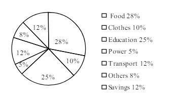
The pie-chart below shows the percentage of a family's household income distributed into different categories. Describe the pie-chart in 150 words:— question image

উত্তর ও ব্যাখ্যা দেখতে ফ্রি রেজিস্ট্রেশন করো

ফ্রি শুরু করো

2.সৃজনশীল প্রশ্ন · Barisal

Barisal Board · 2017

The pie-chart below shows the percentage of a family's household income distributed into different categories. Describe the pie-chart in 150 words:— question image

উত্তর ও ব্যাখ্যা দেখতে ফ্রি রেজিস্ট্রেশন করো

ফ্রি শুরু করো

3.সৃজনশীল প্রশ্ন · Sylhet

Sylhet Board · 2017

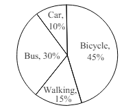
The pie chart below shows the percentages of transportation used by 800 students come\to come \to college. Describe the chart in 150 words. question image

উত্তর ও ব্যাখ্যা দেখতে ফ্রি রেজিস্ট্রেশন করো

ফ্রি শুরু করো

4.সৃজনশীল প্রশ্ন · Sylhet

Sylhet Board · 2017

The pie chart below shows the percentages of transportation used by 800 students come\to come \to college. Describe the chart in 150 words. question image

উত্তর ও ব্যাখ্যা দেখতে ফ্রি রেজিস্ট্রেশন করো

ফ্রি শুরু করো

5.সৃজনশীল প্রশ্ন · Chittagong

Chittagong Board · 2017

The graph chart shows the choice of profession by educated people in our country. Describe the graph in at least 150 words:—

উত্তর ও ব্যাখ্যা দেখতে ফ্রি রেজিস্ট্রেশন করো

ফ্রি শুরু করো

6.সৃজনশীল প্রশ্ন · Chittagong

Chittagong Board · 2017

The graph chart shows the choice of profession by educated people in our country. Describe the graph in at least 150 words:—

উত্তর ও ব্যাখ্যা দেখতে ফ্রি রেজিস্ট্রেশন করো

ফ্রি শুরু করো

7.সৃজনশীল প্রশ্ন · Comilla

Comilla Board · 2017

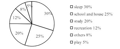
The pie chart below shows the time allocation of studentsdailystudents^{\prime} daily activities. Analyse the chart focussing the main preoccupations. (At least in 150 words) question image

উত্তর ও ব্যাখ্যা দেখতে ফ্রি রেজিস্ট্রেশন করো

ফ্রি শুরু করো

8.সৃজনশীল প্রশ্ন · Comilla

Comilla Board · 2017

The pie chart below shows the time allocation of studentsdailystudents^{\prime} daily activities. Analyse the chart focussing the main preoccupations. (At least in 150 words) question image

উত্তর ও ব্যাখ্যা দেখতে ফ্রি রেজিস্ট্রেশন করো

ফ্রি শুরু করো

9.সৃজনশীল প্রশ্ন · Jessore

Jessore Board · 2017

The graph below shows "The number of people living below the poverty line from 1995 to 2010". Describe the graph in 150 words. You should highlight and summarize the information given in the graph.

উত্তর ও ব্যাখ্যা দেখতে ফ্রি রেজিস্ট্রেশন করো

ফ্রি শুরু করো

10.সৃজনশীল প্রশ্ন · Jessore

Jessore Board · 2017

The graph below shows "The number of people living below the poverty line from 1995 to 2010". Describe the graph in 150 words. You should highlight and summarize the information given in the graph.

উত্তর ও ব্যাখ্যা দেখতে ফ্রি রেজিস্ট্রেশন করো

ফ্রি শুরু করো

11.সৃজনশীল প্রশ্ন · Dinajpur

Dinajpur Board · 2017

Look at the chart below. It shows the sources of air pollution in a city. Now, analyze the chart in at least 150 words focusing the main aspects.

উত্তর ও ব্যাখ্যা দেখতে ফ্রি রেজিস্ট্রেশন করো

ফ্রি শুরু করো

12.সৃজনশীল প্রশ্ন · Dinajpur

Dinajpur Board · 2017

Look at the chart below. It shows the sources of air pollution in a city. Now, analyze the chart in at least 150 words focusing the main aspects.

উত্তর ও ব্যাখ্যা দেখতে ফ্রি রেজিস্ট্রেশন করো

ফ্রি শুরু করো

আরো প্রশ্ন দেখো

আরো হাজারো প্রশ্ন + মডেল টেস্ট

ফ্রি রেজিস্ট্রেশন করো — ফেভারিট, AI টিউটর, লিডারবোর্ড ও অ্যানালিটিক্স আনলক করো।