শেয়ারFacebookWhatsApp

The pie chart below shows the sources of environment pollution in a city. Now, analyze the chart in at least 80 words. Your writing should precisely highlight the information and the key features illustrated in the chart.

উত্তর: The given pie chart provides information on the sources of environment pollution in a city. In the chart, the sources mentioned are vehicles, industrial wastes, toxic chemicals, household wastes, powerhouse and others. It is clear that among all the sources, vehicles are the main source of environment pollution in a city, causing 40% of the pollution. Household wastes rank second and accounts for 20% of environment pollution. Then industrial wastes are causing 12% of the pollution, which is 28% less than that of vehicles and 8% less than that of household wastes. Then there are toxic chemicals contributing to 8% of environment pollution while powerhouse is responsible for 5%. Lastly, other various sources are causing 15% of environment pollution. Overall, the pie chart portrays that powerhouse is causing the least amount of environment pollution and in comparison, the damage vehicles are causing is concerning. বাংলা অনুবাদঃ উপস্থাপিত পাই চার্টটি একটি শহরের পরিবেশ দূষণের উৎসগুলোর তথ্য প্রদান করে। চার্টে উল্লেখিত উৎসগুলো হলো যানবাহন, শিল্প বর্জ্য, বিষাক্ত রাসায়নিক, গৃহস্থালি বর্জ্য, পাওয়ারহাউস এবং অন্যান্য। চার্ট থেকে স্পষ্ট যে সমস্ত উৎসের মধ্যে যানবাহন একটি শহরে পরিবেশ দূষণের প্রধান উৎস, যা ৪০% দূষণের জন্য দায়ী। গৃহস্থালি বর্জ্য দ্বিতীয় স্থানে রয়েছে এবং এটি পরিবেশ দূষণের জন্য ২০% দায়ী। এরপর শিল্প বর্জ্য ১২% দূষণের কারণ, যা যানবাহনের তুলনায় ২৮% এবং গৃহস্থালি বর্জ্যের তুলনায় ৮% কম। তারপর বিষাক্ত রাসায়নিক ৮% দূষণে অবদান রাখে, আর পাওয়ারহাউস ৫% দূষণের জন্য দায়ী। সর্বশেষে, বিভিন্ন অন্যান্য উৎস ১৫% পরিবেশ দূষণের কারণ। সামগ্রিকভাবে, পাই চার্টটি দেখায় যে পাওয়ারহাউস সবচেয়ে কম দূষণ ঘটাচ্ছে, এবং এর তুলনায় যানবাহনের কারণে সৃষ্ট ক্ষতি উদ্বেগজনক।

HSC English 1st Paper Writing : Interpreting graph/chart CQ — Prosthuti প্রশ্নব্যাংক

HSC · English 1st Paper · Writing : Interpreting graph/chart · সৃজনশীল

The pie chart below shows the sources of environment pollution in a…

ঢাকা কমার্স কলেজ · 2024

উত্তর
The given pie chart provides information on the sources of environment pollution in a city. In the chart, the sources mentioned are vehicles, industrial wastes, toxic chemicals, household wastes, powerhouse and others. It is clear that among all the sources, vehicles are the main source of environment pollution in a city, causing 40% of the pollution. Household wastes rank second and accounts for 20% of environment pollution. Then industrial wastes are causing 12% of the pollution, which is 28% less than that of vehicles and 8% less than that of household wastes. Then there are toxic chemicals contributing to 8% of environment pollution while powerhouse is responsible for 5%. Lastly, other various sources are causing 15% of environment pollution. Overall, the pie chart portrays that powerhouse is causing the least amount of environment pollution and in comparison, the damage vehicles are causing is concerning. বাংলা অনুবাদঃ উপস্থাপিত পাই চার্টটি একটি শহরের পরিবেশ দূষণের উৎসগুলোর তথ্য প্রদান করে। চার্টে উল্লেখিত উৎসগুলো হলো যানবাহন, শিল্প বর্জ্য, বিষাক্ত রাসায়নিক, গৃহস্থালি বর্জ্য, পাওয়ারহাউস এবং অন্যান্য। চার্ট থেকে স্পষ্ট যে সমস্ত উৎসের মধ্যে যানবাহন একটি শহরে পরিবেশ দূষণের প্রধান উৎস, যা ৪০% দূষণের জন্য দায়ী। গৃহস্থালি বর্জ্য দ্বিতীয় স্থানে রয়েছে এবং এটি পরিবেশ দূষণের জন্য ২০% দায়ী। এরপর শিল্প বর্জ্য ১২% দূষণের কারণ, যা যানবাহনের তুলনায় ২৮% এবং গৃহস্থালি বর্জ্যের তুলনায় ৮% কম। তারপর বিষাক্ত রাসায়নিক ৮% দূষণে অবদান রাখে, আর পাওয়ারহাউস ৫% দূষণের জন্য দায়ী। সর্বশেষে, বিভিন্ন অন্যান্য উৎস ১৫% পরিবেশ দূষণের কারণ। সামগ্রিকভাবে, পাই চার্টটি দেখায় যে পাওয়ারহাউস সবচেয়ে কম দূষণ ঘটাচ্ছে, এবং এর তুলনায় যানবাহনের কারণে সৃষ্ট ক্ষতি উদ্বেগজনক।
HSCEnglish 1st PaperWriting : Interpreting graph/chartঢাকা কমার্স কলেজ
12টি সম্পর্কিত প্রশ্ন — ব্যাখ্যা লকড

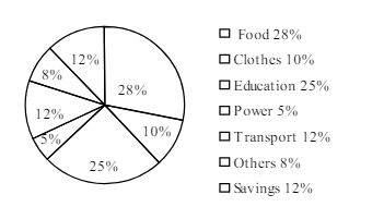
1.The pie-chart below shows the percentage of a family's household income distributed into different categories. Describe the pie-chart in 150 words:— question image

Barisal

The pie-chart below shows the percentage of a family's household income distributed into different categories. Describe the pie-chart in 150 words:— question image

উত্তর ও ব্যাখ্যা দেখতে ফ্রি রেজিস্ট্রেশন করো

ফ্রি শুরু করো

2.The pie-chart below shows the percentage of a family's household income distributed into different categories. Describe the pie-chart in 150 words:— question image

Barisal

The pie-chart below shows the percentage of a family's household income distributed into different categories. Describe the pie-chart in 150 words:— question image

উত্তর ও ব্যাখ্যা দেখতে ফ্রি রেজিস্ট্রেশন করো

ফ্রি শুরু করো

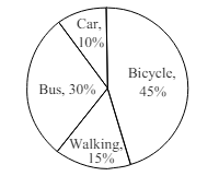
3.The pie chart below shows the percentages of transportation used by 800 students come\to come \to college. Describe the chart in 150 words. question image

Sylhet

The pie chart below shows the percentages of transportation used by 800 students come\to come \to college. Describe the chart in 150 words. question image

উত্তর ও ব্যাখ্যা দেখতে ফ্রি রেজিস্ট্রেশন করো

ফ্রি শুরু করো

4.The pie chart below shows the percentages of transportation used by 800 students come\to come \to college. Describe the chart in 150 words. question image

Sylhet

The pie chart below shows the percentages of transportation used by 800 students come\to come \to college. Describe the chart in 150 words. question image

উত্তর ও ব্যাখ্যা দেখতে ফ্রি রেজিস্ট্রেশন করো

ফ্রি শুরু করো

5.The graph chart shows the choice of profession by educated people in our country. Describe the graph in at least 150 words:—

Chittagong

The graph chart shows the choice of profession by educated people in our country. Describe the graph in at least 150 words:—

উত্তর ও ব্যাখ্যা দেখতে ফ্রি রেজিস্ট্রেশন করো

ফ্রি শুরু করো

6.The graph chart shows the choice of profession by educated people in our country. Describe the graph in at least 150 words:—

Chittagong

The graph chart shows the choice of profession by educated people in our country. Describe the graph in at least 150 words:—

উত্তর ও ব্যাখ্যা দেখতে ফ্রি রেজিস্ট্রেশন করো

ফ্রি শুরু করো

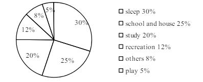
7.The pie chart below shows the time allocation of studentsdailystudents^{\prime} daily activities. Analyse the chart focussing the main preoccupations. (At least in 150 words) question image

Comilla

The pie chart below shows the time allocation of studentsdailystudents^{\prime} daily activities. Analyse the chart focussing the main preoccupations. (At least in 150 words) question image

উত্তর ও ব্যাখ্যা দেখতে ফ্রি রেজিস্ট্রেশন করো

ফ্রি শুরু করো

8.The pie chart below shows the time allocation of studentsdailystudents^{\prime} daily activities. Analyse the chart focussing the main preoccupations. (At least in 150 words) question image

Comilla

The pie chart below shows the time allocation of studentsdailystudents^{\prime} daily activities. Analyse the chart focussing the main preoccupations. (At least in 150 words) question image

উত্তর ও ব্যাখ্যা দেখতে ফ্রি রেজিস্ট্রেশন করো

ফ্রি শুরু করো

9.The graph below shows "The number of people living below the poverty line from 1995 to 2010". Describe the graph in 150 words. You should highlight and summarize the information given in the graph.

Jessore

The graph below shows "The number of people living below the poverty line from 1995 to 2010". Describe the graph in 150 words. You should highlight and summarize the information given in the graph.

উত্তর ও ব্যাখ্যা দেখতে ফ্রি রেজিস্ট্রেশন করো

ফ্রি শুরু করো

10.The graph below shows "The number of people living below the poverty line from 1995 to 2010". Describe the graph in 150 words. You should highlight and summarize the information given in the graph.

Jessore

The graph below shows "The number of people living below the poverty line from 1995 to 2010". Describe the graph in 150 words. You should highlight and summarize the information given in the graph.

উত্তর ও ব্যাখ্যা দেখতে ফ্রি রেজিস্ট্রেশন করো

ফ্রি শুরু করো

11.Look at the chart below. It shows the sources of air pollution in a city. Now, analyze the chart in at least 150 words focusing the main aspects.

Dinajpur

Look at the chart below. It shows the sources of air pollution in a city. Now, analyze the chart in at least 150 words focusing the main aspects.

উত্তর ও ব্যাখ্যা দেখতে ফ্রি রেজিস্ট্রেশন করো

ফ্রি শুরু করো

12.Look at the chart below. It shows the sources of air pollution in a city. Now, analyze the chart in at least 150 words focusing the main aspects.

Dinajpur

Look at the chart below. It shows the sources of air pollution in a city. Now, analyze the chart in at least 150 words focusing the main aspects.

উত্তর ও ব্যাখ্যা দেখতে ফ্রি রেজিস্ট্রেশন করো

ফ্রি শুরু করো

আরো প্রশ্ন দেখো

আরো হাজারো প্রশ্ন + মডেল টেস্ট

ফ্রি রেজিস্ট্রেশন করো — ফেভারিট, AI টিউটর, লিডারবোর্ড ও অ্যানালিটিক্স আনলক করো।