শেয়ারFacebookWhatsApp

The graph below shows what percentage of time the college students in different areas of our country spend for pastime activities from 2016 to 2022. Describe the graph in 150 words.

উত্তর: The graph shows the percentage of time the college students in different areas of our country spend for pastime activities from 2016 to 2022. The graph illustrates that there are three different types of activities where the students spend their time. These activities are using Facebook, watching TV and sporting activities. The graph shows an overall increasing tendency to use Facebook over the years. In the year 2016, we can see that 60% students used to spend their time on Facebook while 50% students used to spend time watching TV and 35% of students used to spend time on sports. After two years in 2018, there was a slight increase in the use of Facebook and watching TV making the percentage 70% and 60% respectively while the percentage of sports lessened to become 25%. The rising tendency of Facebook use and TV watching and falling rate of sports continued in the year 2020. In this year, the first two activities reached 80% and 70% while the last one declined to 20%. The use of Facebook and the activity of watching TV showed another stable increase in the year 2022 reaching at 90% and 80% respectively. This year the users of sporting events again fell down reaching 15%. The overall chart presents a negative picture that students are gradually becoming accustomed to Facebooking and watching TV while withdrawing themselves from sports activities. বাংলা অনুবাদঃ গ্রাফটি আমাদের দেশের বিভিন্ন এলাকার কলেজ শিক্ষার্থীরা ২০১৬ থেকে ২০২২ সাল পর্যন্ত অবসর কাটানোর জন্য কীভাবে সময় ব্যয় করেছে তার শতকরা হার প্রদর্শন করছে। গ্রাফে দেখানো হয়েছে যে শিক্ষার্থীরা তিন ধরনের কর্মকাণ্ডে সময় ব্যয় করে। এই কর্মকাণ্ডগুলো হলো ফেসবুক ব্যবহার, টেলিভিশন দেখা এবং খেলাধুলা। গ্রাফটি দেখায় যে, বছরের পর বছর ফেসবুক ব্যবহারের প্রতি শিক্ষার্থীদের একটি সামগ্রিক বৃদ্ধির প্রবণতা রয়েছে। ২০১৬ সালে দেখা যায়, ৬০% শিক্ষার্থী ফেসবুকে সময় ব্যয় করত, ৫০% শিক্ষার্থী টেলিভিশন দেখায় সময় দিত এবং ৩৫% শিক্ষার্থী খেলাধুলায় সময় ব্যয় করত। দুই বছর পর, ২০১৮ সালে ফেসবুক ব্যবহার এবং টেলিভিশন দেখার ক্ষেত্রে সামান্য বৃদ্ধি ঘটে, যা যথাক্রমে ৭০% এবং ৬০% এ পৌঁছায়, তবে খেলাধুলার শতাংশ কমে ২৫% হয়। ফেসবুক ব্যবহারের প্রবণতা বৃদ্ধি এবং টেলিভিশন দেখার হার বৃদ্ধি অব্যাহত থাকে এবং খেলাধুলার হার কমতে থাকে ২০২০ সালেও। এ বছর প্রথম দুটি কর্মকাণ্ড ৮০% এবং ৭০% এ পৌঁছায়, যখন খেলাধুলার হার কমে ২০% হয়। ২০২২ সালে ফেসবুক ব্যবহার এবং টেলিভিশন দেখার প্রবণতায় আরেকটি স্থিতিশীল বৃদ্ধি লক্ষ্য করা যায়, যা যথাক্রমে ৯০% এবং ৮০% এ পৌঁছে। একই বছরে খেলাধুলার ব্যবহারকারী আরও কমে ১৫% এ নেমে আসে। সামগ্রিক গ্রাফটি একটি নেতিবাচক চিত্র উপস্থাপন করে, যেখানে দেখা যায় শিক্ষার্থীরা ক্রমাগত ফেসবুক ব্যবহার এবং টেলিভিশন দেখায় অভ্যস্ত হয়ে উঠছে, আর খেলাধুলা থেকে নিজেদের সরিয়ে নিচ্ছে।

HSC English 1st Paper Writing : Interpreting graph/chart CQ — Prosthuti প্রশ্নব্যাংক

HSC · English 1st Paper · Writing : Interpreting graph/chart · সৃজনশীল

The graph below shows what percentage of time the college students …

সরকারি বিজ্ঞান কলেজ, ঢাকা · 2024

উত্তর
The graph shows the percentage of time the college students in different areas of our country spend for pastime activities from 2016 to 2022. The graph illustrates that there are three different types of activities where the students spend their time. These activities are using Facebook, watching TV and sporting activities. The graph shows an overall increasing tendency to use Facebook over the years. In the year 2016, we can see that 60% students used to spend their time on Facebook while 50% students used to spend time watching TV and 35% of students used to spend time on sports. After two years in 2018, there was a slight increase in the use of Facebook and watching TV making the percentage 70% and 60% respectively while the percentage of sports lessened to become 25%. The rising tendency of Facebook use and TV watching and falling rate of sports continued in the year 2020. In this year, the first two activities reached 80% and 70% while the last one declined to 20%. The use of Facebook and the activity of watching TV showed another stable increase in the year 2022 reaching at 90% and 80% respectively. This year the users of sporting events again fell down reaching 15%. The overall chart presents a negative picture that students are gradually becoming accustomed to Facebooking and watching TV while withdrawing themselves from sports activities. বাংলা অনুবাদঃ গ্রাফটি আমাদের দেশের বিভিন্ন এলাকার কলেজ শিক্ষার্থীরা ২০১৬ থেকে ২০২২ সাল পর্যন্ত অবসর কাটানোর জন্য কীভাবে সময় ব্যয় করেছে তার শতকরা হার প্রদর্শন করছে। গ্রাফে দেখানো হয়েছে যে শিক্ষার্থীরা তিন ধরনের কর্মকাণ্ডে সময় ব্যয় করে। এই কর্মকাণ্ডগুলো হলো ফেসবুক ব্যবহার, টেলিভিশন দেখা এবং খেলাধুলা। গ্রাফটি দেখায় যে, বছরের পর বছর ফেসবুক ব্যবহারের প্রতি শিক্ষার্থীদের একটি সামগ্রিক বৃদ্ধির প্রবণতা রয়েছে। ২০১৬ সালে দেখা যায়, ৬০% শিক্ষার্থী ফেসবুকে সময় ব্যয় করত, ৫০% শিক্ষার্থী টেলিভিশন দেখায় সময় দিত এবং ৩৫% শিক্ষার্থী খেলাধুলায় সময় ব্যয় করত। দুই বছর পর, ২০১৮ সালে ফেসবুক ব্যবহার এবং টেলিভিশন দেখার ক্ষেত্রে সামান্য বৃদ্ধি ঘটে, যা যথাক্রমে ৭০% এবং ৬০% এ পৌঁছায়, তবে খেলাধুলার শতাংশ কমে ২৫% হয়। ফেসবুক ব্যবহারের প্রবণতা বৃদ্ধি এবং টেলিভিশন দেখার হার বৃদ্ধি অব্যাহত থাকে এবং খেলাধুলার হার কমতে থাকে ২০২০ সালেও। এ বছর প্রথম দুটি কর্মকাণ্ড ৮০% এবং ৭০% এ পৌঁছায়, যখন খেলাধুলার হার কমে ২০% হয়। ২০২২ সালে ফেসবুক ব্যবহার এবং টেলিভিশন দেখার প্রবণতায় আরেকটি স্থিতিশীল বৃদ্ধি লক্ষ্য করা যায়, যা যথাক্রমে ৯০% এবং ৮০% এ পৌঁছে। একই বছরে খেলাধুলার ব্যবহারকারী আরও কমে ১৫% এ নেমে আসে। সামগ্রিক গ্রাফটি একটি নেতিবাচক চিত্র উপস্থাপন করে, যেখানে দেখা যায় শিক্ষার্থীরা ক্রমাগত ফেসবুক ব্যবহার এবং টেলিভিশন দেখায় অভ্যস্ত হয়ে উঠছে, আর খেলাধুলা থেকে নিজেদের সরিয়ে নিচ্ছে।
HSCEnglish 1st PaperWriting : Interpreting graph/chartসরকারি বিজ্ঞান কলেজ, ঢাকা
12টি সম্পর্কিত প্রশ্ন — উত্তর ও ব্যাখ্যা লকড

1.সৃজনশীল প্রশ্ন · Barisal

Barisal Board · 2017

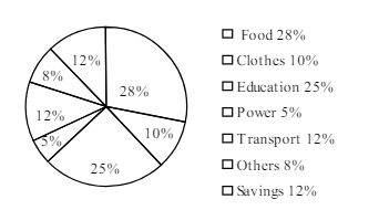
The pie-chart below shows the percentage of a family's household income distributed into different categories. Describe the pie-chart in 150 words:— question image

উত্তর ও ব্যাখ্যা দেখতে ফ্রি রেজিস্ট্রেশন করো

ফ্রি শুরু করো

2.সৃজনশীল প্রশ্ন · Barisal

Barisal Board · 2017

The pie-chart below shows the percentage of a family's household income distributed into different categories. Describe the pie-chart in 150 words:— question image

উত্তর ও ব্যাখ্যা দেখতে ফ্রি রেজিস্ট্রেশন করো

ফ্রি শুরু করো

3.সৃজনশীল প্রশ্ন · Sylhet

Sylhet Board · 2017

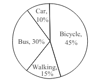
The pie chart below shows the percentages of transportation used by 800 students come\to come \to college. Describe the chart in 150 words. question image

উত্তর ও ব্যাখ্যা দেখতে ফ্রি রেজিস্ট্রেশন করো

ফ্রি শুরু করো

4.সৃজনশীল প্রশ্ন · Sylhet

Sylhet Board · 2017

The pie chart below shows the percentages of transportation used by 800 students come\to come \to college. Describe the chart in 150 words. question image

উত্তর ও ব্যাখ্যা দেখতে ফ্রি রেজিস্ট্রেশন করো

ফ্রি শুরু করো

5.সৃজনশীল প্রশ্ন · Chittagong

Chittagong Board · 2017

The graph chart shows the choice of profession by educated people in our country. Describe the graph in at least 150 words:—

উত্তর ও ব্যাখ্যা দেখতে ফ্রি রেজিস্ট্রেশন করো

ফ্রি শুরু করো

6.সৃজনশীল প্রশ্ন · Chittagong

Chittagong Board · 2017

The graph chart shows the choice of profession by educated people in our country. Describe the graph in at least 150 words:—

উত্তর ও ব্যাখ্যা দেখতে ফ্রি রেজিস্ট্রেশন করো

ফ্রি শুরু করো

7.সৃজনশীল প্রশ্ন · Comilla

Comilla Board · 2017

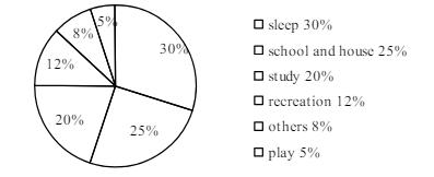
The pie chart below shows the time allocation of studentsdailystudents^{\prime} daily activities. Analyse the chart focussing the main preoccupations. (At least in 150 words) question image

উত্তর ও ব্যাখ্যা দেখতে ফ্রি রেজিস্ট্রেশন করো

ফ্রি শুরু করো

8.সৃজনশীল প্রশ্ন · Comilla

Comilla Board · 2017

The pie chart below shows the time allocation of studentsdailystudents^{\prime} daily activities. Analyse the chart focussing the main preoccupations. (At least in 150 words) question image

উত্তর ও ব্যাখ্যা দেখতে ফ্রি রেজিস্ট্রেশন করো

ফ্রি শুরু করো

9.সৃজনশীল প্রশ্ন · Jessore

Jessore Board · 2017

The graph below shows "The number of people living below the poverty line from 1995 to 2010". Describe the graph in 150 words. You should highlight and summarize the information given in the graph.

উত্তর ও ব্যাখ্যা দেখতে ফ্রি রেজিস্ট্রেশন করো

ফ্রি শুরু করো

10.সৃজনশীল প্রশ্ন · Jessore

Jessore Board · 2017

The graph below shows "The number of people living below the poverty line from 1995 to 2010". Describe the graph in 150 words. You should highlight and summarize the information given in the graph.

উত্তর ও ব্যাখ্যা দেখতে ফ্রি রেজিস্ট্রেশন করো

ফ্রি শুরু করো

11.সৃজনশীল প্রশ্ন · Dinajpur

Dinajpur Board · 2017

Look at the chart below. It shows the sources of air pollution in a city. Now, analyze the chart in at least 150 words focusing the main aspects.

উত্তর ও ব্যাখ্যা দেখতে ফ্রি রেজিস্ট্রেশন করো

ফ্রি শুরু করো

12.সৃজনশীল প্রশ্ন · Dinajpur

Dinajpur Board · 2017

Look at the chart below. It shows the sources of air pollution in a city. Now, analyze the chart in at least 150 words focusing the main aspects.

উত্তর ও ব্যাখ্যা দেখতে ফ্রি রেজিস্ট্রেশন করো

ফ্রি শুরু করো

আরো প্রশ্ন দেখো

আরো হাজারো প্রশ্ন + মডেল টেস্ট

ফ্রি রেজিস্ট্রেশন করো — ফেভারিট, AI টিউটর, লিডারবোর্ড ও অ্যানালিটিক্স আনলক করো।