শেয়ারFacebookWhatsApp

The following graph shows the percentage of early marriage in Bangladesh, India and Nepal in different decades. Now write a paragraph on "Statistics of Early Marriage" depending on the graph given below. [চিত্র]

উত্তর: The mentioned graph shows the percentage of early marriage in Bangladesh, India and Nepal in different decades. In the 1980s the rate of early marriage in Bangladesh was 25%, in India 30% and in Nepal 29%. In the 1990s, the rate of early marriage in Bangladesh and India was the same which was 25% but in Nepal it came down to 20. In the 2000s the rate of early marriage in Bangladesh was 15%, in India 18% and in Nepal it was positively reduced to 5%. In the 2010s the rate of early marriage in Bangladesh continued decreasing and reached to 10%, in India 12% and in Nepal 2%. From the graph we see that the rate of early marriage in Bangladesh and India decreased gradually in these decades. On the other hand, this rate decreased significantly in Nepal every year. The highest rate of early marriage was in India in the 2000s and the 2010s. The rate was 30%. And the lowest rate of early marriage was in Nepal in 2010s. The rate was only 2%. বাংলা অনুবাদঃ উল্লেখিত গ্রাফটি বাংলাদেশ, ভারত এবং নেপালে বিভিন্ন দশকে বাল্যবিবাহের শতকরা হার প্রদর্শন করে। ১৯৮০-এর দশকে বাংলাদেশে বাল্যবিবাহের হার ছিল ২৫%, ভারতে ৩০% এবং নেপালে ২৯%। ১৯৯০-এর দশকে বাংলাদেশ এবং ভারতে বাল্যবিবাহের হার একই ছিল, যা ২৫%। তবে নেপালে এই হার কমে ২০%-এ নেমে আসে। ২০০০-এর দশকে বাংলাদেশে বাল্যবিবাহের হার ছিল ১৫%, ভারতে ১৮% এবং নেপালে উল্লেখযোগ্যভাবে কমে ৫%-এ পৌঁছায়। ২০১০-এর দশকে বাংলাদেশে বাল্যবিবাহের হার কমতে থাকে এবং এটি ১০%-এ নেমে আসে, ভারতে ১২% এবং নেপালে মাত্র ২% হয়। গ্রাফ থেকে দেখা যায়, বাংলাদেশ এবং ভারতে বাল্যবিবাহের হার এসব দশকে ধীরে ধীরে কমেছে। অন্যদিকে, নেপালে এই হার প্রতি দশকেই উল্লেখযোগ্যভাবে হ্রাস পেয়েছে। বাল্যবিবাহের সর্বোচ্চ হার ছিল ভারতে ২০০০ এবং ২০১০-এর দশকে, যা ছিল ৩০%। এবং বাল্যবিবাহের সর্বনিম্ন হার ছিল নেপালে ২০১০-এর দশকে, যা ছিল মাত্র ২%।

HSC English 1st Paper Writing : Interpreting graph/chart CQ — Prosthuti প্রশ্নব্যাংক

HSC · English 1st Paper · Writing : Interpreting graph/chart · সৃজনশীল

The following graph shows the percentage of early marriage in Bangl…

চট্টগ্রাম কলেজ · 2024

উত্তর
The mentioned graph shows the percentage of early marriage in Bangladesh, India and Nepal in different decades. In the 1980s the rate of early marriage in Bangladesh was 25%, in India 30% and in Nepal 29%. In the 1990s, the rate of early marriage in Bangladesh and India was the same which was 25% but in Nepal it came down to 20. In the 2000s the rate of early marriage in Bangladesh was 15%, in India 18% and in Nepal it was positively reduced to 5%. In the 2010s the rate of early marriage in Bangladesh continued decreasing and reached to 10%, in India 12% and in Nepal 2%. From the graph we see that the rate of early marriage in Bangladesh and India decreased gradually in these decades. On the other hand, this rate decreased significantly in Nepal every year. The highest rate of early marriage was in India in the 2000s and the 2010s. The rate was 30%. And the lowest rate of early marriage was in Nepal in 2010s. The rate was only 2%. বাংলা অনুবাদঃ উল্লেখিত গ্রাফটি বাংলাদেশ, ভারত এবং নেপালে বিভিন্ন দশকে বাল্যবিবাহের শতকরা হার প্রদর্শন করে। ১৯৮০-এর দশকে বাংলাদেশে বাল্যবিবাহের হার ছিল ২৫%, ভারতে ৩০% এবং নেপালে ২৯%। ১৯৯০-এর দশকে বাংলাদেশ এবং ভারতে বাল্যবিবাহের হার একই ছিল, যা ২৫%। তবে নেপালে এই হার কমে ২০%-এ নেমে আসে। ২০০০-এর দশকে বাংলাদেশে বাল্যবিবাহের হার ছিল ১৫%, ভারতে ১৮% এবং নেপালে উল্লেখযোগ্যভাবে কমে ৫%-এ পৌঁছায়। ২০১০-এর দশকে বাংলাদেশে বাল্যবিবাহের হার কমতে থাকে এবং এটি ১০%-এ নেমে আসে, ভারতে ১২% এবং নেপালে মাত্র ২% হয়। গ্রাফ থেকে দেখা যায়, বাংলাদেশ এবং ভারতে বাল্যবিবাহের হার এসব দশকে ধীরে ধীরে কমেছে। অন্যদিকে, নেপালে এই হার প্রতি দশকেই উল্লেখযোগ্যভাবে হ্রাস পেয়েছে। বাল্যবিবাহের সর্বোচ্চ হার ছিল ভারতে ২০০০ এবং ২০১০-এর দশকে, যা ছিল ৩০%। এবং বাল্যবিবাহের সর্বনিম্ন হার ছিল নেপালে ২০১০-এর দশকে, যা ছিল মাত্র ২%।
HSCEnglish 1st PaperWriting : Interpreting graph/chartচট্টগ্রাম কলেজ
12টি সম্পর্কিত প্রশ্ন — ব্যাখ্যা লকড

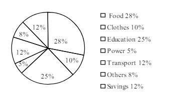
1.The pie-chart below shows the percentage of a family's household income distributed into different categories. Describe the pie-chart in 150 words:— question image

Barisal

The pie-chart below shows the percentage of a family's household income distributed into different categories. Describe the pie-chart in 150 words:— question image

উত্তর ও ব্যাখ্যা দেখতে ফ্রি রেজিস্ট্রেশন করো

ফ্রি শুরু করো

2.The pie-chart below shows the percentage of a family's household income distributed into different categories. Describe the pie-chart in 150 words:— question image

Barisal

The pie-chart below shows the percentage of a family's household income distributed into different categories. Describe the pie-chart in 150 words:— question image

উত্তর ও ব্যাখ্যা দেখতে ফ্রি রেজিস্ট্রেশন করো

ফ্রি শুরু করো

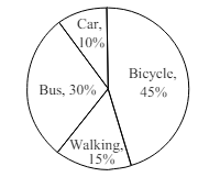
3.The pie chart below shows the percentages of transportation used by 800 students come\to come \to college. Describe the chart in 150 words. question image

Sylhet

The pie chart below shows the percentages of transportation used by 800 students come\to come \to college. Describe the chart in 150 words. question image

উত্তর ও ব্যাখ্যা দেখতে ফ্রি রেজিস্ট্রেশন করো

ফ্রি শুরু করো

4.The pie chart below shows the percentages of transportation used by 800 students come\to come \to college. Describe the chart in 150 words. question image

Sylhet

The pie chart below shows the percentages of transportation used by 800 students come\to come \to college. Describe the chart in 150 words. question image

উত্তর ও ব্যাখ্যা দেখতে ফ্রি রেজিস্ট্রেশন করো

ফ্রি শুরু করো

5.The graph chart shows the choice of profession by educated people in our country. Describe the graph in at least 150 words:—

Chittagong

The graph chart shows the choice of profession by educated people in our country. Describe the graph in at least 150 words:—

উত্তর ও ব্যাখ্যা দেখতে ফ্রি রেজিস্ট্রেশন করো

ফ্রি শুরু করো

6.The graph chart shows the choice of profession by educated people in our country. Describe the graph in at least 150 words:—

Chittagong

The graph chart shows the choice of profession by educated people in our country. Describe the graph in at least 150 words:—

উত্তর ও ব্যাখ্যা দেখতে ফ্রি রেজিস্ট্রেশন করো

ফ্রি শুরু করো

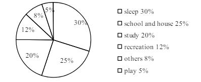
7.The pie chart below shows the time allocation of studentsdailystudents^{\prime} daily activities. Analyse the chart focussing the main preoccupations. (At least in 150 words) question image

Comilla

The pie chart below shows the time allocation of studentsdailystudents^{\prime} daily activities. Analyse the chart focussing the main preoccupations. (At least in 150 words) question image

উত্তর ও ব্যাখ্যা দেখতে ফ্রি রেজিস্ট্রেশন করো

ফ্রি শুরু করো

8.The pie chart below shows the time allocation of studentsdailystudents^{\prime} daily activities. Analyse the chart focussing the main preoccupations. (At least in 150 words) question image

Comilla

The pie chart below shows the time allocation of studentsdailystudents^{\prime} daily activities. Analyse the chart focussing the main preoccupations. (At least in 150 words) question image

উত্তর ও ব্যাখ্যা দেখতে ফ্রি রেজিস্ট্রেশন করো

ফ্রি শুরু করো

9.The graph below shows "The number of people living below the poverty line from 1995 to 2010". Describe the graph in 150 words. You should highlight and summarize the information given in the graph.

Jessore

The graph below shows "The number of people living below the poverty line from 1995 to 2010". Describe the graph in 150 words. You should highlight and summarize the information given in the graph.

উত্তর ও ব্যাখ্যা দেখতে ফ্রি রেজিস্ট্রেশন করো

ফ্রি শুরু করো

10.The graph below shows "The number of people living below the poverty line from 1995 to 2010". Describe the graph in 150 words. You should highlight and summarize the information given in the graph.

Jessore

The graph below shows "The number of people living below the poverty line from 1995 to 2010". Describe the graph in 150 words. You should highlight and summarize the information given in the graph.

উত্তর ও ব্যাখ্যা দেখতে ফ্রি রেজিস্ট্রেশন করো

ফ্রি শুরু করো

11.Look at the chart below. It shows the sources of air pollution in a city. Now, analyze the chart in at least 150 words focusing the main aspects.

Dinajpur

Look at the chart below. It shows the sources of air pollution in a city. Now, analyze the chart in at least 150 words focusing the main aspects.

উত্তর ও ব্যাখ্যা দেখতে ফ্রি রেজিস্ট্রেশন করো

ফ্রি শুরু করো

12.Look at the chart below. It shows the sources of air pollution in a city. Now, analyze the chart in at least 150 words focusing the main aspects.

Dinajpur

Look at the chart below. It shows the sources of air pollution in a city. Now, analyze the chart in at least 150 words focusing the main aspects.

উত্তর ও ব্যাখ্যা দেখতে ফ্রি রেজিস্ট্রেশন করো

ফ্রি শুরু করো

আরো প্রশ্ন দেখো

আরো হাজারো প্রশ্ন + মডেল টেস্ট

ফ্রি রেজিস্ট্রেশন করো — ফেভারিট, AI টিউটর, লিডারবোর্ড ও অ্যানালিটিক্স আনলক করো।