শেয়ারFacebookWhatsApp

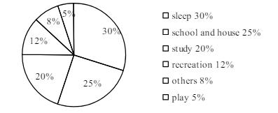
The pie chart below shows the time allocation of a student's daily activities, Describe the chart in 150 words. You should highlight and summarize the information in the chart. [চিত্র]

উত্তর: The pie chart shows how student pass their time doing various activities. The chart shows there's more than half of students “time in spent in college and in sleep. The rest of the term is spent In play in college. Thus paint more time in this to activities. The main pursuit of the student is study and they spend 20% time in their study. Playing games is important to them, and so they spend some time in Play. They keep 5% of their time of this students also give importance in recreation. They pass 12% of their time in recreation. Lost of all, they spent 8% of their time in other activities. Thus student pass their time in sleep, School, study, playing games, entertainment and doing other activities. The ratio of student time spending indicates that they spend their time in a logical way. বাংলা অনুবাদঃ পাই চার্টটি শিক্ষার্থীদের বিভিন্ন কাজে সময় ব্যয়ের চিত্র তুলে ধরে। চার্ট থেকে দেখা যায় যে শিক্ষার্থীরা তাদের সময়ের অর্ধেকের বেশি স্কুলে এবং ঘুমাতে ব্যয় করে। বাকি সময় খেলা, বিনোদন এবং অন্যান্য কার্যক্রমে ব্যয় হয়। শিক্ষার্থীদের প্রধান লক্ষ্য হলো পড়াশোনা, এবং তারা তাদের সময়ের ২০% পড়াশোনায় ব্যয় করে। খেলা তাদের জন্য গুরুত্বপূর্ণ, তাই তারা খেলার জন্য ৫% সময় বরাদ্দ রাখে। বিনোদনেও শিক্ষার্থীরা গুরুত্ব দেয়, এবং তারা তাদের সময়ের ১২% বিনোদনে ব্যয় করে। সর্বশেষে, তারা তাদের সময়ের ৮% অন্যান্য কাজে ব্যয় করে। এভাবে, শিক্ষার্থীরা তাদের সময় ঘুম, স্কুল, পড়াশোনা, খেলা, বিনোদন এবং অন্যান্য কাজের মধ্যে ভাগ করে নেয়। শিক্ষার্থীদের সময় ব্যবহারের অনুপাত থেকে বোঝা যায় যে তারা সময়কে যৌক্তিকভাবে ব্যবহার করে।

HSC English 1st Paper Writing : Interpreting graph/chart CQ — Prosthuti প্রশ্নব্যাংক

HSC · English 1st Paper · Writing : Interpreting graph/chart · সৃজনশীল

The pie chart below shows the time allocation of a student's daily …

Barisal Board · 2025

উত্তর
The pie chart shows how student pass their time doing various activities. The chart shows there's more than half of students “time in spent in college and in sleep. The rest of the term is spent In play in college. Thus paint more time in this to activities. The main pursuit of the student is study and they spend 20% time in their study. Playing games is important to them, and so they spend some time in Play. They keep 5% of their time of this students also give importance in recreation. They pass 12% of their time in recreation. Lost of all, they spent 8% of their time in other activities. Thus student pass their time in sleep, School, study, playing games, entertainment and doing other activities. The ratio of student time spending indicates that they spend their time in a logical way. বাংলা অনুবাদঃ পাই চার্টটি শিক্ষার্থীদের বিভিন্ন কাজে সময় ব্যয়ের চিত্র তুলে ধরে। চার্ট থেকে দেখা যায় যে শিক্ষার্থীরা তাদের সময়ের অর্ধেকের বেশি স্কুলে এবং ঘুমাতে ব্যয় করে। বাকি সময় খেলা, বিনোদন এবং অন্যান্য কার্যক্রমে ব্যয় হয়। শিক্ষার্থীদের প্রধান লক্ষ্য হলো পড়াশোনা, এবং তারা তাদের সময়ের ২০% পড়াশোনায় ব্যয় করে। খেলা তাদের জন্য গুরুত্বপূর্ণ, তাই তারা খেলার জন্য ৫% সময় বরাদ্দ রাখে। বিনোদনেও শিক্ষার্থীরা গুরুত্ব দেয়, এবং তারা তাদের সময়ের ১২% বিনোদনে ব্যয় করে। সর্বশেষে, তারা তাদের সময়ের ৮% অন্যান্য কাজে ব্যয় করে। এভাবে, শিক্ষার্থীরা তাদের সময় ঘুম, স্কুল, পড়াশোনা, খেলা, বিনোদন এবং অন্যান্য কাজের মধ্যে ভাগ করে নেয়। শিক্ষার্থীদের সময় ব্যবহারের অনুপাত থেকে বোঝা যায় যে তারা সময়কে যৌক্তিকভাবে ব্যবহার করে।
HSCEnglish 1st PaperWriting : Interpreting graph/chartBarisal
12টি সম্পর্কিত প্রশ্ন — উত্তর ও ব্যাখ্যা লকড

1.সৃজনশীল প্রশ্ন · Barisal

Barisal Board · 2017

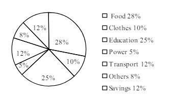
The pie-chart below shows the percentage of a family's household income distributed into different categories. Describe the pie-chart in 150 words:— question image

উত্তর ও ব্যাখ্যা দেখতে ফ্রি রেজিস্ট্রেশন করো

ফ্রি শুরু করো

2.সৃজনশীল প্রশ্ন · Barisal

Barisal Board · 2017

The pie-chart below shows the percentage of a family's household income distributed into different categories. Describe the pie-chart in 150 words:— question image

উত্তর ও ব্যাখ্যা দেখতে ফ্রি রেজিস্ট্রেশন করো

ফ্রি শুরু করো

3.সৃজনশীল প্রশ্ন · Sylhet

Sylhet Board · 2017

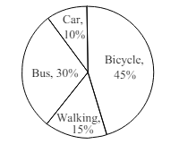
The pie chart below shows the percentages of transportation used by 800 students come\to come \to college. Describe the chart in 150 words. question image

উত্তর ও ব্যাখ্যা দেখতে ফ্রি রেজিস্ট্রেশন করো

ফ্রি শুরু করো

4.সৃজনশীল প্রশ্ন · Sylhet

Sylhet Board · 2017

The pie chart below shows the percentages of transportation used by 800 students come\to come \to college. Describe the chart in 150 words. question image

উত্তর ও ব্যাখ্যা দেখতে ফ্রি রেজিস্ট্রেশন করো

ফ্রি শুরু করো

5.সৃজনশীল প্রশ্ন · Chittagong

Chittagong Board · 2017

The graph chart shows the choice of profession by educated people in our country. Describe the graph in at least 150 words:—

উত্তর ও ব্যাখ্যা দেখতে ফ্রি রেজিস্ট্রেশন করো

ফ্রি শুরু করো

6.সৃজনশীল প্রশ্ন · Chittagong

Chittagong Board · 2017

The graph chart shows the choice of profession by educated people in our country. Describe the graph in at least 150 words:—

উত্তর ও ব্যাখ্যা দেখতে ফ্রি রেজিস্ট্রেশন করো

ফ্রি শুরু করো

7.সৃজনশীল প্রশ্ন · Comilla

Comilla Board · 2017

The pie chart below shows the time allocation of studentsdailystudents^{\prime} daily activities. Analyse the chart focussing the main preoccupations. (At least in 150 words) question image

উত্তর ও ব্যাখ্যা দেখতে ফ্রি রেজিস্ট্রেশন করো

ফ্রি শুরু করো

8.সৃজনশীল প্রশ্ন · Comilla

Comilla Board · 2017

The pie chart below shows the time allocation of studentsdailystudents^{\prime} daily activities. Analyse the chart focussing the main preoccupations. (At least in 150 words) question image

উত্তর ও ব্যাখ্যা দেখতে ফ্রি রেজিস্ট্রেশন করো

ফ্রি শুরু করো

9.সৃজনশীল প্রশ্ন · Jessore

Jessore Board · 2017

The graph below shows "The number of people living below the poverty line from 1995 to 2010". Describe the graph in 150 words. You should highlight and summarize the information given in the graph.

উত্তর ও ব্যাখ্যা দেখতে ফ্রি রেজিস্ট্রেশন করো

ফ্রি শুরু করো

10.সৃজনশীল প্রশ্ন · Jessore

Jessore Board · 2017

The graph below shows "The number of people living below the poverty line from 1995 to 2010". Describe the graph in 150 words. You should highlight and summarize the information given in the graph.

উত্তর ও ব্যাখ্যা দেখতে ফ্রি রেজিস্ট্রেশন করো

ফ্রি শুরু করো

11.সৃজনশীল প্রশ্ন · Dinajpur

Dinajpur Board · 2017

Look at the chart below. It shows the sources of air pollution in a city. Now, analyze the chart in at least 150 words focusing the main aspects.

উত্তর ও ব্যাখ্যা দেখতে ফ্রি রেজিস্ট্রেশন করো

ফ্রি শুরু করো

12.সৃজনশীল প্রশ্ন · Dinajpur

Dinajpur Board · 2017

Look at the chart below. It shows the sources of air pollution in a city. Now, analyze the chart in at least 150 words focusing the main aspects.

উত্তর ও ব্যাখ্যা দেখতে ফ্রি রেজিস্ট্রেশন করো

ফ্রি শুরু করো

আরো প্রশ্ন দেখো

আরো হাজারো প্রশ্ন + মডেল টেস্ট

ফ্রি রেজিস্ট্রেশন করো — ফেভারিট, AI টিউটর, লিডারবোর্ড ও অ্যানালিটিক্স আনলক করো।