শেয়ারFacebookWhatsApp

The following graph displays the COVID-19 scenario (death rate) in Bangladesh in respect of age distribution in percentage. Describe the graph in your own sentences. [চিত্র]

উত্তর: The graph shows the percentages of death caused by COVID-19 in respect of age distribution. In the graph, varying percentages of death by COVID-19 can be noticed according to different levels of age. As the graph shows, 3% death caused by COVID-19 was recorded for the people of the age group 10 or below 10; 8% for the people of the age group 11 to 20; 26% for the people of the age group 21 to 30; 24% for the people of the age group 41 to 50; 13% for the people of the age group 51 to 60; and 8% for the people of the age group above 60. The highest number of people who died by COVID-19 were of the age 21 to 30 while the lowest number of people who died by COVID-19 were of the age 10 or below. At the same time, the people of the age groups to 40 and 41 to 50 occupied the second and third highest percentages of death respectively. So, it is evident that the young people were at the highest risk of death. Contrarily, the children were safer than any other age group. Also, the adolescents and the old people were at lesser risk of death. বাংলা অনুবাদঃ গ্রাফটি বয়সভিত্তিক কোভিড-১৯ এর কারণে মৃত্যুর শতাংশ প্রদর্শন করে। গ্রাফে বিভিন্ন বয়স স্তরের মধ্যে কোভিড-১৯ এর কারণে মৃত্যুর শতাংশের পার্থক্য লক্ষ্য করা যায়। গ্রাফ অনুযায়ী, ১০ বছর বা তার কম বয়সী ব্যক্তিদের ক্ষেত্রে মৃত্যুর হার ছিল ৩%; ১১ থেকে ২০ বছর বয়সীদের জন্য ৮%; ২১ থেকে ৩০ বছর বয়সীদের জন্য ২৬%; ৪১ থেকে ৫০ বছর বয়সীদের জন্য ২৪%; ৫১ থেকে ৬০ বছর বয়সীদের জন্য ১৩%; এবং ৬০ বছরের ঊর্ধ্বে বয়সীদের জন্য ৮%। কোভিড-১৯ এর কারণে মৃত্যুর সর্বোচ্চ হার ছিল ২১ থেকে ৩০ বছর বয়সীদের মধ্যে, যখন মৃত্যুর সর্বনিম্ন হার ছিল ১০ বছর বা তার কম বয়সীদের মধ্যে। একই সময়ে, ৩১ থেকে ৪০ এবং ৪১ থেকে ৫০ বছর বয়সীদের মধ্যে মৃত্যুর হার দ্বিতীয় এবং তৃতীয় সর্বোচ্চ স্থান দখল করে। এ থেকে স্পষ্ট হয় যে তরুণদের মৃত্যুর ঝুঁকি ছিল সবচেয়ে বেশি। বিপরীতে, শিশুরা অন্যান্য বয়স গোষ্ঠীর তুলনায় বেশি নিরাপদ ছিল। এছাড়া, কিশোর-কিশোরী এবং বয়স্ক ব্যক্তিরা অপেক্ষাকৃত কম ঝুঁকিতে ছিল।

HSC English 1st Paper Writing : Interpreting graph/chart CQ — Prosthuti প্রশ্নব্যাংক

HSC · English 1st Paper · Writing : Interpreting graph/chart · সৃজনশীল

The following graph displays the COVID-19 scenario (death rate) in …

হলিক্রস কলেজ · 2024

উত্তর
The graph shows the percentages of death caused by COVID-19 in respect of age distribution. In the graph, varying percentages of death by COVID-19 can be noticed according to different levels of age. As the graph shows, 3% death caused by COVID-19 was recorded for the people of the age group 10 or below 10; 8% for the people of the age group 11 to 20; 26% for the people of the age group 21 to 30; 24% for the people of the age group 41 to 50; 13% for the people of the age group 51 to 60; and 8% for the people of the age group above 60. The highest number of people who died by COVID-19 were of the age 21 to 30 while the lowest number of people who died by COVID-19 were of the age 10 or below. At the same time, the people of the age groups to 40 and 41 to 50 occupied the second and third highest percentages of death respectively. So, it is evident that the young people were at the highest risk of death. Contrarily, the children were safer than any other age group. Also, the adolescents and the old people were at lesser risk of death. বাংলা অনুবাদঃ গ্রাফটি বয়সভিত্তিক কোভিড-১৯ এর কারণে মৃত্যুর শতাংশ প্রদর্শন করে। গ্রাফে বিভিন্ন বয়স স্তরের মধ্যে কোভিড-১৯ এর কারণে মৃত্যুর শতাংশের পার্থক্য লক্ষ্য করা যায়। গ্রাফ অনুযায়ী, ১০ বছর বা তার কম বয়সী ব্যক্তিদের ক্ষেত্রে মৃত্যুর হার ছিল ৩%; ১১ থেকে ২০ বছর বয়সীদের জন্য ৮%; ২১ থেকে ৩০ বছর বয়সীদের জন্য ২৬%; ৪১ থেকে ৫০ বছর বয়সীদের জন্য ২৪%; ৫১ থেকে ৬০ বছর বয়সীদের জন্য ১৩%; এবং ৬০ বছরের ঊর্ধ্বে বয়সীদের জন্য ৮%। কোভিড-১৯ এর কারণে মৃত্যুর সর্বোচ্চ হার ছিল ২১ থেকে ৩০ বছর বয়সীদের মধ্যে, যখন মৃত্যুর সর্বনিম্ন হার ছিল ১০ বছর বা তার কম বয়সীদের মধ্যে। একই সময়ে, ৩১ থেকে ৪০ এবং ৪১ থেকে ৫০ বছর বয়সীদের মধ্যে মৃত্যুর হার দ্বিতীয় এবং তৃতীয় সর্বোচ্চ স্থান দখল করে। এ থেকে স্পষ্ট হয় যে তরুণদের মৃত্যুর ঝুঁকি ছিল সবচেয়ে বেশি। বিপরীতে, শিশুরা অন্যান্য বয়স গোষ্ঠীর তুলনায় বেশি নিরাপদ ছিল। এছাড়া, কিশোর-কিশোরী এবং বয়স্ক ব্যক্তিরা অপেক্ষাকৃত কম ঝুঁকিতে ছিল।
HSCEnglish 1st PaperWriting : Interpreting graph/chartহলিক্রস কলেজ
12টি সম্পর্কিত প্রশ্ন — উত্তর ও ব্যাখ্যা লকড

1.সৃজনশীল প্রশ্ন · Barisal

Barisal Board · 2017

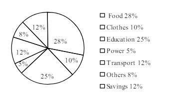
The pie-chart below shows the percentage of a family's household income distributed into different categories. Describe the pie-chart in 150 words:— question image

উত্তর ও ব্যাখ্যা দেখতে ফ্রি রেজিস্ট্রেশন করো

ফ্রি শুরু করো

2.সৃজনশীল প্রশ্ন · Barisal

Barisal Board · 2017

The pie-chart below shows the percentage of a family's household income distributed into different categories. Describe the pie-chart in 150 words:— question image

উত্তর ও ব্যাখ্যা দেখতে ফ্রি রেজিস্ট্রেশন করো

ফ্রি শুরু করো

3.সৃজনশীল প্রশ্ন · Sylhet

Sylhet Board · 2017

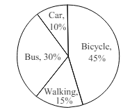
The pie chart below shows the percentages of transportation used by 800 students come\to come \to college. Describe the chart in 150 words. question image

উত্তর ও ব্যাখ্যা দেখতে ফ্রি রেজিস্ট্রেশন করো

ফ্রি শুরু করো

4.সৃজনশীল প্রশ্ন · Sylhet

Sylhet Board · 2017

The pie chart below shows the percentages of transportation used by 800 students come\to come \to college. Describe the chart in 150 words. question image

উত্তর ও ব্যাখ্যা দেখতে ফ্রি রেজিস্ট্রেশন করো

ফ্রি শুরু করো

5.সৃজনশীল প্রশ্ন · Chittagong

Chittagong Board · 2017

The graph chart shows the choice of profession by educated people in our country. Describe the graph in at least 150 words:—

উত্তর ও ব্যাখ্যা দেখতে ফ্রি রেজিস্ট্রেশন করো

ফ্রি শুরু করো

6.সৃজনশীল প্রশ্ন · Chittagong

Chittagong Board · 2017

The graph chart shows the choice of profession by educated people in our country. Describe the graph in at least 150 words:—

উত্তর ও ব্যাখ্যা দেখতে ফ্রি রেজিস্ট্রেশন করো

ফ্রি শুরু করো

7.সৃজনশীল প্রশ্ন · Comilla

Comilla Board · 2017

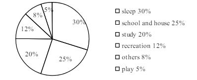
The pie chart below shows the time allocation of studentsdailystudents^{\prime} daily activities. Analyse the chart focussing the main preoccupations. (At least in 150 words) question image

উত্তর ও ব্যাখ্যা দেখতে ফ্রি রেজিস্ট্রেশন করো

ফ্রি শুরু করো

8.সৃজনশীল প্রশ্ন · Comilla

Comilla Board · 2017

The pie chart below shows the time allocation of studentsdailystudents^{\prime} daily activities. Analyse the chart focussing the main preoccupations. (At least in 150 words) question image

উত্তর ও ব্যাখ্যা দেখতে ফ্রি রেজিস্ট্রেশন করো

ফ্রি শুরু করো

9.সৃজনশীল প্রশ্ন · Jessore

Jessore Board · 2017

The graph below shows "The number of people living below the poverty line from 1995 to 2010". Describe the graph in 150 words. You should highlight and summarize the information given in the graph.

উত্তর ও ব্যাখ্যা দেখতে ফ্রি রেজিস্ট্রেশন করো

ফ্রি শুরু করো

10.সৃজনশীল প্রশ্ন · Jessore

Jessore Board · 2017

The graph below shows "The number of people living below the poverty line from 1995 to 2010". Describe the graph in 150 words. You should highlight and summarize the information given in the graph.

উত্তর ও ব্যাখ্যা দেখতে ফ্রি রেজিস্ট্রেশন করো

ফ্রি শুরু করো

11.সৃজনশীল প্রশ্ন · Dinajpur

Dinajpur Board · 2017

Look at the chart below. It shows the sources of air pollution in a city. Now, analyze the chart in at least 150 words focusing the main aspects.

উত্তর ও ব্যাখ্যা দেখতে ফ্রি রেজিস্ট্রেশন করো

ফ্রি শুরু করো

12.সৃজনশীল প্রশ্ন · Dinajpur

Dinajpur Board · 2017

Look at the chart below. It shows the sources of air pollution in a city. Now, analyze the chart in at least 150 words focusing the main aspects.

উত্তর ও ব্যাখ্যা দেখতে ফ্রি রেজিস্ট্রেশন করো

ফ্রি শুরু করো

আরো প্রশ্ন দেখো

আরো হাজারো প্রশ্ন + মডেল টেস্ট

ফ্রি রেজিস্ট্রেশন করো — ফেভারিট, AI টিউটর, লিডারবোর্ড ও অ্যানালিটিক্স আনলক করো।