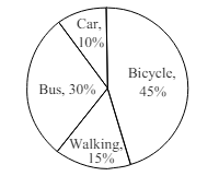
The pie chart below shows the percentages of transportation used by 1000 students [গণিত] come [গণিত] 'X College [গণিত] . Now, describe the chart in 150 words.
উত্তর: The given pie chart presents data on the modes of transportation utilized by 1000 students [গণিত] commute [গণিত] 'X College [গণিত] . The five categories include bicycle, bus, walking, motorbike, and car.It is evident that the majority of students (45%) use bicycles, indicating a strong preference for this eco-friendly and cost-effective mode of transport. Buses are the second most commonly used, accounting for 25% of the students, suggesting that public transport remains a popular and accessible option. Walking, chosen by 15% of the students, reflects the proximity of residences [গণিত] the college campus for a considerable portion of the student population.Meanwhile, 10% of students use motorbikes, possibly due [গণিত] their speed and affordability compared [গণিত] cars. Only 5% travel by car, which may be attributed [গণিত] higher expenses, limited parking, or environmental concerns.In summary, the chart highlights a clear trend towards affordable, sustainable, and practical transportation methods among college students.
HSC English 1st Paper Writing : Interpreting graph/chart CQ — Prosthuti প্রশ্নব্যাংক
HSC · English 1st Paper · Writing : Interpreting graph/chart · সৃজনশীল
The pie chart below shows the percentages of transportation used by…
Comilla Board · 2025
উত্তর