শেয়ারFacebookWhatsApp

The graph below shows students from different academic areas who got themselves admitted into a public university last year. The [গণিত] -aligned numbers show the percentages of students. You should analyse the information mentioning, the ratio of their achievements in at least 150 words. [চিত্র]

উত্তর: Students from different academic areas got themselves admitted into a public university last year The graph illustrating the distribution of students admitted to a public university from different academic areas last year presents a clear view of the predominant fields of study chosen by these students. The vertical axis represents the percentage of students, while the horizontal axis lists the academic areas: Science, Humanities, Business Studies, Madrasah, and Technical Education. Science dominates the chart with 45% of the students, almost half of the total admissions. This indicates a strong preference or perhaps better preparation and opportunities in Science, reflecting the high demand for the science-related education and careers. Humanities follow closely with 40%, showing a nearly equal interest as science among the students. This significant percentage highlights the value placed on humanities education and its role in the academic ecosystem, providing a balanced perspective between scientific and cultural studies. Business Studies account for 8% of the admissions, suggesting a moderate interest in this field. This relatively smaller percentage might indicate a more specialized or competitive nature of business programmes or possibly fewer students inclined toward this discipline. Madrasah, with 4%, shows a niche interest, representing students who pursue religious or spiritual studies. This specific focus attracts a smaller yet dedicated group of students. Lastly, Technical Education comprises 3% of the admissions, indicating a lesser emphasis compared to other fields. This could reflect either a limited number of technical programmes available or fewer students choosing this path. Overall, the graph reveals that Science and Humanities are the leading areas of study, together making up 85% of the student body, while Business Studies, Madrasah and Technical Education are less prominent but still crucial in their respective capacities. বাংলা অনুবাদঃ গ্রাফটি গত বছর বিভিন্ন একাডেমিক ক্ষেত্র থেকে সরকারি বিশ্ববিদ্যালয়ে ভর্তি হওয়া শিক্ষার্থীদের বণ্টন স্পষ্টভাবে উপস্থাপন করে। উল্লম্ব অক্ষে শিক্ষার্থীদের শতকরা হার এবং আনুভূমিক অক্ষে একাডেমিক ক্ষেত্রগুলো—বিজ্ঞান, মানবিক, ব্যবসায় শিক্ষা, মাদ্রাসা এবং কারিগরি শিক্ষার তালিকা প্রদর্শিত হয়েছে। বিজ্ঞান শীর্ষস্থানে রয়েছে, যেখানে শিক্ষার্থীদের ৪৫% ভর্তি হয়েছে, যা মোট ভর্তির প্রায় অর্ধেক। এটি বিজ্ঞান সম্পর্কিত শিক্ষা ও ক্যারিয়ারের চাহিদা, প্রস্তুতি ও সুযোগের প্রতি শিক্ষার্থীদের শক্তিশালী আগ্রহকে নির্দেশ করে। মানবিক বিভাগ ৪০% নিয়ে কাছাকাছি অবস্থানে রয়েছে, যা বিজ্ঞান বিভাগের প্রায় সমান আগ্রহ প্রদর্শন করে। এই উল্লেখযোগ্য শতাংশ মানবিক শিক্ষার মূল্য এবং এটি যে একাডেমিক পরিবেশে একটি ভারসাম্যপূর্ণ দৃষ্টিভঙ্গি প্রদান করে তা তুলে ধরে। ব্যবসায় শিক্ষা বিভাগে ভর্তি ৮%, যা এই ক্ষেত্রে মাঝারি আগ্রহ নির্দেশ করে। এই তুলনামূলকভাবে কম শতাংশ হয়তো ব্যবসায় শিক্ষার আরও বিশেষায়িত বা প্রতিযোগিতামূলক প্রকৃতি কিংবা এই ক্ষেত্রে কম শিক্ষার্থী আগ্রহী হওয়ার ইঙ্গিত দেয়। মাদ্রাসা বিভাগে ৪% ভর্তি হয়েছে, যা ধর্মীয় বা আধ্যাত্মিক শিক্ষার প্রতি নির্দিষ্ট আগ্রহকে উপস্থাপন করে। এই ক্ষেত্রে একটি ছোট কিন্তু নিবেদিত শিক্ষার্থী দল আকৃষ্ট হয়। শেষে, কারিগরি শিক্ষায় ৩% ভর্তি হয়েছে, যা অন্যান্য ক্ষেত্রের তুলনায় কম গুরুত্ব প্রদর্শন করে। এটি হয়তো সীমিত সংখ্যক কারিগরি প্রোগ্রাম উপলব্ধতা বা শিক্ষার্থীদের এই পথে আগ্রহ কম থাকার প্রতিফলন হতে পারে। সামগ্রিকভাবে, গ্রাফটি দেখায় যে বিজ্ঞান এবং মানবিক বিভাগ শীর্ষস্থানীয় অধ্যয়ন ক্ষেত্র, যা শিক্ষার্থী সংস্থার ৮৫% তৈরি করে, যেখানে ব্যবসায় শিক্ষা, মাদ্রাসা এবং কারিগরি শিক্ষা কম প্রধান হলেও তাদের নিজ নিজ ক্ষেত্রে গুরুত্বপূর্ণ।

HSC English 1st Paper Writing : Interpreting graph/chart CQ — Prosthuti প্রশ্নব্যাংক

HSC · English 1st Paper · Writing : Interpreting graph/chart · সৃজনশীল

The graph below shows students from different academic areas who go…

Rajshahi Board · 2024

উত্তর
Students from different academic areas got themselves admitted into a public university last year The graph illustrating the distribution of students admitted to a public university from different academic areas last year presents a clear view of the predominant fields of study chosen by these students. The vertical axis represents the percentage of students, while the horizontal axis lists the academic areas: Science, Humanities, Business Studies, Madrasah, and Technical Education. Science dominates the chart with 45% of the students, almost half of the total admissions. This indicates a strong preference or perhaps better preparation and opportunities in Science, reflecting the high demand for the science-related education and careers. Humanities follow closely with 40%, showing a nearly equal interest as science among the students. This significant percentage highlights the value placed on humanities education and its role in the academic ecosystem, providing a balanced perspective between scientific and cultural studies. Business Studies account for 8% of the admissions, suggesting a moderate interest in this field. This relatively smaller percentage might indicate a more specialized or competitive nature of business programmes or possibly fewer students inclined toward this discipline. Madrasah, with 4%, shows a niche interest, representing students who pursue religious or spiritual studies. This specific focus attracts a smaller yet dedicated group of students. Lastly, Technical Education comprises 3% of the admissions, indicating a lesser emphasis compared to other fields. This could reflect either a limited number of technical programmes available or fewer students choosing this path. Overall, the graph reveals that Science and Humanities are the leading areas of study, together making up 85% of the student body, while Business Studies, Madrasah and Technical Education are less prominent but still crucial in their respective capacities. বাংলা অনুবাদঃ গ্রাফটি গত বছর বিভিন্ন একাডেমিক ক্ষেত্র থেকে সরকারি বিশ্ববিদ্যালয়ে ভর্তি হওয়া শিক্ষার্থীদের বণ্টন স্পষ্টভাবে উপস্থাপন করে। উল্লম্ব অক্ষে শিক্ষার্থীদের শতকরা হার এবং আনুভূমিক অক্ষে একাডেমিক ক্ষেত্রগুলো—বিজ্ঞান, মানবিক, ব্যবসায় শিক্ষা, মাদ্রাসা এবং কারিগরি শিক্ষার তালিকা প্রদর্শিত হয়েছে। বিজ্ঞান শীর্ষস্থানে রয়েছে, যেখানে শিক্ষার্থীদের ৪৫% ভর্তি হয়েছে, যা মোট ভর্তির প্রায় অর্ধেক। এটি বিজ্ঞান সম্পর্কিত শিক্ষা ও ক্যারিয়ারের চাহিদা, প্রস্তুতি ও সুযোগের প্রতি শিক্ষার্থীদের শক্তিশালী আগ্রহকে নির্দেশ করে। মানবিক বিভাগ ৪০% নিয়ে কাছাকাছি অবস্থানে রয়েছে, যা বিজ্ঞান বিভাগের প্রায় সমান আগ্রহ প্রদর্শন করে। এই উল্লেখযোগ্য শতাংশ মানবিক শিক্ষার মূল্য এবং এটি যে একাডেমিক পরিবেশে একটি ভারসাম্যপূর্ণ দৃষ্টিভঙ্গি প্রদান করে তা তুলে ধরে। ব্যবসায় শিক্ষা বিভাগে ভর্তি ৮%, যা এই ক্ষেত্রে মাঝারি আগ্রহ নির্দেশ করে। এই তুলনামূলকভাবে কম শতাংশ হয়তো ব্যবসায় শিক্ষার আরও বিশেষায়িত বা প্রতিযোগিতামূলক প্রকৃতি কিংবা এই ক্ষেত্রে কম শিক্ষার্থী আগ্রহী হওয়ার ইঙ্গিত দেয়। মাদ্রাসা বিভাগে ৪% ভর্তি হয়েছে, যা ধর্মীয় বা আধ্যাত্মিক শিক্ষার প্রতি নির্দিষ্ট আগ্রহকে উপস্থাপন করে। এই ক্ষেত্রে একটি ছোট কিন্তু নিবেদিত শিক্ষার্থী দল আকৃষ্ট হয়। শেষে, কারিগরি শিক্ষায় ৩% ভর্তি হয়েছে, যা অন্যান্য ক্ষেত্রের তুলনায় কম গুরুত্ব প্রদর্শন করে। এটি হয়তো সীমিত সংখ্যক কারিগরি প্রোগ্রাম উপলব্ধতা বা শিক্ষার্থীদের এই পথে আগ্রহ কম থাকার প্রতিফলন হতে পারে। সামগ্রিকভাবে, গ্রাফটি দেখায় যে বিজ্ঞান এবং মানবিক বিভাগ শীর্ষস্থানীয় অধ্যয়ন ক্ষেত্র, যা শিক্ষার্থী সংস্থার ৮৫% তৈরি করে, যেখানে ব্যবসায় শিক্ষা, মাদ্রাসা এবং কারিগরি শিক্ষা কম প্রধান হলেও তাদের নিজ নিজ ক্ষেত্রে গুরুত্বপূর্ণ।
HSCEnglish 1st PaperWriting : Interpreting graph/chartRajshahi
12টি সম্পর্কিত প্রশ্ন — উত্তর ও ব্যাখ্যা লকড

1.সৃজনশীল প্রশ্ন · Barisal

Barisal Board · 2017

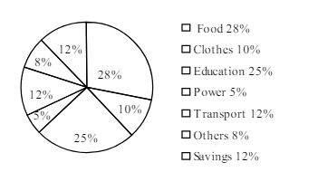
The pie-chart below shows the percentage of a family's household income distributed into different categories. Describe the pie-chart in 150 words:— question image

উত্তর ও ব্যাখ্যা দেখতে ফ্রি রেজিস্ট্রেশন করো

ফ্রি শুরু করো

2.সৃজনশীল প্রশ্ন · Barisal

Barisal Board · 2017

The pie-chart below shows the percentage of a family's household income distributed into different categories. Describe the pie-chart in 150 words:— question image

উত্তর ও ব্যাখ্যা দেখতে ফ্রি রেজিস্ট্রেশন করো

ফ্রি শুরু করো

3.সৃজনশীল প্রশ্ন · Sylhet

Sylhet Board · 2017

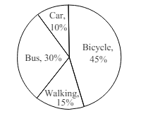
The pie chart below shows the percentages of transportation used by 800 students come\to come \to college. Describe the chart in 150 words. question image

উত্তর ও ব্যাখ্যা দেখতে ফ্রি রেজিস্ট্রেশন করো

ফ্রি শুরু করো

4.সৃজনশীল প্রশ্ন · Sylhet

Sylhet Board · 2017

The pie chart below shows the percentages of transportation used by 800 students come\to come \to college. Describe the chart in 150 words. question image

উত্তর ও ব্যাখ্যা দেখতে ফ্রি রেজিস্ট্রেশন করো

ফ্রি শুরু করো

5.সৃজনশীল প্রশ্ন · Chittagong

Chittagong Board · 2017

The graph chart shows the choice of profession by educated people in our country. Describe the graph in at least 150 words:—

উত্তর ও ব্যাখ্যা দেখতে ফ্রি রেজিস্ট্রেশন করো

ফ্রি শুরু করো

6.সৃজনশীল প্রশ্ন · Chittagong

Chittagong Board · 2017

The graph chart shows the choice of profession by educated people in our country. Describe the graph in at least 150 words:—

উত্তর ও ব্যাখ্যা দেখতে ফ্রি রেজিস্ট্রেশন করো

ফ্রি শুরু করো

7.সৃজনশীল প্রশ্ন · Comilla

Comilla Board · 2017

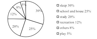
The pie chart below shows the time allocation of studentsdailystudents^{\prime} daily activities. Analyse the chart focussing the main preoccupations. (At least in 150 words) question image

উত্তর ও ব্যাখ্যা দেখতে ফ্রি রেজিস্ট্রেশন করো

ফ্রি শুরু করো

8.সৃজনশীল প্রশ্ন · Comilla

Comilla Board · 2017

The pie chart below shows the time allocation of studentsdailystudents^{\prime} daily activities. Analyse the chart focussing the main preoccupations. (At least in 150 words) question image

উত্তর ও ব্যাখ্যা দেখতে ফ্রি রেজিস্ট্রেশন করো

ফ্রি শুরু করো

9.সৃজনশীল প্রশ্ন · Jessore

Jessore Board · 2017

The graph below shows "The number of people living below the poverty line from 1995 to 2010". Describe the graph in 150 words. You should highlight and summarize the information given in the graph.

উত্তর ও ব্যাখ্যা দেখতে ফ্রি রেজিস্ট্রেশন করো

ফ্রি শুরু করো

10.সৃজনশীল প্রশ্ন · Jessore

Jessore Board · 2017

The graph below shows "The number of people living below the poverty line from 1995 to 2010". Describe the graph in 150 words. You should highlight and summarize the information given in the graph.

উত্তর ও ব্যাখ্যা দেখতে ফ্রি রেজিস্ট্রেশন করো

ফ্রি শুরু করো

11.সৃজনশীল প্রশ্ন · Dinajpur

Dinajpur Board · 2017

Look at the chart below. It shows the sources of air pollution in a city. Now, analyze the chart in at least 150 words focusing the main aspects.

উত্তর ও ব্যাখ্যা দেখতে ফ্রি রেজিস্ট্রেশন করো

ফ্রি শুরু করো

12.সৃজনশীল প্রশ্ন · Dinajpur

Dinajpur Board · 2017

Look at the chart below. It shows the sources of air pollution in a city. Now, analyze the chart in at least 150 words focusing the main aspects.

উত্তর ও ব্যাখ্যা দেখতে ফ্রি রেজিস্ট্রেশন করো

ফ্রি শুরু করো

আরো প্রশ্ন দেখো

আরো হাজারো প্রশ্ন + মডেল টেস্ট

ফ্রি রেজিস্ট্রেশন করো — ফেভারিট, AI টিউটর, লিডারবোর্ড ও অ্যানালিটিক্স আনলক করো।