শেয়ারFacebookWhatsApp

The graph chart show the choice of profession by educated people in our country. describe the graph in 150 words. [চিত্র]

উত্তর: Ans: The graph shows the choice of profession by educated people. The graph shows that the highest position of education people choose government job as they are profession all career. In percentage, 60% out of 100 have shown their preference in government job. Next comes banking which is choice of 40% educated people as they are profession. And 30% of people like teaching, next come business which is choice of 20% education people as their profession.then comes farming, only 10% of the educated people choose farming as their profession. The rest of the lowest position of education people have been found to choose research work of different types, and only 5% from the graph is found that most of the educated people choose a job that can ensure the future security. And a small portion of educated people like selg employment and farming. But it is not helpful. The government should take effective step to encourage educated people to engage informing as ours in an agricultural country. Also, educated people should be enquirers in business or self employment. বাংলা অনুবাদঃ গ্রাফটি শিক্ষিত মানুষের পেশা নির্বাচনের চিত্র তুলে ধরে। গ্রাফ অনুযায়ী, শিক্ষিত মানুষের মধ্যে সর্বাধিক সংখ্যক, অর্থাৎ ৬০%, তাদের পেশা হিসেবে সরকারি চাকরি বেছে নেয়। এরপর ব্যাংকিং পেশা রয়েছে, যা ৪০% শিক্ষিত মানুষের পছন্দ। ৩০% মানুষ শিক্ষকতা পেশা পছন্দ করে, এরপর ব্যবসা আসে, যা ২০% শিক্ষিত মানুষের পছন্দ। এরপর কৃষিকাজ, যা মাত্র ১০% শিক্ষিত মানুষ বেছে নেয়। সবচেয়ে কম সংখ্যক শিক্ষিত মানুষ গবেষণা কাজে আগ্রহী, যা মাত্র ৫%। গ্রাফ থেকে স্পষ্ট যে অধিকাংশ শিক্ষিত মানুষ এমন পেশা বেছে নেয় যা তাদের ভবিষ্যৎ নিরাপত্তা নিশ্চিত করতে পারে। তবে, একটি ছোট অংশ স্ব-কর্মসংস্থান এবং কৃষিকাজ পছন্দ করে, যা দেশের জন্য যথেষ্ট সহায়ক নয়। আমাদের একটি কৃষিভিত্তিক দেশ হওয়ায় সরকারকে কার্যকর পদক্ষেপ নিতে হবে যাতে শিক্ষিত মানুষ কৃষিকাজে আগ্রহী হয়। একইসঙ্গে, শিক্ষিত মানুষকে ব্যবসা বা স্ব-কর্মসংস্থানে আগ্রহী হতে উৎসাহিত করা উচিত।

HSC English 1st Paper Writing : Interpreting graph/chart CQ — Prosthuti প্রশ্নব্যাংক

HSC · English 1st Paper · Writing : Interpreting graph/chart · সৃজনশীল

The graph chart show the choice of profession by educated people in…

Dhaka Board · 2023

উত্তর
Ans: The graph shows the choice of profession by educated people. The graph shows that the highest position of education people choose government job as they are profession all career. In percentage, 60% out of 100 have shown their preference in government job. Next comes banking which is choice of 40% educated people as they are profession. And 30% of people like teaching, next come business which is choice of 20% education people as their profession.then comes farming, only 10% of the educated people choose farming as their profession. The rest of the lowest position of education people have been found to choose research work of different types, and only 5% from the graph is found that most of the educated people choose a job that can ensure the future security. And a small portion of educated people like selg employment and farming. But it is not helpful. The government should take effective step to encourage educated people to engage informing as ours in an agricultural country. Also, educated people should be enquirers in business or self employment. বাংলা অনুবাদঃ গ্রাফটি শিক্ষিত মানুষের পেশা নির্বাচনের চিত্র তুলে ধরে। গ্রাফ অনুযায়ী, শিক্ষিত মানুষের মধ্যে সর্বাধিক সংখ্যক, অর্থাৎ ৬০%, তাদের পেশা হিসেবে সরকারি চাকরি বেছে নেয়। এরপর ব্যাংকিং পেশা রয়েছে, যা ৪০% শিক্ষিত মানুষের পছন্দ। ৩০% মানুষ শিক্ষকতা পেশা পছন্দ করে, এরপর ব্যবসা আসে, যা ২০% শিক্ষিত মানুষের পছন্দ। এরপর কৃষিকাজ, যা মাত্র ১০% শিক্ষিত মানুষ বেছে নেয়। সবচেয়ে কম সংখ্যক শিক্ষিত মানুষ গবেষণা কাজে আগ্রহী, যা মাত্র ৫%। গ্রাফ থেকে স্পষ্ট যে অধিকাংশ শিক্ষিত মানুষ এমন পেশা বেছে নেয় যা তাদের ভবিষ্যৎ নিরাপত্তা নিশ্চিত করতে পারে। তবে, একটি ছোট অংশ স্ব-কর্মসংস্থান এবং কৃষিকাজ পছন্দ করে, যা দেশের জন্য যথেষ্ট সহায়ক নয়। আমাদের একটি কৃষিভিত্তিক দেশ হওয়ায় সরকারকে কার্যকর পদক্ষেপ নিতে হবে যাতে শিক্ষিত মানুষ কৃষিকাজে আগ্রহী হয়। একইসঙ্গে, শিক্ষিত মানুষকে ব্যবসা বা স্ব-কর্মসংস্থানে আগ্রহী হতে উৎসাহিত করা উচিত।
HSCEnglish 1st PaperWriting : Interpreting graph/chartDhaka
12টি সম্পর্কিত প্রশ্ন — উত্তর ও ব্যাখ্যা লকড

1.সৃজনশীল প্রশ্ন · Barisal

Barisal Board · 2017

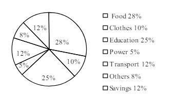
The pie-chart below shows the percentage of a family's household income distributed into different categories. Describe the pie-chart in 150 words:— question image

উত্তর ও ব্যাখ্যা দেখতে ফ্রি রেজিস্ট্রেশন করো

ফ্রি শুরু করো

2.সৃজনশীল প্রশ্ন · Barisal

Barisal Board · 2017

The pie-chart below shows the percentage of a family's household income distributed into different categories. Describe the pie-chart in 150 words:— question image

উত্তর ও ব্যাখ্যা দেখতে ফ্রি রেজিস্ট্রেশন করো

ফ্রি শুরু করো

3.সৃজনশীল প্রশ্ন · Sylhet

Sylhet Board · 2017

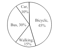
The pie chart below shows the percentages of transportation used by 800 students come\to come \to college. Describe the chart in 150 words. question image

উত্তর ও ব্যাখ্যা দেখতে ফ্রি রেজিস্ট্রেশন করো

ফ্রি শুরু করো

4.সৃজনশীল প্রশ্ন · Sylhet

Sylhet Board · 2017

The pie chart below shows the percentages of transportation used by 800 students come\to come \to college. Describe the chart in 150 words. question image

উত্তর ও ব্যাখ্যা দেখতে ফ্রি রেজিস্ট্রেশন করো

ফ্রি শুরু করো

5.সৃজনশীল প্রশ্ন · Chittagong

Chittagong Board · 2017

The graph chart shows the choice of profession by educated people in our country. Describe the graph in at least 150 words:—

উত্তর ও ব্যাখ্যা দেখতে ফ্রি রেজিস্ট্রেশন করো

ফ্রি শুরু করো

6.সৃজনশীল প্রশ্ন · Chittagong

Chittagong Board · 2017

The graph chart shows the choice of profession by educated people in our country. Describe the graph in at least 150 words:—

উত্তর ও ব্যাখ্যা দেখতে ফ্রি রেজিস্ট্রেশন করো

ফ্রি শুরু করো

7.সৃজনশীল প্রশ্ন · Comilla

Comilla Board · 2017

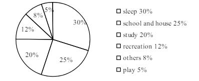
The pie chart below shows the time allocation of studentsdailystudents^{\prime} daily activities. Analyse the chart focussing the main preoccupations. (At least in 150 words) question image

উত্তর ও ব্যাখ্যা দেখতে ফ্রি রেজিস্ট্রেশন করো

ফ্রি শুরু করো

8.সৃজনশীল প্রশ্ন · Comilla

Comilla Board · 2017

The pie chart below shows the time allocation of studentsdailystudents^{\prime} daily activities. Analyse the chart focussing the main preoccupations. (At least in 150 words) question image

উত্তর ও ব্যাখ্যা দেখতে ফ্রি রেজিস্ট্রেশন করো

ফ্রি শুরু করো

9.সৃজনশীল প্রশ্ন · Jessore

Jessore Board · 2017

The graph below shows "The number of people living below the poverty line from 1995 to 2010". Describe the graph in 150 words. You should highlight and summarize the information given in the graph.

উত্তর ও ব্যাখ্যা দেখতে ফ্রি রেজিস্ট্রেশন করো

ফ্রি শুরু করো

10.সৃজনশীল প্রশ্ন · Jessore

Jessore Board · 2017

The graph below shows "The number of people living below the poverty line from 1995 to 2010". Describe the graph in 150 words. You should highlight and summarize the information given in the graph.

উত্তর ও ব্যাখ্যা দেখতে ফ্রি রেজিস্ট্রেশন করো

ফ্রি শুরু করো

11.সৃজনশীল প্রশ্ন · Dinajpur

Dinajpur Board · 2017

Look at the chart below. It shows the sources of air pollution in a city. Now, analyze the chart in at least 150 words focusing the main aspects.

উত্তর ও ব্যাখ্যা দেখতে ফ্রি রেজিস্ট্রেশন করো

ফ্রি শুরু করো

12.সৃজনশীল প্রশ্ন · Dinajpur

Dinajpur Board · 2017

Look at the chart below. It shows the sources of air pollution in a city. Now, analyze the chart in at least 150 words focusing the main aspects.

উত্তর ও ব্যাখ্যা দেখতে ফ্রি রেজিস্ট্রেশন করো

ফ্রি শুরু করো

আরো প্রশ্ন দেখো

আরো হাজারো প্রশ্ন + মডেল টেস্ট

ফ্রি রেজিস্ট্রেশন করো — ফেভারিট, AI টিউটর, লিডারবোর্ড ও অ্যানালিটিক্স আনলক করো।