শেয়ারFacebookWhatsApp

The graph below shows "The number of internet users in town and village from 2010 to 2015". Describe the graph in 150 words. You should highlight and summarize the information given in the graph :

উত্তর: The number of Internet users in towns and villages 2010-2015 (in %) The graph, the outcome of a survey, indicates the percentage of the number of Internet users in towns and villages. The survey period ranges from 2010 to 2015. The graph covering these 6 years shows that the percentage of the number of Internet users is rising rapidly and constantly. In 2010, the first year of the survey period, we find that the number of Internet users in towns was 10% of the city dwellers and it rose to 14% in the next year. On the other hand, the number of Internet users in villages was only 4% of the total villagers in 2010 which rose to 5% in 2011. The next year that is in 2012, Internet using population rose from 14% to 20% in towns and from 5% to 8% in villages. The graph indicates the rapid increase of the Internet users both in towns and villages. The year 2013, shows the Internet users in towns and villages to be 27% and 13% respectively. In 2014, we notice that the number of Internet users in towns rose to 35% which was 27% in the previous year. Though the percentage of Internet users in villages increased rapidly rising from 4% to 20% in 5 years, It was small compared with the 35% users in towns. The Internet users in towns and villages in 2015 increased to 45% and 25% respectively. tech dome. However, the tendency of using Internet is increasing rapidly both in towns and villages owing to its great utility in modern and globalized world. বাংলা অনুবাদঃ গ্রাফটি একটি জরিপের ফলাফল তুলে ধরে, যা ২০১০ থেকে ২০১৫ সাল পর্যন্ত শহর ও গ্রামের ইন্টারনেট ব্যবহারকারীদের শতকরা হার প্রদর্শন করে। গ্রাফে দেখা যায়, এই ৬ বছরে ইন্টারনেট ব্যবহারকারীদের হার দ্রুত এবং ধারাবাহিকভাবে বৃদ্ধি পাচ্ছে। ২০১০ সালে জরিপের প্রথম বছরে, শহরের মোট জনসংখ্যার ১০% ইন্টারনেট ব্যবহার করত, যা পরের বছর ২০১১ সালে বেড়ে ১৪%-এ পৌঁছায়। অন্যদিকে, গ্রামে ২০১০ সালে ইন্টারনেট ব্যবহারকারীর সংখ্যা ছিল মোট গ্রামবাসীর মাত্র ৪%, যা ২০১১ সালে ৫%-এ পৌঁছায়। ২০১২ সালে শহরে ইন্টারনেট ব্যবহারকারীর হার ১৪% থেকে ২০%-এ বৃদ্ধি পায় এবং গ্রামে এই হার ৫% থেকে ৮%-এ উন্নীত হয়। গ্রাফটি শহর এবং গ্রামে ইন্টারনেট ব্যবহারকারীদের দ্রুত বৃদ্ধি নির্দেশ করে। ২০১৩ সালে শহরে ইন্টারনেট ব্যবহারকারীর হার ২৭% এবং গ্রামে ১৩% ছিল। ২০১৪ সালে শহরের ইন্টারনেট ব্যবহারকারীর হার ২৭% থেকে বেড়ে ৩৫%-এ পৌঁছায়। যদিও গ্রামে ইন্টারনেট ব্যবহারকারীদের হার দ্রুত বৃদ্ধি পেয়ে ৫ বছরে ৪% থেকে ২০%-এ পৌঁছায়, এটি শহরের ৩৫% ব্যবহারকারীর তুলনায় কম ছিল। ২০১৫ সালে শহরে ইন্টারনেট ব্যবহারকারীর হার বৃদ্ধি পেয়ে ৪৫% এবং গ্রামে ২৫%-এ পৌঁছায়। তবে, ইন্টারনেট ব্যবহারের প্রবণতা শহর এবং গ্রামে দ্রুত বৃদ্ধি পাচ্ছে, যা আধুনিক এবং বিশ্বায়িত বিশ্বের গুরুত্বপূর্ণ চাহিদা পূরণ করছে।

HSC English 1st Paper Writing : Interpreting graph/chart CQ — Prosthuti প্রশ্নব্যাংক

HSC · English 1st Paper · Writing : Interpreting graph/chart · সৃজনশীল

The graph below shows "The number of internet users in town and vil…

Barisal Board · 2019

উত্তর

The number of Internet users in towns and villages 2010-2015 (in %) The graph, the outcome of a survey, indicates the percentage of the number of Internet users in towns and villages. The survey period ranges from 2010 to 2015. The graph covering these 6 years shows that the percentage of the number of Internet users is rising rapidly and constantly. In 2010, the first year of the survey period, we find that the number of Internet users in towns was 10% of the city dwellers and it rose to 14% in the next year. On the other hand, the number of Internet users in villages was only 4% of the total villagers in 2010 which rose to 5% in 2011. The next year that is in 2012, Internet using population rose from 14% to 20% in towns and from 5% to 8% in villages. The graph indicates the rapid increase of the Internet users both in towns and villages. The year 2013, shows the Internet users in towns and villages to be 27% and 13% respectively. In 2014, we notice that the number of Internet users in towns rose to 35% which was 27% in the previous year. Though the percentage of Internet users in villages increased rapidly rising from 4% to 20% in 5 years, It was small compared with the 35% users in towns. The Internet users in towns and villages in 2015 increased to 45% and 25% respectively. tech dome. However, the tendency of using Internet is increasing rapidly both in towns and villages owing to its great utility in modern and globalized world. বাংলা অনুবাদঃ গ্রাফটি একটি জরিপের ফলাফল তুলে ধরে, যা ২০১০ থেকে ২০১৫ সাল পর্যন্ত শহর ও গ্রামের ইন্টারনেট ব্যবহারকারীদের শতকরা হার প্রদর্শন করে। গ্রাফে দেখা যায়, এই ৬ বছরে ইন্টারনেট ব্যবহারকারীদের হার দ্রুত এবং ধারাবাহিকভাবে বৃদ্ধি পাচ্ছে। ২০১০ সালে জরিপের প্রথম বছরে, শহরের মোট জনসংখ্যার ১০% ইন্টারনেট ব্যবহার করত, যা পরের বছর ২০১১ সালে বেড়ে ১৪%-এ পৌঁছায়। অন্যদিকে, গ্রামে ২০১০ সালে ইন্টারনেট ব্যবহারকারীর সংখ্যা ছিল মোট গ্রামবাসীর মাত্র ৪%, যা ২০১১ সালে ৫%-এ পৌঁছায়। ২০১২ সালে শহরে ইন্টারনেট ব্যবহারকারীর হার ১৪% থেকে ২০%-এ বৃদ্ধি পায় এবং গ্রামে এই হার ৫% থেকে ৮%-এ উন্নীত হয়। গ্রাফটি শহর এবং গ্রামে ইন্টারনেট ব্যবহারকারীদের দ্রুত বৃদ্ধি নির্দেশ করে। ২০১৩ সালে শহরে ইন্টারনেট ব্যবহারকারীর হার ২৭% এবং গ্রামে ১৩% ছিল। ২০১৪ সালে শহরের ইন্টারনেট ব্যবহারকারীর হার ২৭% থেকে বেড়ে ৩৫%-এ পৌঁছায়। যদিও গ্রামে ইন্টারনেট ব্যবহারকারীদের হার দ্রুত বৃদ্ধি পেয়ে ৫ বছরে ৪% থেকে ২০%-এ পৌঁছায়, এটি শহরের ৩৫% ব্যবহারকারীর তুলনায় কম ছিল। ২০১৫ সালে শহরে ইন্টারনেট ব্যবহারকারীর হার বৃদ্ধি পেয়ে ৪৫% এবং গ্রামে ২৫%-এ পৌঁছায়। তবে, ইন্টারনেট ব্যবহারের প্রবণতা শহর এবং গ্রামে দ্রুত বৃদ্ধি পাচ্ছে, যা আধুনিক এবং বিশ্বায়িত বিশ্বের গুরুত্বপূর্ণ চাহিদা পূরণ করছে।
HSCEnglish 1st PaperWriting : Interpreting graph/chartBarisal
12টি সম্পর্কিত প্রশ্ন — উত্তর ও ব্যাখ্যা লকড

1.সৃজনশীল প্রশ্ন · Barisal

Barisal Board · 2017

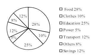
The pie-chart below shows the percentage of a family's household income distributed into different categories. Describe the pie-chart in 150 words:— question image

উত্তর ও ব্যাখ্যা দেখতে ফ্রি রেজিস্ট্রেশন করো

ফ্রি শুরু করো

2.সৃজনশীল প্রশ্ন · Barisal

Barisal Board · 2017

The pie-chart below shows the percentage of a family's household income distributed into different categories. Describe the pie-chart in 150 words:— question image

উত্তর ও ব্যাখ্যা দেখতে ফ্রি রেজিস্ট্রেশন করো

ফ্রি শুরু করো

3.সৃজনশীল প্রশ্ন · Sylhet

Sylhet Board · 2017

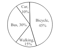
The pie chart below shows the percentages of transportation used by 800 students come\to come \to college. Describe the chart in 150 words. question image

উত্তর ও ব্যাখ্যা দেখতে ফ্রি রেজিস্ট্রেশন করো

ফ্রি শুরু করো

4.সৃজনশীল প্রশ্ন · Sylhet

Sylhet Board · 2017

The pie chart below shows the percentages of transportation used by 800 students come\to come \to college. Describe the chart in 150 words. question image

উত্তর ও ব্যাখ্যা দেখতে ফ্রি রেজিস্ট্রেশন করো

ফ্রি শুরু করো

5.সৃজনশীল প্রশ্ন · Chittagong

Chittagong Board · 2017

The graph chart shows the choice of profession by educated people in our country. Describe the graph in at least 150 words:—

উত্তর ও ব্যাখ্যা দেখতে ফ্রি রেজিস্ট্রেশন করো

ফ্রি শুরু করো

6.সৃজনশীল প্রশ্ন · Chittagong

Chittagong Board · 2017

The graph chart shows the choice of profession by educated people in our country. Describe the graph in at least 150 words:—

উত্তর ও ব্যাখ্যা দেখতে ফ্রি রেজিস্ট্রেশন করো

ফ্রি শুরু করো

7.সৃজনশীল প্রশ্ন · Comilla

Comilla Board · 2017

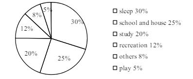
The pie chart below shows the time allocation of studentsdailystudents^{\prime} daily activities. Analyse the chart focussing the main preoccupations. (At least in 150 words) question image

উত্তর ও ব্যাখ্যা দেখতে ফ্রি রেজিস্ট্রেশন করো

ফ্রি শুরু করো

8.সৃজনশীল প্রশ্ন · Comilla

Comilla Board · 2017

The pie chart below shows the time allocation of studentsdailystudents^{\prime} daily activities. Analyse the chart focussing the main preoccupations. (At least in 150 words) question image

উত্তর ও ব্যাখ্যা দেখতে ফ্রি রেজিস্ট্রেশন করো

ফ্রি শুরু করো

9.সৃজনশীল প্রশ্ন · Jessore

Jessore Board · 2017

The graph below shows "The number of people living below the poverty line from 1995 to 2010". Describe the graph in 150 words. You should highlight and summarize the information given in the graph.

উত্তর ও ব্যাখ্যা দেখতে ফ্রি রেজিস্ট্রেশন করো

ফ্রি শুরু করো

10.সৃজনশীল প্রশ্ন · Jessore

Jessore Board · 2017

The graph below shows "The number of people living below the poverty line from 1995 to 2010". Describe the graph in 150 words. You should highlight and summarize the information given in the graph.

উত্তর ও ব্যাখ্যা দেখতে ফ্রি রেজিস্ট্রেশন করো

ফ্রি শুরু করো

11.সৃজনশীল প্রশ্ন · Dinajpur

Dinajpur Board · 2017

Look at the chart below. It shows the sources of air pollution in a city. Now, analyze the chart in at least 150 words focusing the main aspects.

উত্তর ও ব্যাখ্যা দেখতে ফ্রি রেজিস্ট্রেশন করো

ফ্রি শুরু করো

12.সৃজনশীল প্রশ্ন · Dinajpur

Dinajpur Board · 2017

Look at the chart below. It shows the sources of air pollution in a city. Now, analyze the chart in at least 150 words focusing the main aspects.

উত্তর ও ব্যাখ্যা দেখতে ফ্রি রেজিস্ট্রেশন করো

ফ্রি শুরু করো

আরো প্রশ্ন দেখো

আরো হাজারো প্রশ্ন + মডেল টেস্ট

ফ্রি রেজিস্ট্রেশন করো — ফেভারিট, AI টিউটর, লিডারবোর্ড ও অ্যানালিটিক্স আনলক করো।