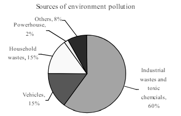
Look at the chart below. It shows the sources of environment pollution in a city. Now, analyse the chart in at least 80 words. You should highlight the information and the main features given in the chart: [চিত্র]
উত্তর: The percentage of travellers in Bangladesh travelling in different transportations per day The pie chart shows the percentage of travellers in Bangladesh travelling in different transportations per day. There are five types of transportations shown in the pie chart. They are land vehicles, train, launch and steamer, bicycle and others and boats. As per the information contained in the pie chart, we find that of the five types of transportations, the highest percentage of the travellers use land vehicles. 75% of the travellers use land vehicles as their transportation while 10% of them use train, 8% use launch and steamer. 2% of the travellers use bicycle and others and 5% of the travellers use boats. A detailed study of the pie chart provides us with the information that the majority of the travellers (75%) avail themselves of land vehicles. Hence, land vehicles occupy the lion's share of the travelling mechanism. Bicycles and related vehicles hold the minimum share of the travelling mechanism. বাংলা অনুবাদঃ পাই চার্টটি বাংলাদেশে দৈনিক বিভিন্ন পরিবহনে ভ্রমণকারী মানুষের শতকরা হার প্রদর্শন করে। চার্টে পাঁচ ধরনের পরিবহন দেখানো হয়েছে: স্থল পরিবহন, ট্রেন, লঞ্চ ও স্টিমার, সাইকেল এবং অন্যান্য, এবং নৌকা। চার্টের তথ্য অনুযায়ী, পাঁচ ধরনের পরিবহনের মধ্যে স্থল পরিবহনে ভ্রমণকারীদের হার সর্বাধিক। ৭৫% ভ্রমণকারী স্থল পরিবহন ব্যবহার করে, যেখানে ১০% ট্রেন, ৮% লঞ্চ ও স্টিমার, ২% সাইকেল এবং অন্যান্য যানবাহন, এবং ৫% নৌকা ব্যবহার করে। পাই চার্টের বিশ্লেষণ থেকে জানা যায় যে, অধিকাংশ ভ্রমণকারী (৭৫%) স্থল পরিবহন ব্যবহার করেন। ফলে, স্থল পরিবহন ভ্রমণের ক্ষেত্রে প্রধান ভূমিকা পালন করে। অন্যদিকে, সাইকেল এবং সংশ্লিষ্ট যানবাহনের ব্যবহার ভ্রমণের ক্ষেত্রে সবচেয়ে কম।
HSC English 1st Paper Writing : Interpreting graph/chart CQ — Prosthuti প্রশ্নব্যাংক
HSC · English 1st Paper · Writing : Interpreting graph/chart · সৃজনশীল
Look at the chart below. It shows the sources of environment pollution in a city. Now, analyse the chart in at least 80 words. You should highlight the information and the main features given in the chart:
উত্তর