শেয়ারFacebookWhatsApp

Look at the chart below. It shows the sources of environment pollution in a city. Now, analyse the chart in at least 80 words. You should highlight the information and the main features given in the chart: [চিত্র]

উত্তর: Sources of environment pollution in a city The given pie chart shows the sources of environment pollution in a city. Here five types of sources are taken into consideration for their contribution to the pollution of the city. As per the pieces of information contained in the chart, we observe that only industrial wastes and toxic chemicals contribute 55% of the total role to pollution. Then comes the turn of vehicles. contributing 17% and of household wastes having 15% of role in the pollution process. Powerhouse contributes 8%, followed by miscellaneous things which contribute 5% of pollutions. A critical analysis of the chart bade us to believe that the pollution of the city is mainly caused by wastes of all types. It is really alarming that if this trend continues, the city in question will be quite uninhabítable. Use of vehicles is necessary to control. বাংলা অনুবাদঃ উপস্থাপিত পাই চার্টটি একটি শহরের পরিবেশ দূষণের উৎসগুলো প্রদর্শন করে। এখানে পাঁচটি উৎসের অবদানকে বিবেচনায় নেওয়া হয়েছে, যা শহরের দূষণের জন্য দায়ী। চার্টের তথ্য অনুযায়ী, শিল্প বর্জ্য এবং বিষাক্ত রাসায়নিক মোট দূষণের ৫৫% অবদান রাখে। এরপর যানবাহনের অবস্থান, যা ১৭% এবং গৃহস্থালি বর্জ্য, যা ১৫% দূষণের জন্য দায়ী। পাওয়ারহাউস ৮% এবং বিভিন্ন অন্যান্য উৎস ৫% দূষণে অবদান রাখে। চার্টের গভীর বিশ্লেষণ আমাদের বিশ্বাস করায় যে শহরের দূষণ প্রধানত বিভিন্ন ধরনের বর্জ্যের কারণে ঘটে। এটি সত্যিই উদ্বেগজনক যে, যদি এই প্রবণতা অব্যাহত থাকে, তবে সংশ্লিষ্ট শহরটি বসবাসের অযোগ্য হয়ে উঠবে। যানবাহনের ব্যবহারের উপর নিয়ন্ত্রণ আনা অত্যন্ত জরুরি।

HSC English 1st Paper Writing : Interpreting graph/chart CQ — Prosthuti প্রশ্নব্যাংক

HSC · English 1st Paper · Writing : Interpreting graph/chart · সৃজনশীল

Look at the chart below. It shows the sources of environment pollut…

Dinajpur Board · 2019

উত্তর
Sources of environment pollution in a city The given pie chart shows the sources of environment pollution in a city. Here five types of sources are taken into consideration for their contribution to the pollution of the city. As per the pieces of information contained in the chart, we observe that only industrial wastes and toxic chemicals contribute 55% of the total role to pollution. Then comes the turn of vehicles. contributing 17% and of household wastes having 15% of role in the pollution process. Powerhouse contributes 8%, followed by miscellaneous things which contribute 5% of pollutions. A critical analysis of the chart bade us to believe that the pollution of the city is mainly caused by wastes of all types. It is really alarming that if this trend continues, the city in question will be quite uninhabítable. Use of vehicles is necessary to control. বাংলা অনুবাদঃ উপস্থাপিত পাই চার্টটি একটি শহরের পরিবেশ দূষণের উৎসগুলো প্রদর্শন করে। এখানে পাঁচটি উৎসের অবদানকে বিবেচনায় নেওয়া হয়েছে, যা শহরের দূষণের জন্য দায়ী। চার্টের তথ্য অনুযায়ী, শিল্প বর্জ্য এবং বিষাক্ত রাসায়নিক মোট দূষণের ৫৫% অবদান রাখে। এরপর যানবাহনের অবস্থান, যা ১৭% এবং গৃহস্থালি বর্জ্য, যা ১৫% দূষণের জন্য দায়ী। পাওয়ারহাউস ৮% এবং বিভিন্ন অন্যান্য উৎস ৫% দূষণে অবদান রাখে। চার্টের গভীর বিশ্লেষণ আমাদের বিশ্বাস করায় যে শহরের দূষণ প্রধানত বিভিন্ন ধরনের বর্জ্যের কারণে ঘটে। এটি সত্যিই উদ্বেগজনক যে, যদি এই প্রবণতা অব্যাহত থাকে, তবে সংশ্লিষ্ট শহরটি বসবাসের অযোগ্য হয়ে উঠবে। যানবাহনের ব্যবহারের উপর নিয়ন্ত্রণ আনা অত্যন্ত জরুরি।
HSCEnglish 1st PaperWriting : Interpreting graph/chartDinajpur
12টি সম্পর্কিত প্রশ্ন — উত্তর ও ব্যাখ্যা লকড

1.সৃজনশীল প্রশ্ন · Barisal

Barisal Board · 2017

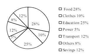
The pie-chart below shows the percentage of a family's household income distributed into different categories. Describe the pie-chart in 150 words:— question image

উত্তর ও ব্যাখ্যা দেখতে ফ্রি রেজিস্ট্রেশন করো

ফ্রি শুরু করো

2.সৃজনশীল প্রশ্ন · Barisal

Barisal Board · 2017

The pie-chart below shows the percentage of a family's household income distributed into different categories. Describe the pie-chart in 150 words:— question image

উত্তর ও ব্যাখ্যা দেখতে ফ্রি রেজিস্ট্রেশন করো

ফ্রি শুরু করো

3.সৃজনশীল প্রশ্ন · Sylhet

Sylhet Board · 2017

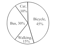
The pie chart below shows the percentages of transportation used by 800 students come\to come \to college. Describe the chart in 150 words. question image

উত্তর ও ব্যাখ্যা দেখতে ফ্রি রেজিস্ট্রেশন করো

ফ্রি শুরু করো

4.সৃজনশীল প্রশ্ন · Sylhet

Sylhet Board · 2017

The pie chart below shows the percentages of transportation used by 800 students come\to come \to college. Describe the chart in 150 words. question image

উত্তর ও ব্যাখ্যা দেখতে ফ্রি রেজিস্ট্রেশন করো

ফ্রি শুরু করো

5.সৃজনশীল প্রশ্ন · Chittagong

Chittagong Board · 2017

The graph chart shows the choice of profession by educated people in our country. Describe the graph in at least 150 words:—

উত্তর ও ব্যাখ্যা দেখতে ফ্রি রেজিস্ট্রেশন করো

ফ্রি শুরু করো

6.সৃজনশীল প্রশ্ন · Chittagong

Chittagong Board · 2017

The graph chart shows the choice of profession by educated people in our country. Describe the graph in at least 150 words:—

উত্তর ও ব্যাখ্যা দেখতে ফ্রি রেজিস্ট্রেশন করো

ফ্রি শুরু করো

7.সৃজনশীল প্রশ্ন · Comilla

Comilla Board · 2017

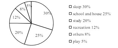
The pie chart below shows the time allocation of studentsdailystudents^{\prime} daily activities. Analyse the chart focussing the main preoccupations. (At least in 150 words) question image

উত্তর ও ব্যাখ্যা দেখতে ফ্রি রেজিস্ট্রেশন করো

ফ্রি শুরু করো

8.সৃজনশীল প্রশ্ন · Comilla

Comilla Board · 2017

The pie chart below shows the time allocation of studentsdailystudents^{\prime} daily activities. Analyse the chart focussing the main preoccupations. (At least in 150 words) question image

উত্তর ও ব্যাখ্যা দেখতে ফ্রি রেজিস্ট্রেশন করো

ফ্রি শুরু করো

9.সৃজনশীল প্রশ্ন · Jessore

Jessore Board · 2017

The graph below shows "The number of people living below the poverty line from 1995 to 2010". Describe the graph in 150 words. You should highlight and summarize the information given in the graph.

উত্তর ও ব্যাখ্যা দেখতে ফ্রি রেজিস্ট্রেশন করো

ফ্রি শুরু করো

10.সৃজনশীল প্রশ্ন · Jessore

Jessore Board · 2017

The graph below shows "The number of people living below the poverty line from 1995 to 2010". Describe the graph in 150 words. You should highlight and summarize the information given in the graph.

উত্তর ও ব্যাখ্যা দেখতে ফ্রি রেজিস্ট্রেশন করো

ফ্রি শুরু করো

11.সৃজনশীল প্রশ্ন · Dinajpur

Dinajpur Board · 2017

Look at the chart below. It shows the sources of air pollution in a city. Now, analyze the chart in at least 150 words focusing the main aspects.

উত্তর ও ব্যাখ্যা দেখতে ফ্রি রেজিস্ট্রেশন করো

ফ্রি শুরু করো

12.সৃজনশীল প্রশ্ন · Dinajpur

Dinajpur Board · 2017

Look at the chart below. It shows the sources of air pollution in a city. Now, analyze the chart in at least 150 words focusing the main aspects.

উত্তর ও ব্যাখ্যা দেখতে ফ্রি রেজিস্ট্রেশন করো

ফ্রি শুরু করো

আরো প্রশ্ন দেখো

আরো হাজারো প্রশ্ন + মডেল টেস্ট

ফ্রি রেজিস্ট্রেশন করো — ফেভারিট, AI টিউটর, লিডারবোর্ড ও অ্যানালিটিক্স আনলক করো।