শেয়ারFacebookWhatsApp

The graph below shows shows 'Imports [গণিত] from 2000 [গণিত] 2011. Describe the graph in 150 words. You should highlight and summarize the information given in the graph. Imports (Billion $)

উত্তর: Imports from 2000 to 2011 (Billion $) The graph illustrates the annual imports (in billion dollars) from 2000 to 2011. Over this period, imports show a consistent upward trend with slight fluctuations. In 2000, imports started at 💲8.1 billion, followed by a gradual increase to 💲10.03 billion in 2004. From 2005 onwards, the rise becomes more significant, reaching 💲12.97 billion in 2005 and 💲13.77 billion in 2006. The years 2007 and 2008 witnessed further growth, with imports increasing to 💲16.67 billion and 💲19.58 billion, respectively. In 2009, imports slightly rose to 💲19.73 billion, followed by a jump to 💲21.34 billion in 2010. The highest growth occurred in 2011, with imports surging to 💲31.75 billion, marking the most significant annual increase in the entire period. This indicates a steady growth in imports, particularly during the last few years, reflecting possibly expanding trade or economic activities. বাংলা অনুবাদঃ গ্রাফটি ২০০০ থেকে ২০১১ সাল পর্যন্ত বার্ষিক আমদানির (বিলিয়ন ডলারে) তথ্য প্রদর্শন করে। এই সময়কালে আমদানিতে সামান্য ওঠানামা সত্ত্বেও একটি ধারাবাহিক ঊর্ধ্বমুখী প্রবণতা লক্ষ্য করা যায়। ২০০০ সালে আমদানির পরিমাণ ছিল [গণিত] ১০.০৩ বিলিয়নে পৌঁছায়। ২০০৫ সাল থেকে এই বৃদ্ধির গতি আরও উল্লেখযোগ্য হয়ে ওঠে, যখন আমদানি [গণিত] ১৩.৭৭ বিলিয়ন হয়। ২০০৭ এবং ২০০৮ সালে আমদানির পরিমাণ আরও বৃদ্ধি পেয়ে যথাক্রমে [গণিত] ১৯.৫৮ বিলিয়নে দাঁড়ায়। ২০০৯ সালে আমদানি সামান্য বৃদ্ধি পেয়ে [গণিত] ২১.৩৪ বিলিয়নে বৃদ্ধি পায়। ২০১১ সালে আমদানির পরিমাণ $৩১.৭৫ বিলিয়নে বৃদ্ধি পেয়ে সবচেয়ে বড় বার্ষিক বৃদ্ধির সূচনা করে। এটি পুরো সময়কালে সবচেয়ে উল্লেখযোগ্য বৃদ্ধি, যা সম্ভবত বাণিজ্য বা অর্থনৈতিক কার্যক্রমের প্রসারকে নির্দেশ করে। সামগ্রিকভাবে, গ্রাফটি আমদানিতে একটি স্থিতিশীল এবং ক্রমবর্ধমান প্রবণতা প্রতিফলিত করে, বিশেষত শেষ কয়েক বছরে।

HSC English 1st Paper Writing : Interpreting graph/chart CQ — Prosthuti প্রশ্নব্যাংক

HSC · English 1st Paper · Writing : Interpreting graph/chart · সৃজনশীল

The graph below shows shows 'Imports from 2000 2011. Describe the…

আদমজী ক্যান্টনমেন্ট কলেজ, ঢাকা · 2019

উত্তর
Imports from 2000 to 2011 (Billion \$) The graph illustrates the annual imports (in billion dollars) from 2000 to 2011. Over this period, imports show a consistent upward trend with slight fluctuations. In 2000, imports started at 💲8.1 billion, followed by a gradual increase to 💲10.03 billion in 2004. From 2005 onwards, the rise becomes more significant, reaching 💲12.97 billion in 2005 and 💲13.77 billion in 2006. The years 2007 and 2008 witnessed further growth, with imports increasing to 💲16.67 billion and 💲19.58 billion, respectively. In 2009, imports slightly rose to 💲19.73 billion, followed by a jump to 💲21.34 billion in 2010. The highest growth occurred in 2011, with imports surging to 💲31.75 billion, marking the most significant annual increase in the entire period. This indicates a steady growth in imports, particularly during the last few years, reflecting possibly expanding trade or economic activities. বাংলা অনুবাদঃ গ্রাফটি ২০০০ থেকে ২০১১ সাল পর্যন্ত বার্ষিক আমদানির (বিলিয়ন ডলারে) তথ্য প্রদর্শন করে। এই সময়কালে আমদানিতে সামান্য ওঠানামা সত্ত্বেও একটি ধারাবাহিক ঊর্ধ্বমুখী প্রবণতা লক্ষ্য করা যায়। ২০০০ সালে আমদানির পরিমাণ ছিল .১বিলিয়ন,যাধীরেধীরেবৃদ্ধিপেয়ে২০০৪সালে৮.১ বিলিয়ন, যা ধীরে ধীরে বৃদ্ধি পেয়ে ২০০৪ সালে১০.০৩ বিলিয়নে পৌঁছায়। ২০০৫ সাল থেকে এই বৃদ্ধির গতি আরও উল্লেখযোগ্য হয়ে ওঠে, যখন আমদানি ১২.৯৭বিলিয়নেপৌঁছেএবং২০০৬সালে১২.৯৭ বিলিয়নে পৌঁছে এবং ২০০৬ সালে১৩.৭৭ বিলিয়ন হয়। ২০০৭ এবং ২০০৮ সালে আমদানির পরিমাণ আরও বৃদ্ধি পেয়ে যথাক্রমে ১৬.৬৭বিলিয়নএবং১৬.৬৭ বিলিয়ন এবং১৯.৫৮ বিলিয়নে দাঁড়ায়। ২০০৯ সালে আমদানি সামান্য বৃদ্ধি পেয়ে ১৯.৭৩বিলিয়নেপৌঁছায়,যা২০১০সালে১৯.৭৩ বিলিয়নে পৌঁছায়, যা ২০১০ সালে২১.৩৪ বিলিয়নে বৃদ্ধি পায়। ২০১১ সালে আমদানির পরিমাণ $৩১.৭৫ বিলিয়নে বৃদ্ধি পেয়ে সবচেয়ে বড় বার্ষিক বৃদ্ধির সূচনা করে। এটি পুরো সময়কালে সবচেয়ে উল্লেখযোগ্য বৃদ্ধি, যা সম্ভবত বাণিজ্য বা অর্থনৈতিক কার্যক্রমের প্রসারকে নির্দেশ করে। সামগ্রিকভাবে, গ্রাফটি আমদানিতে একটি স্থিতিশীল এবং ক্রমবর্ধমান প্রবণতা প্রতিফলিত করে, বিশেষত শেষ কয়েক বছরে।
HSCEnglish 1st PaperWriting : Interpreting graph/chartআদমজী ক্যান্টনমেন্ট কলেজ, ঢাকা
12টি সম্পর্কিত প্রশ্ন — উত্তর ও ব্যাখ্যা লকড

1.সৃজনশীল প্রশ্ন · Barisal

Barisal Board · 2017

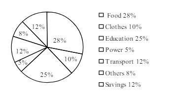
The pie-chart below shows the percentage of a family's household income distributed into different categories. Describe the pie-chart in 150 words:— question image

উত্তর ও ব্যাখ্যা দেখতে ফ্রি রেজিস্ট্রেশন করো

ফ্রি শুরু করো

2.সৃজনশীল প্রশ্ন · Barisal

Barisal Board · 2017

The pie-chart below shows the percentage of a family's household income distributed into different categories. Describe the pie-chart in 150 words:— question image

উত্তর ও ব্যাখ্যা দেখতে ফ্রি রেজিস্ট্রেশন করো

ফ্রি শুরু করো

3.সৃজনশীল প্রশ্ন · Sylhet

Sylhet Board · 2017

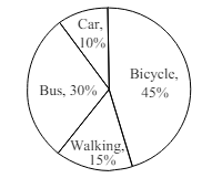
The pie chart below shows the percentages of transportation used by 800 students come\to come \to college. Describe the chart in 150 words. question image

উত্তর ও ব্যাখ্যা দেখতে ফ্রি রেজিস্ট্রেশন করো

ফ্রি শুরু করো

4.সৃজনশীল প্রশ্ন · Sylhet

Sylhet Board · 2017

The pie chart below shows the percentages of transportation used by 800 students come\to come \to college. Describe the chart in 150 words. question image

উত্তর ও ব্যাখ্যা দেখতে ফ্রি রেজিস্ট্রেশন করো

ফ্রি শুরু করো

5.সৃজনশীল প্রশ্ন · Chittagong

Chittagong Board · 2017

The graph chart shows the choice of profession by educated people in our country. Describe the graph in at least 150 words:—

উত্তর ও ব্যাখ্যা দেখতে ফ্রি রেজিস্ট্রেশন করো

ফ্রি শুরু করো

6.সৃজনশীল প্রশ্ন · Chittagong

Chittagong Board · 2017

The graph chart shows the choice of profession by educated people in our country. Describe the graph in at least 150 words:—

উত্তর ও ব্যাখ্যা দেখতে ফ্রি রেজিস্ট্রেশন করো

ফ্রি শুরু করো

7.সৃজনশীল প্রশ্ন · Comilla

Comilla Board · 2017

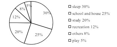
The pie chart below shows the time allocation of studentsdailystudents^{\prime} daily activities. Analyse the chart focussing the main preoccupations. (At least in 150 words) question image

উত্তর ও ব্যাখ্যা দেখতে ফ্রি রেজিস্ট্রেশন করো

ফ্রি শুরু করো

8.সৃজনশীল প্রশ্ন · Comilla

Comilla Board · 2017

The pie chart below shows the time allocation of studentsdailystudents^{\prime} daily activities. Analyse the chart focussing the main preoccupations. (At least in 150 words) question image

উত্তর ও ব্যাখ্যা দেখতে ফ্রি রেজিস্ট্রেশন করো

ফ্রি শুরু করো

9.সৃজনশীল প্রশ্ন · Jessore

Jessore Board · 2017

The graph below shows "The number of people living below the poverty line from 1995 to 2010". Describe the graph in 150 words. You should highlight and summarize the information given in the graph.

উত্তর ও ব্যাখ্যা দেখতে ফ্রি রেজিস্ট্রেশন করো

ফ্রি শুরু করো

10.সৃজনশীল প্রশ্ন · Jessore

Jessore Board · 2017

The graph below shows "The number of people living below the poverty line from 1995 to 2010". Describe the graph in 150 words. You should highlight and summarize the information given in the graph.

উত্তর ও ব্যাখ্যা দেখতে ফ্রি রেজিস্ট্রেশন করো

ফ্রি শুরু করো

11.সৃজনশীল প্রশ্ন · Dinajpur

Dinajpur Board · 2017

Look at the chart below. It shows the sources of air pollution in a city. Now, analyze the chart in at least 150 words focusing the main aspects.

উত্তর ও ব্যাখ্যা দেখতে ফ্রি রেজিস্ট্রেশন করো

ফ্রি শুরু করো

12.সৃজনশীল প্রশ্ন · Dinajpur

Dinajpur Board · 2017

Look at the chart below. It shows the sources of air pollution in a city. Now, analyze the chart in at least 150 words focusing the main aspects.

উত্তর ও ব্যাখ্যা দেখতে ফ্রি রেজিস্ট্রেশন করো

ফ্রি শুরু করো

আরো প্রশ্ন দেখো

আরো হাজারো প্রশ্ন + মডেল টেস্ট

ফ্রি রেজিস্ট্রেশন করো — ফেভারিট, AI টিউটর, লিডারবোর্ড ও অ্যানালিটিক্স আনলক করো।