শেয়ারFacebookWhatsApp

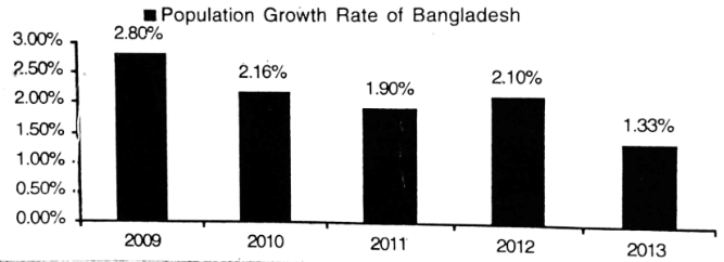
The graph below shows "Population Growth Rate" from 2009 [গণিত] 2013. Describe the graph in af least 80 words highlighting the information given in the graph. [চিত্র]

উত্তর: Population growth rate of Bangladesh from 2009 to 2013 The graph provides information about the population growth rate of Bangladesh from 2009 to 2013 . In 2009, the rate was [গণিত] , then in 2010 the rate was [গণিত] . But in 2011 , the rate came down to [গণিত] . Then the increase occurred in 2012 and the rate was [গণিত] . Again, in 2013 the population rate decreased and came down to [গণিত] . The graph indicates that the highest rate was in 2009 and the lowest one in 2013 . If we observe the graph very minutely, we see the fluctuation on the population growth rate. In fact, this country's population growth rate is unstable as the rate changes every year. বাংলা অনুবাদঃ গ্রাফটি ২০০৯ থেকে ২০১৩ সাল পর্যন্ত বাংলাদেশের জনসংখ্যা বৃদ্ধির হার সম্পর্কে তথ্য প্রদান করে। ২০০৯ সালে জনসংখ্যা বৃদ্ধির হার ছিল [গণিত] , যা ২০১০ সালে কমে [গণিত] -এ দাঁড়ায়। কিন্তু ২০১১ সালে এই হার আরও কমে [গণিত] -এ পৌঁছায়। ২০১২ সালে এই হারে সামান্য বৃদ্ধি ঘটে এবং তা [গণিত] হয়। আবার ২০১৩ সালে জনসংখ্যা বৃদ্ধির হার কমে [গণিত] -এ দাঁড়ায়। গ্রাফ থেকে দেখা যায়, সর্বোচ্চ বৃদ্ধি হার ছিল ২০০৯ সালে এবং সর্বনিম্ন বৃদ্ধি হার ছিল ২০১৩ সালে। যদি গ্রাফটি সূক্ষ্মভাবে পর্যবেক্ষণ করা হয়, তবে দেখা যায় যে জনসংখ্যা বৃদ্ধির হারে পরিবর্তন লক্ষ্যণীয়। প্রকৃতপক্ষে, এই দেশের জনসংখ্যা বৃদ্ধির হার অস্থিতিশীল, কারণ এটি প্রতি বছর পরিবর্তিত হচ্ছে।

HSC English 1st Paper Writing : Interpreting graph/chart CQ — Prosthuti প্রশ্নব্যাংক

HSC · English 1st Paper · Writing : Interpreting graph/chart · সৃজনশীল

The graph below shows "Population Growth Rate" from 2009 →2013.Describethegraphinafleast80wordshighlightingtheinformationgiveninthe\to 2013. Describe the graph in af least 80 words highlighting the information given in the graph. question image

উত্তর

Population growth rate of Bangladesh from 2009 to 2013 The graph provides information about the population growth rate of Bangladesh from 2009 to 2013 . In 2009, the rate was 2.80%2.80 \%, then in 2010 the rate was 2.16%2.16 \%. But in 2011 , the rate came down to 1.90%1.90 \%. Then the increase occurred in 2012 and the rate was 2.10%2.10 \%. Again, in 2013 the population rate decreased and came down to 1.33%1.33 \%. The graph indicates that the highest rate was in 2009 and the lowest one in 2013 . If we observe the graph very minutely, we see the fluctuation on the population growth rate. In fact, this country's population growth rate is unstable as the rate changes every year. বাংলা অনুবাদঃ গ্রাফটি ২০০৯ থেকে ২০১৩ সাল পর্যন্ত বাংলাদেশের জনসংখ্যা বৃদ্ধির হার সম্পর্কে তথ্য প্রদান করে। ২০০৯ সালে জনসংখ্যা বৃদ্ধির হার ছিল ২.৮০২.৮০ %, যা ২০১০ সালে কমে ২.১৬২.১৬ %-এ দাঁড়ায়। কিন্তু ২০১১ সালে এই হার আরও কমে ১.৯০১.৯০ %-এ পৌঁছায়। ২০১২ সালে এই হারে সামান্য বৃদ্ধি ঘটে এবং তা ২.১০২.১০ % হয়। আবার ২০১৩ সালে জনসংখ্যা বৃদ্ধির হার কমে ১.৩৩১.৩৩ %-এ দাঁড়ায়। গ্রাফ থেকে দেখা যায়, সর্বোচ্চ বৃদ্ধি হার ছিল ২০০৯ সালে এবং সর্বনিম্ন বৃদ্ধি হার ছিল ২০১৩ সালে। যদি গ্রাফটি সূক্ষ্মভাবে পর্যবেক্ষণ করা হয়, তবে দেখা যায় যে জনসংখ্যা বৃদ্ধির হারে পরিবর্তন লক্ষ্যণীয়। প্রকৃতপক্ষে, এই দেশের জনসংখ্যা বৃদ্ধির হার অস্থিতিশীল, কারণ এটি প্রতি বছর পরিবর্তিত হচ্ছে।
HSCEnglish 1st PaperWriting : Interpreting graph/chart
12টি সম্পর্কিত প্রশ্ন — ব্যাখ্যা লকড

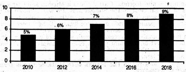
1.The graph shows "The economic growth rate of Bangladesh from 2010 →2018\to 2018 ". Describe in 150 words. question image

The graph shows "The economic growth rate of Bangladesh from 2010 →2018\to 2018 ". Describe in 150 words. question image

উত্তর ও ব্যাখ্যা দেখতে ফ্রি রেজিস্ট্রেশন করো

ফ্রি শুরু করো

2.Look at the chart below. It shows the sources of air pollution in Dhaka. Now, analyze the chart in at least 80 words focusing the main aspects. question image

Look at the chart below. It shows the sources of air pollution in Dhaka. Now, analyze the chart in at least 80 words focusing the main aspects. question image

উত্তর ও ব্যাখ্যা দেখতে ফ্রি রেজিস্ট্রেশন করো

ফ্রি শুরু করো

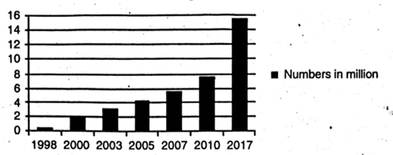
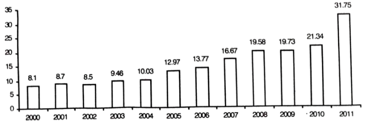
3.Look at the following graph. It shows the number of mobile phone users in Bangladesh. The point is shows in mllion. Now, describe the graph. question image

Look at the following graph. It shows the number of mobile phone users in Bangladesh. The point is shows in mllion. Now, describe the graph. question image

উত্তর ও ব্যাখ্যা দেখতে ফ্রি রেজিস্ট্রেশন করো

ফ্রি শুরু করো

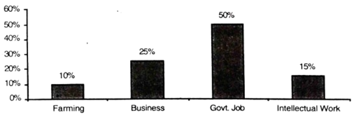
4.The graph below shows the choice of professions by different eduoated people. Describe the graph in 150 words. You should highlight and summarize the information given in the graph. question image

The graph below shows the choice of professions by different eduoated people. Describe the graph in 150 words. You should highlight and summarize the information given in the graph. question image

উত্তর ও ব্যাখ্যা দেখতে ফ্রি রেজিস্ট্রেশন করো

ফ্রি শুরু করো

5.The graph below shows shows 'Imports′from2000→2011.Describethegraphin150Imports^{\prime} from 2000 \to 2011. Describe the graph in 150 words. You should highlight and summarize the information given in the graph. Imports (Billion \$) question image

The graph below shows shows 'Imports′from2000→2011.Describethegraphin150Imports^{\prime} from 2000 \to 2011. Describe the graph in 150 words. You should highlight and summarize the information given in the graph. Imports (Billion \$) question image

উত্তর ও ব্যাখ্যা দেখতে ফ্রি রেজিস্ট্রেশন করো

ফ্রি শুরু করো

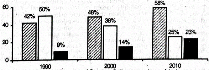
6.The barchart below shows the young people's changing attitude →\to pastimes. Describe the cˉhartinatleast80\bar chart in at least 80 words. You should highlight and analyze the information given in the graph. question image

The barchart below shows the young people's changing attitude →\to pastimes. Describe the cˉhartinatleast80\bar chart in at least 80 words. You should highlight and analyze the information given in the graph. question image

উত্তর ও ব্যাখ্যা দেখতে ফ্রি রেজিস্ট্রেশন করো

ফ্রি শুরু করো

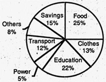
7.The pie chart shows the distribution (in percentage) of monthly income of a middle-class family in Bangladesh. Describe the chart in at least 80 words. question image

The pie chart shows the distribution (in percentage) of monthly income of a middle-class family in Bangladesh. Describe the chart in at least 80 words. question image

উত্তর ও ব্যাখ্যা দেখতে ফ্রি রেজিস্ট্রেশন করো

ফ্রি শুরু করো

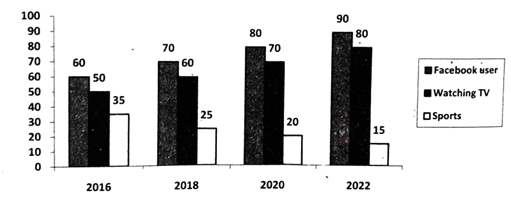
8.The graph below shows what percentage of time the college students in different areas of our country spend for pastime activities from 2016 →2022.Describethegraphin150\to 2022. Describe the graph in 150 words. question image

The graph below shows what percentage of time the college students in different areas of our country spend for pastime activities from 2016 →2022.Describethegraphin150\to 2022. Describe the graph in 150 words. question image

উত্তর ও ব্যাখ্যা দেখতে ফ্রি রেজিস্ট্রেশন করো

ফ্রি শুরু করো

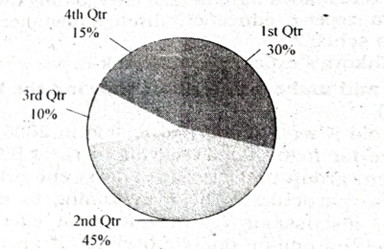
9.The pie chart below shows the percentages of transportation used by 800 students →come→\to come \to college. Describe the chart in 150 words. question image 1. Bus 30% 2. Bicycle 45% 3. Car 10% 4. Waling 15%

The pie chart below shows the percentages of transportation used by 800 students →come→\to come \to college. Describe the chart in 150 words. question image 1. Bus 30% 2. Bicycle 45% 3. Car 10% 4. Waling 15%

উত্তর ও ব্যাখ্যা দেখতে ফ্রি রেজিস্ট্রেশন করো

ফ্রি শুরু করো

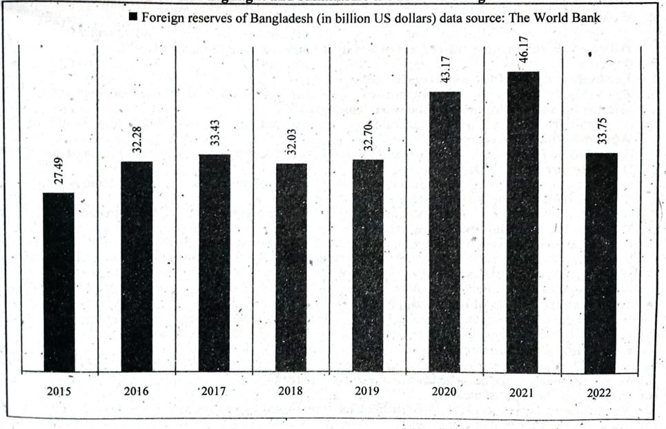
10.The graph/chart below shows the foreign reserves of Bangladesh from the year 2015 →2022.Describethechartin150\to 2022. Describe the chart in 150 words. You should highlight and summarize the information given in the chart. ■Foreign reserves of Bangladesh (in billion US dollars) data source: The World Bank question image

The graph/chart below shows the foreign reserves of Bangladesh from the year 2015 →2022.Describethechartin150\to 2022. Describe the chart in 150 words. You should highlight and summarize the information given in the chart. ■Foreign reserves of Bangladesh (in billion US dollars) data source: The World Bank question image

উত্তর ও ব্যাখ্যা দেখতে ফ্রি রেজিস্ট্রেশন করো

ফ্রি শুরু করো

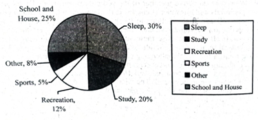
11.The pie chart below shows the time allocation of a student's daily activities. Describe the pie-chart in a least 150 words. question image

The pie chart below shows the time allocation of a student's daily activities. Describe the pie-chart in a least 150 words. question image

উত্তর ও ব্যাখ্যা দেখতে ফ্রি রেজিস্ট্রেশন করো

ফ্রি শুরু করো

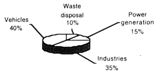
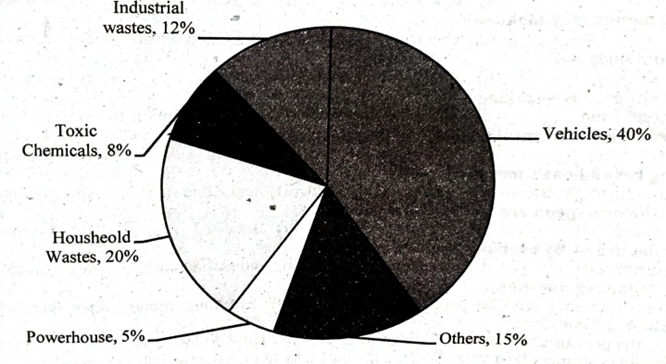
12.The pie chart below shows the sources of environment pollution in a city. Now, analyze the chart in at least 80 words. Your writing should precisely highlight the information and the key features illustrated in the chart. question image

The pie chart below shows the sources of environment pollution in a city. Now, analyze the chart in at least 80 words. Your writing should precisely highlight the information and the key features illustrated in the chart. question image

উত্তর ও ব্যাখ্যা দেখতে ফ্রি রেজিস্ট্রেশন করো

ফ্রি শুরু করো

আরো প্রশ্ন দেখো

আরো হাজারো প্রশ্ন + মডেল টেস্ট

ফ্রি রেজিস্ট্রেশন করো — ফেভারিট, AI টিউটর, লিডারবোর্ড ও অ্যানালিটিক্স আনলক করো।

The graph below shows "Population Growth Rate" from 2009 2013. Des… | Prosthuti