শেয়ারFacebookWhatsApp

The graph below shows the choice of professions by different eduoated people. Describe the graph in 150 words. You should highlight and summarize the information given in the graph. [চিত্র]
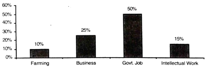
উত্তর: The choice of professions by different educated people The graph has shown the choice of profession by jobs are mentioned in the graph- these are farming, different educated people. Four categories business, govt job and intellectual work. of Here we see that govt job has occupied the first position. 50% of the educated people prefer govt job as their profession. In the field of the educated people's choice of their profession, business has occupied the second position. 25% of educated people select business as their profession. Intellectual wo work is in the third position. The percentage of the people who choose intellectual work as their profession is 15%. On the other hand, very few people are interested in farming which is always called a key [গণিত] our national development. Only 10% educated people choose farming as their profession. If the educated people are interested in farming, it can be said without hesitation that they will succeed in life. Our country will also go forward with their success. It is ive such not possible [গণিত] give such guarantee that every educated person will get government job. So, [গণিত] summarize the graph, we can say with an emphasis that it is high time some of the educated people made up their mind [গণিত] select farming and business as their profession. বাংলা অনুবাদঃ গ্রাফটি বিভিন্ন শিক্ষিত মানুষের পেশা নির্বাচনের চিত্র তুলে ধরেছে। এখানে চারটি পেশার উল্লেখ করা হয়েছে: কৃষিকাজ, ব্যবসা, সরকারি চাকরি এবং বুদ্ধিবৃত্তিক কাজ। গ্রাফ অনুযায়ী, সরকারি চাকরি প্রথম স্থানে রয়েছে। ৫০% শিক্ষিত মানুষ তাদের পেশা হিসেবে সরকারি চাকরি বেছে নেন। পেশা নির্বাচনের ক্ষেত্রে ব্যবসা দ্বিতীয় স্থানে রয়েছে, যেখানে ২৫% শিক্ষিত মানুষ ব্যবসাকে তাদের পেশা হিসেবে বেছে নেন। বুদ্ধিবৃত্তিক কাজ তৃতীয় স্থানে রয়েছে, এবং এই পেশায় শিক্ষিত মানুষের ১৫% আগ্রহী। অন্যদিকে, কৃষিকাজে আগ্রহী মানুষের সংখ্যা খুবই কম, যা সবসময় জাতীয় উন্নয়নের মূল চাবিকাঠি হিসেবে বিবেচিত হয়। মাত্র ১০% শিক্ষিত মানুষ কৃষিকাজকে তাদের পেশা হিসেবে বেছে নেন। যদি শিক্ষিত মানুষ কৃষিকাজে আগ্রহী হয়, তবে নিশ্চিতভাবেই তারা জীবনে সফল হবেন, এবং তাদের সাফল্যের সঙ্গে দেশও অগ্রসর হবে। তবে, এটি নিশ্চিত করা সম্ভব নয় যে প্রতিটি শিক্ষিত মানুষ সরকারি চাকরি পাবে। সারাংশ হিসেবে বলা যায়, এখনই সময় যে কিছু শিক্ষিত মানুষ তাদের পেশা হিসেবে কৃষিকাজ এবং ব্যবসা বেছে নেওয়ার সিদ্ধান্ত নেবে। এটি তাদের ব্যক্তিগত সাফল্য এবং দেশের উন্নয়নের জন্য অত্যন্ত গুরুত্বপূর্ণ।

HSC English 1st Paper Writing : Interpreting graph/chart CQ — Prosthuti প্রশ্নব্যাংক

HSC · English 1st Paper · Writing : Interpreting graph/chart · সৃজনশীল

The graph below shows the choice of professions by different eduoated people. Describe the graph in 150 words. You should highlight and summarize the information given in the graph. question image

উত্তর

The choice of professions by different educated people The graph has shown the choice of profession by jobs are mentioned in the graph- these are farming, different educated people. Four categories business, govt job and intellectual work. of Here we see that govt job has occupied the first position. 50% of the educated people prefer govt job as their profession. In the field of the educated people's choice of their profession, business has occupied the second position. 25% of educated people select business as their profession. Intellectual wo work is in the third position. The percentage of the people who choose intellectual work as their profession is 15%. On the other hand, very few people are interested in farming which is always called a key →ournational\to our national development. Only 10% educated people choose farming as their profession. If the educated people are interested in farming, it can be said without hesitation that they will succeed in life. Our country will also go forward with their success. It is ive such not possible →givesuchguaranteethateveryeducatedpersonwillgetgovernment\to give such guarantee that every educated person will get government job. So, →summarizethe\to summarize the graph, we can say with an emphasis that it is high time some of the educated people made up their mind →selectfarmingandbusinessastheir\to select farming and business as their profession.\end{if}]--> বাংলা অনুবাদঃ গ্রাফটি বিভিন্ন শিক্ষিত মানুষের পেশা নির্বাচনের চিত্র তুলে ধরেছে। এখানে চারটি পেশার উল্লেখ করা হয়েছে: কৃষিকাজ, ব্যবসা, সরকারি চাকরি এবং বুদ্ধিবৃত্তিক কাজ। গ্রাফ অনুযায়ী, সরকারি চাকরি প্রথম স্থানে রয়েছে। ৫০% শিক্ষিত মানুষ তাদের পেশা হিসেবে সরকারি চাকরি বেছে নেন। পেশা নির্বাচনের ক্ষেত্রে ব্যবসা দ্বিতীয় স্থানে রয়েছে, যেখানে ২৫% শিক্ষিত মানুষ ব্যবসাকে তাদের পেশা হিসেবে বেছে নেন। বুদ্ধিবৃত্তিক কাজ তৃতীয় স্থানে রয়েছে, এবং এই পেশায় শিক্ষিত মানুষের ১৫% আগ্রহী। অন্যদিকে, কৃষিকাজে আগ্রহী মানুষের সংখ্যা খুবই কম, যা সবসময় জাতীয় উন্নয়নের মূল চাবিকাঠি হিসেবে বিবেচিত হয়। মাত্র ১০% শিক্ষিত মানুষ কৃষিকাজকে তাদের পেশা হিসেবে বেছে নেন। যদি শিক্ষিত মানুষ কৃষিকাজে আগ্রহী হয়, তবে নিশ্চিতভাবেই তারা জীবনে সফল হবেন, এবং তাদের সাফল্যের সঙ্গে দেশও অগ্রসর হবে। তবে, এটি নিশ্চিত করা সম্ভব নয় যে প্রতিটি শিক্ষিত মানুষ সরকারি চাকরি পাবে। সারাংশ হিসেবে বলা যায়, এখনই সময় যে কিছু শিক্ষিত মানুষ তাদের পেশা হিসেবে কৃষিকাজ এবং ব্যবসা বেছে নেওয়ার সিদ্ধান্ত নেবে। এটি তাদের ব্যক্তিগত সাফল্য এবং দেশের উন্নয়নের জন্য অত্যন্ত গুরুত্বপূর্ণ।
HSCEnglish 1st PaperWriting : Interpreting graph/chart
12টি সম্পর্কিত প্রশ্ন — ব্যাখ্যা লকড

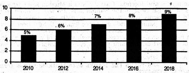
1.The graph shows "The economic growth rate of Bangladesh from 2010 →2018\to 2018 ". Describe in 150 words. question image

The graph shows "The economic growth rate of Bangladesh from 2010 →2018\to 2018 ". Describe in 150 words. question image

উত্তর ও ব্যাখ্যা দেখতে ফ্রি রেজিস্ট্রেশন করো

ফ্রি শুরু করো

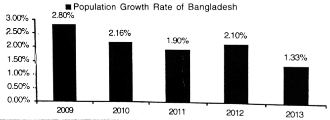
2.The graph below shows "Population Growth Rate" from 2009 →2013.Describethegraphinafleast80wordshighlightingtheinformationgiveninthe\to 2013. Describe the graph in af least 80 words highlighting the information given in the graph. question image

The graph below shows "Population Growth Rate" from 2009 →2013.Describethegraphinafleast80wordshighlightingtheinformationgiveninthe\to 2013. Describe the graph in af least 80 words highlighting the information given in the graph. question image

উত্তর ও ব্যাখ্যা দেখতে ফ্রি রেজিস্ট্রেশন করো

ফ্রি শুরু করো

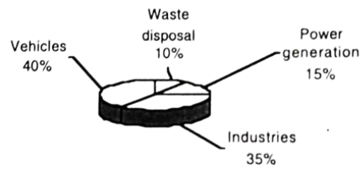
3.Look at the chart below. It shows the sources of air pollution in Dhaka. Now, analyze the chart in at least 80 words focusing the main aspects. question image

Look at the chart below. It shows the sources of air pollution in Dhaka. Now, analyze the chart in at least 80 words focusing the main aspects. question image

উত্তর ও ব্যাখ্যা দেখতে ফ্রি রেজিস্ট্রেশন করো

ফ্রি শুরু করো

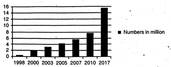
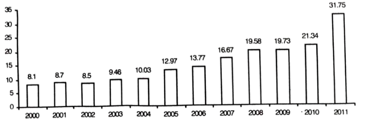
4.Look at the following graph. It shows the number of mobile phone users in Bangladesh. The point is shows in mllion. Now, describe the graph. question image

Look at the following graph. It shows the number of mobile phone users in Bangladesh. The point is shows in mllion. Now, describe the graph. question image

উত্তর ও ব্যাখ্যা দেখতে ফ্রি রেজিস্ট্রেশন করো

ফ্রি শুরু করো

5.The graph below shows shows 'Imports′from2000→2011.Describethegraphin150Imports^{\prime} from 2000 \to 2011. Describe the graph in 150 words. You should highlight and summarize the information given in the graph. Imports (Billion \$) question image

The graph below shows shows 'Imports′from2000→2011.Describethegraphin150Imports^{\prime} from 2000 \to 2011. Describe the graph in 150 words. You should highlight and summarize the information given in the graph. Imports (Billion \$) question image

উত্তর ও ব্যাখ্যা দেখতে ফ্রি রেজিস্ট্রেশন করো

ফ্রি শুরু করো

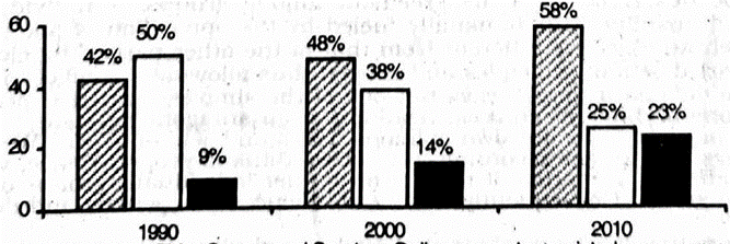
6.The barchart below shows the young people's changing attitude →\to pastimes. Describe the cˉhartinatleast80\bar chart in at least 80 words. You should highlight and analyze the information given in the graph. question image

The barchart below shows the young people's changing attitude →\to pastimes. Describe the cˉhartinatleast80\bar chart in at least 80 words. You should highlight and analyze the information given in the graph. question image

উত্তর ও ব্যাখ্যা দেখতে ফ্রি রেজিস্ট্রেশন করো

ফ্রি শুরু করো

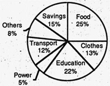
7.The pie chart shows the distribution (in percentage) of monthly income of a middle-class family in Bangladesh. Describe the chart in at least 80 words. question image

The pie chart shows the distribution (in percentage) of monthly income of a middle-class family in Bangladesh. Describe the chart in at least 80 words. question image

উত্তর ও ব্যাখ্যা দেখতে ফ্রি রেজিস্ট্রেশন করো

ফ্রি শুরু করো

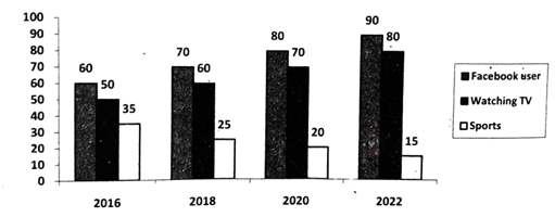
8.The graph below shows what percentage of time the college students in different areas of our country spend for pastime activities from 2016 →2022.Describethegraphin150\to 2022. Describe the graph in 150 words. question image

The graph below shows what percentage of time the college students in different areas of our country spend for pastime activities from 2016 →2022.Describethegraphin150\to 2022. Describe the graph in 150 words. question image

উত্তর ও ব্যাখ্যা দেখতে ফ্রি রেজিস্ট্রেশন করো

ফ্রি শুরু করো

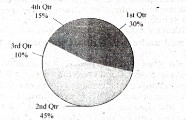
9.The pie chart below shows the percentages of transportation used by 800 students →come→\to come \to college. Describe the chart in 150 words. question image 1. Bus 30% 2. Bicycle 45% 3. Car 10% 4. Waling 15%

The pie chart below shows the percentages of transportation used by 800 students →come→\to come \to college. Describe the chart in 150 words. question image 1. Bus 30% 2. Bicycle 45% 3. Car 10% 4. Waling 15%

উত্তর ও ব্যাখ্যা দেখতে ফ্রি রেজিস্ট্রেশন করো

ফ্রি শুরু করো

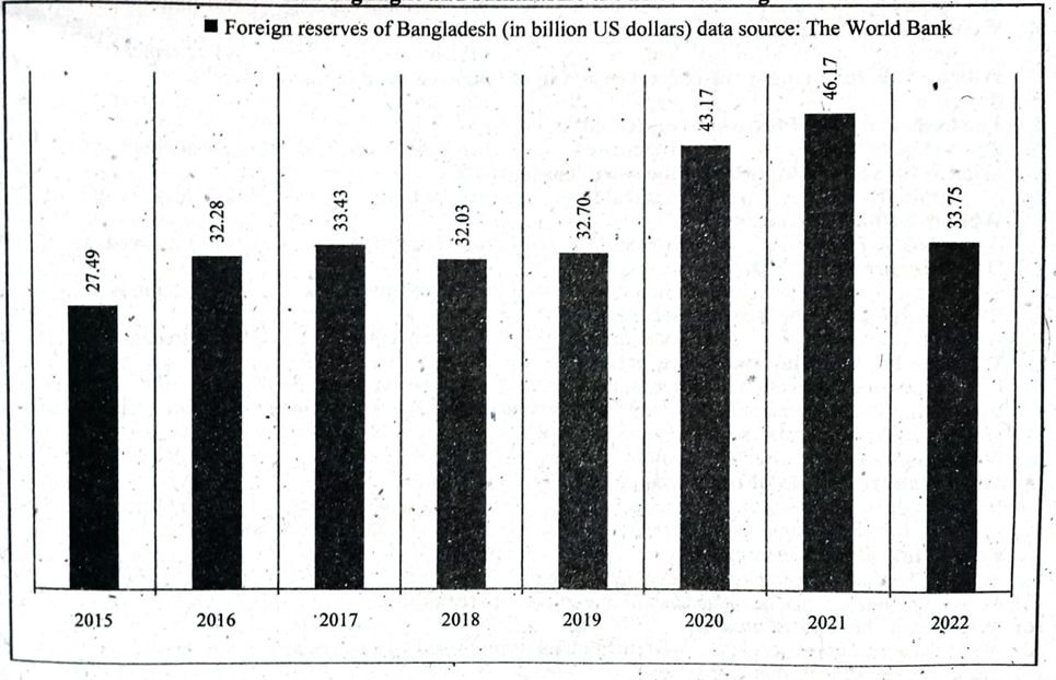
10.The graph/chart below shows the foreign reserves of Bangladesh from the year 2015 →2022.Describethechartin150\to 2022. Describe the chart in 150 words. You should highlight and summarize the information given in the chart. ■Foreign reserves of Bangladesh (in billion US dollars) data source: The World Bank question image

The graph/chart below shows the foreign reserves of Bangladesh from the year 2015 →2022.Describethechartin150\to 2022. Describe the chart in 150 words. You should highlight and summarize the information given in the chart. ■Foreign reserves of Bangladesh (in billion US dollars) data source: The World Bank question image

উত্তর ও ব্যাখ্যা দেখতে ফ্রি রেজিস্ট্রেশন করো

ফ্রি শুরু করো

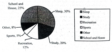
11.The pie chart below shows the time allocation of a student's daily activities. Describe the pie-chart in a least 150 words. question image

The pie chart below shows the time allocation of a student's daily activities. Describe the pie-chart in a least 150 words. question image

উত্তর ও ব্যাখ্যা দেখতে ফ্রি রেজিস্ট্রেশন করো

ফ্রি শুরু করো

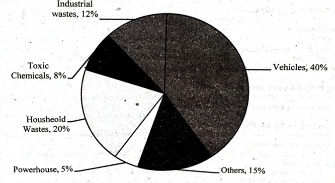
12.The pie chart below shows the sources of environment pollution in a city. Now, analyze the chart in at least 80 words. Your writing should precisely highlight the information and the key features illustrated in the chart. question image

The pie chart below shows the sources of environment pollution in a city. Now, analyze the chart in at least 80 words. Your writing should precisely highlight the information and the key features illustrated in the chart. question image

উত্তর ও ব্যাখ্যা দেখতে ফ্রি রেজিস্ট্রেশন করো

ফ্রি শুরু করো

আরো প্রশ্ন দেখো

আরো হাজারো প্রশ্ন + মডেল টেস্ট

ফ্রি রেজিস্ট্রেশন করো — ফেভারিট, AI টিউটর, লিডারবোর্ড ও অ্যানালিটিক্স আনলক করো।